Show code
# Run this cell in Colab if needed
try:
    import numpy, pandas, matplotlib
except Exception:
!pip -q install numpy pandas matplotlib scipyBias–variance, uncertainty, validation
![]()
# Run this cell in Colab if needed
try:
import numpy, pandas, matplotlib
except Exception:
!pip -q install numpy pandas matplotlib scipyThis primer lab builds foundations for rigorous financial data science. We focus on three critical concepts that prevent costly errors in production systems.
1. Bias-Variance Trade-off → Understanding when simpler models outperform complex ones
2. Uncertainty Quantification → Measuring confidence in your estimates (not just point estimates)
3. Time-Aware Validation → Preventing look-ahead bias in financial forecasting
These aren’t abstract theory: they’re professional standards that separate robust production systems from research toys.
By the end of this lab, you will have:
Time estimate: ≈ 60 minutes (plus optional extensions)
Let’s start with a quick orientation to ensure your Python environment works correctly. This cell tests basic operations you’ll use throughout the course.
# === Test 1: Basic output ===
print("Hello, notebook!")

# === Test 2: Variables and assertions ===
a = 2 + 2
assert a == 4, "Basic arithmetic check failed"

# === Test 3: Lists and slicing ===
nums = [10, 20, 30, 40]
assert nums[:2] == [10,20], "List slicing check failed"

# === Test 4: Dictionaries (used heavily in financial data) ===
info = {"ticker": "AAPL", "price": 185.0}
assert "ticker" in info and isinstance(info["price"], (int,float)), "Dictionary check failed"

# === Test 5: Functions ===
def add(x, y):
    return x + y
assert add(2,3) == 5, "Function check failed"

print("✔ All orientation checks passed - you're ready to proceed!")
Hello, notebook!
✔ All orientation checks passed - you're ready to proceed!The assert statements are quality checks. If something fails, you get an immediate error message rather than silent bugs later. This is defensive programming: a professional standard.
The bias-variance trade-off is fundamental to model selection. Simple models underfit (high bias), complex models overfit (high variance). The optimal model balances both.
Total Error = Bias² + Variance + Irreducible Noise
import numpy as np
import matplotlib.pyplot as plt

# Model complexity scale (1 = very simple, 10 = very complex)
complexity = np.arange(1, 11)

# Bias decreases with complexity (simple models underfit)
bias2 = (1/complexity)**1.2

# Variance increases with complexity (complex models overfit)
variance = 0.03 * (complexity/10)**1.8

# Total error (MSE) = Bias² + Variance
mse = bias2 + variance

# Find the optimal complexity
optimal_idx = np.argmin(mse)
optimal_complexity = complexity[optimal_idx]
optimal_mse = mse[optimal_idx]

print(f"Optimal complexity: {optimal_complexity}")
print(f"Minimum MSE: {optimal_mse:.4f}")
Optimal complexity: 10
Minimum MSE: 0.0931# Reuse optimal from Step 1 (or recompute so this step is self-contained)
optimal_idx = np.argmin(mse)
optimal_complexity = complexity[optimal_idx]
optimal_mse = mse[optimal_idx]
print(f"MSE is minimized at complexity = {optimal_complexity} (minimum MSE = {optimal_mse:.4f})")
plt.figure(figsize=(10,6))
# Plot the three curves
plt.plot(complexity, bias2, 'o-', label='Bias² (underfitting)', linewidth=2, markersize=8)
plt.plot(complexity, variance, 's-', label='Variance (overfitting)', linewidth=2, markersize=8)
plt.plot(complexity, mse, '^-', label='MSE (total error)', linewidth=2, markersize=8, color='red')
# Mark the optimal point
plt.axvline(optimal_complexity, color='green', linestyle='--', alpha=0.5,
label=f'Optimal (complexity={optimal_complexity})')
plt.plot(optimal_complexity, optimal_mse, 'g*', markersize=20)
plt.xlabel('Model complexity (relative)', fontsize=11)
plt.ylabel('Error', fontsize=11)
plt.title('Bias–Variance Trade‑off (Illustrative)', fontsize=13)
plt.grid(alpha=0.3)
plt.legend(fontsize=10)
plt.tight_layout()
plt.show()MSE is minimized at complexity = 10 (minimum MSE = 0.0931)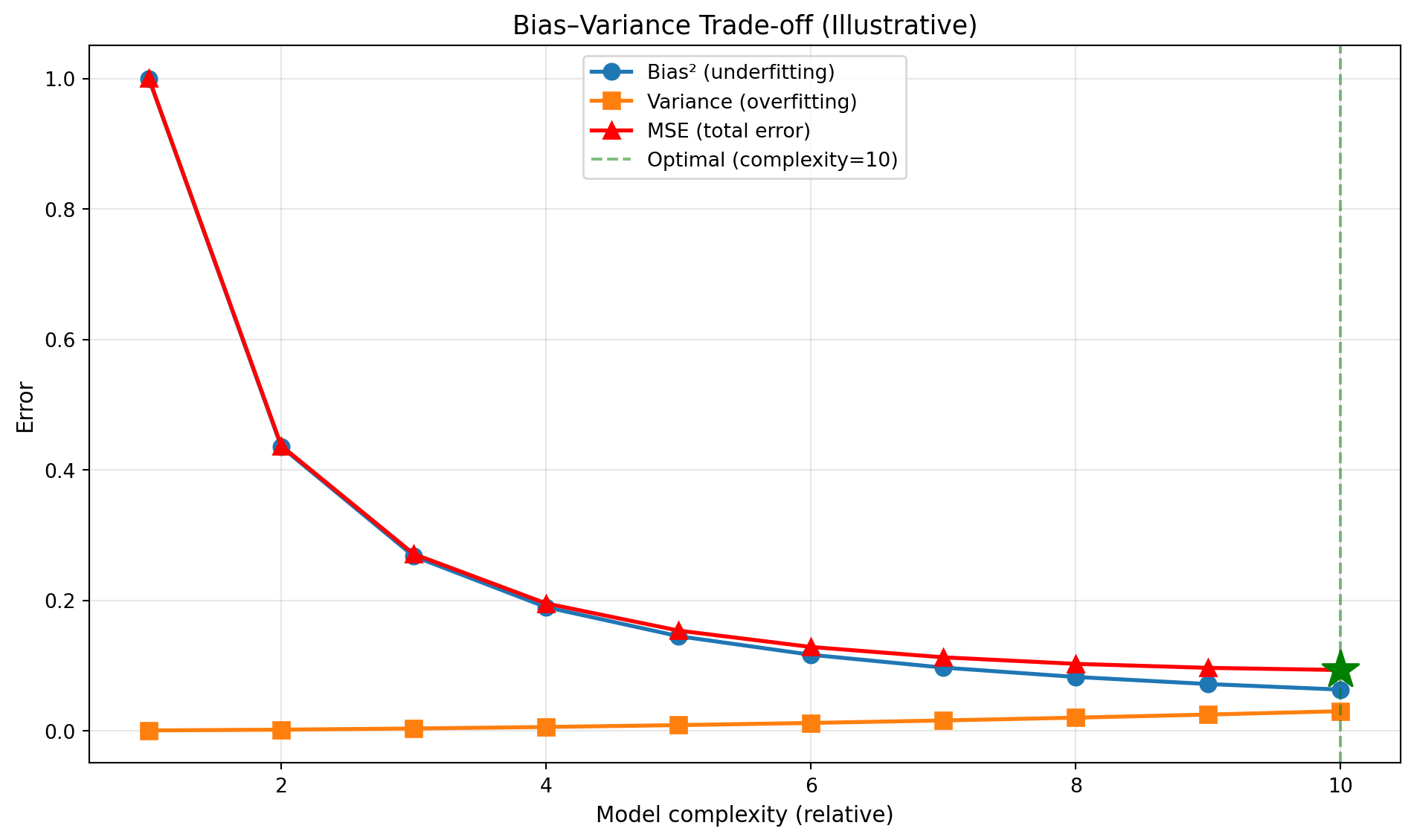
Checkpoint: Where is MSE minimized? Explain why adding more complexity beyond this point hurts performance despite “fitting” the training data better.
Point estimates (like “mean return = 8%”) are incomplete: we need uncertainty quantification. Bootstrap resampling lets us estimate confidence intervals without assuming distribution shape.
The Problem: We have one sample, but want to know “how variable is our estimate?”
The Solution: Resample our data many times (with replacement) and see how estimates vary
Process: 1. Draw random sample from our data (with replacement, same size) 2. Calculate statistic (e.g., mean) 3. Repeat 1000-5000 times 4. Use percentiles of bootstrap distribution as confidence interval
import numpy as np
import matplotlib.pyplot as plt

np.random.seed(3)

# Simulate log-normal returns (realistic: positive skew, fat tail)
x = np.random.lognormal(mean=0.0, sigma=0.5, size=300)

print(f"Sample size: {len(x)}")
print(f"Sample mean: {np.mean(x):.4f}")
print(f"Sample std: {np.std(x, ddof=1):.4f}")
Sample size: 300
Sample mean: 1.1694
Sample std: 0.6455Financial returns often have positive skew (occasional large gains) and fat tails. Lognormal captures this better than normal distribution.
# Number of bootstrap iterations
B = 2000

# Store bootstrap means
boot_means = []

for i in range(B):
    # Resample with replacement (same size as original)
    xb = np.random.choice(x, size=len(x), replace=True)

    # Calculate mean of this bootstrap sample
    boot_means.append(np.mean(xb))

# Convert to array for analysis
boot_means = np.array(boot_means)

print(f"Generated {B} bootstrap samples")
print(f"Mean of bootstrap means: {np.mean(boot_means):.4f}")
print(f"Std of bootstrap means: {np.std(boot_means):.4f}")
Generated 2000 bootstrap samples
Mean of bootstrap means: 1.1705
Std of bootstrap means: 0.0370# 95% confidence interval: use 2.5th and 97.5th percentiles
ci_low, ci_high = np.percentile(boot_means, [2.5, 97.5])
print(f"\n95% Bootstrap Confidence Interval:")
print(f"Lower bound: {ci_low:.4f}")
print(f"Point estimate: {np.mean(x):.4f}")
print(f"Upper bound: {ci_high:.4f}")
# Sanity check: point estimate should be inside CI
assert ci_low < np.mean(x) < ci_high, "Point estimate outside CI!"
print("\n✔ Bootstrap CI computed successfully")
95% Bootstrap Confidence Interval:
Lower bound: 1.1017
Point estimate: 1.1694
Upper bound: 1.2473

✔ Bootstrap CI computed successfullyplt.figure(figsize=(10,5))
# Histogram of bootstrap means
plt.hist(boot_means, bins=50, alpha=0.7, color='steelblue', edgecolor='black')
# Mark the confidence interval
plt.axvline(ci_low, color='red', linestyle='--', linewidth=2, label=f'95% CI: [{ci_low:.3f}, {ci_high:.3f}]')
plt.axvline(ci_high, color='red', linestyle='--', linewidth=2)
plt.axvline(np.mean(x), color='green', linestyle='-', linewidth=2, label=f'Sample mean: {np.mean(x):.3f}')
plt.xlabel('Bootstrap Mean Values', fontsize=11)
plt.ylabel('Frequency', fontsize=11)
plt.title('Bootstrap Distribution of the Mean (B=2000)', fontsize=13)
plt.legend(fontsize=10)
plt.grid(alpha=0.3)
plt.tight_layout()
plt.show()
What the 95% CI means (frequentist): If we repeated this process many times, 95% of the intervals would contain the true population mean.
What it does NOT mean: There’s NOT a 95% probability the true mean is in this interval. The true mean either is or isn’t in there: the probability refers to the procedure, not this specific interval.
Bayesian credible interval (different concept): Given our data and prior beliefs, there’s a 95% probability the parameter is in this range. Requires specifying priors.
Checkpoint: Why does bootstrap work? Hint: think about the relationship between sample-to-population and resample-to-sample.
Financial data has temporal structure: you can’t randomly split train/test without leaking future information into the past. Walk-forward validation respects time ordering.
Standard k-fold cross-validation shuffles data randomly. In finance, this creates look-ahead bias:
Solution: Always split by time, train on past, validate on future.
import matplotlib.pyplot as plt

plt.figure(figsize=(12,3))

# Define training and validation windows
blocks = [
    (0, 20, 'Train 1'),
    (20, 30, 'Valid 1'),
    (30, 50, 'Train 2'),  # Expands: includes Train 1 + Valid 1
    (50, 60, 'Valid 2')
]

for start, end, label in blocks:
    # Color training blocks blue, validation blocks orange
    color = 'tab:blue' if 'Train' in label else 'tab:orange'

    plt.barh(0, end-start, left=start, height=0.6, color=color, edgecolor='black', linewidth=1.5)
    plt.text((start+end)/2, 0, label, ha='center', va='center',
             color='white', fontsize=11, fontweight='bold')

plt.yticks([])
plt.xlabel('Time index (e.g., months or days)', fontsize=11)
plt.xlim(-2, 62)
plt.title('Rolling/Expanding Walk‑Forward Validation (Toy Example)', fontsize=13)
plt.grid(axis='x', alpha=0.3)
plt.tight_layout()
plt.show()

print("✔ Walk‑forward schematic drawn")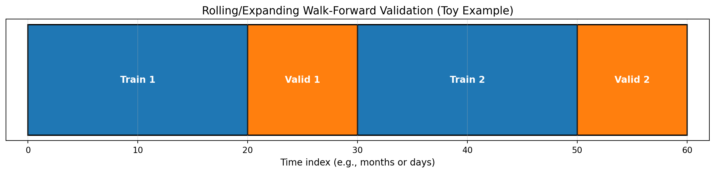
✔ Walk‑forward schematic drawnDeliverable: Write one short paragraph on when to prefer simple models despite recent evidence favoring complexity (Kelly, Malamud, and Zhou (2024)). Consider: regime shifts, parameter estimation error, interpretability requirements, regulatory constraints.
import numpy as np
import pandas as pd
from scipy import stats
import matplotlib.pyplot as plt

np.random.seed(42)

# Synthetic returns with regime shifts to emphasise stylised facts
regimes = np.concatenate([
    np.random.normal(0, 0.6, size=250),
    np.random.normal(0, 1.8, size=120),
    np.random.normal(0, 0.9, size=200)
]) / 100
returns = pd.Series(regimes)

kurt = stats.kurtosis(returns, fisher=False)
acf_abs_lag1 = returns.abs().autocorr(lag=1)

downside = returns[returns < 0]
upside = returns[returns >= 0]
semivar_down = (downside ** 2).mean()
semivar_up = (upside ** 2).mean()

roll_mean = returns.rolling(60).mean()
roll_std = returns.rolling(60).std()

fig, ax = plt.subplots(3, 1, figsize=(10,8), sharex=True)
returns.plot(ax=ax[0], color='tab:blue', linewidth=0.8)
ax[0].set_title('Synthetic Returns with Regimes')
ax[0].grid(alpha=0.3)

returns.abs().plot(ax=ax[1], color='tab:orange', linewidth=0.8)
ax[1].set_title('|Returns| Highlight Volatility Clustering')
ax[1].grid(alpha=0.3)

roll_mean.plot(ax=ax[2], color='tab:green', linewidth=1, label='Rolling mean (60)')
roll_std.plot(ax=ax[2], color='tab:red', linewidth=1, label='Rolling std (60)')
ax[2].set_title('Rolling Moments :  Regime Signals')
ax[2].legend()
ax[2].grid(alpha=0.3)
ax[2].set_xlabel('Observation')

plt.tight_layout()
plt.show()

print(f"Kurtosis (Gaussian=3): {kurt:.2f}")
print(f"Autocorr |returns| lag 1: {acf_abs_lag1:.2f}")
print(f"Downside semivariance: {semivar_down:.4f}")
print(f"Upside semivariance:   {semivar_up:.4f}")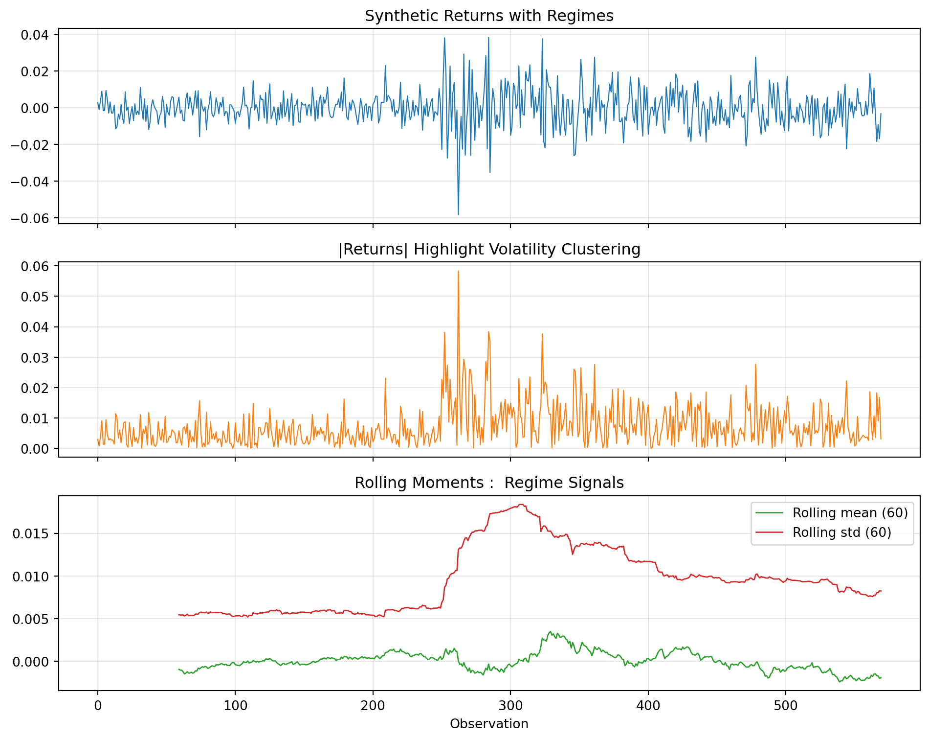
Kurtosis (Gaussian=3): 6.04
Autocorr |returns| lag 1: 0.25
Downside semivariance: 0.0001
Upside semivariance: 0.0001Checkpoint: Draft a bullet list of features or diagnostics you would add before escalating model complexity.
Link your outputs back to the primer deck’s decision flow. In your notes, capture 2–3 bullet points for each step:
How much of return variance is predictable? A rigorous way to measure signal is the R² from an AR(1) model: what fraction of today’s return is predictable from yesterday’s? The Bayesian bootstrap gives us a posterior distribution: not just a point estimate: capturing uncertainty about predictability.
import numpy as np
import matplotlib.pyplot as plt

def bayesian_bootstrap_ar1(returns, n_samples=2000, seed=42):
    """
    Bayesian bootstrap for AR(1) R² = ρ² (squared autocorrelation).

    Returns posterior samples of R² capturing uncertainty.
    """
    rng = np.random.default_rng(seed)
    n = len(returns) - 1
    x, y = returns[:-1], returns[1:]  # Paired observations

    r2_samples = []
    for _ in range(n_samples):
        # Dirichlet weights (Bayesian bootstrap)
        w = rng.dirichlet(np.ones(n))

        # Weighted correlation
        wx, wy = np.sum(w * x), np.sum(w * y)
        cov_xy = np.sum(w * (x - wx) * (y - wy))
        var_x = np.sum(w * (x - wx) ** 2)
        var_y = np.sum(w * (y - wy) ** 2)
        rho = cov_xy / np.sqrt(var_x * var_y + 1e-10)
        r2_samples.append(rho ** 2)

    return np.array(r2_samples)

# Simulate returns (or use your own data)
np.random.seed(123)
returns = np.random.normal(0.0005, 0.02, size=500)  # 500 days, ~0.05% mean, 2% vol

# Compute posterior
r2_posterior = bayesian_bootstrap_ar1(returns, n_samples=2000)

# Summarise
median_r2 = np.median(r2_posterior) * 100
ci_lo, ci_hi = np.percentile(r2_posterior * 100, [2.5, 97.5])

print(f"Posterior R² (predictable variance):")
print(f"  Median: {median_r2:.2f}%")
print(f"  95% CI: [{ci_lo:.2f}%, {ci_hi:.2f}%]")
print(f"  Noise fraction (at median): {100 - median_r2:.2f}%")

# Plot posterior
fig, ax = plt.subplots(figsize=(8, 4))
ax.hist(r2_posterior * 100, bins=50, density=True, alpha=0.7, color='steelblue', edgecolor='white')
ax.axvline(median_r2, color='coral', linestyle='--', linewidth=2, label=f'Median: {median_r2:.2f}%')
ax.axvline(ci_lo, color='gray', linestyle=':', linewidth=1)
ax.axvline(ci_hi, color='gray', linestyle=':', linewidth=1, label=f'95% CI: [{ci_lo:.1f}%, {ci_hi:.1f}%]')
ax.set_xlabel('Predictable variance R² (%)')
ax.set_ylabel('Posterior density')
ax.set_title('Bayesian Bootstrap: How Much Variance is Predictable?')
ax.legend()
ax.set_xlim(0, max(15, ci_hi * 1.5))
plt.tight_layout()
plt.show()
Posterior R² (predictable variance):
Median: 0.14%
95% CI: [0.00%, 1.29%]
Noise fraction (at median): 99.86%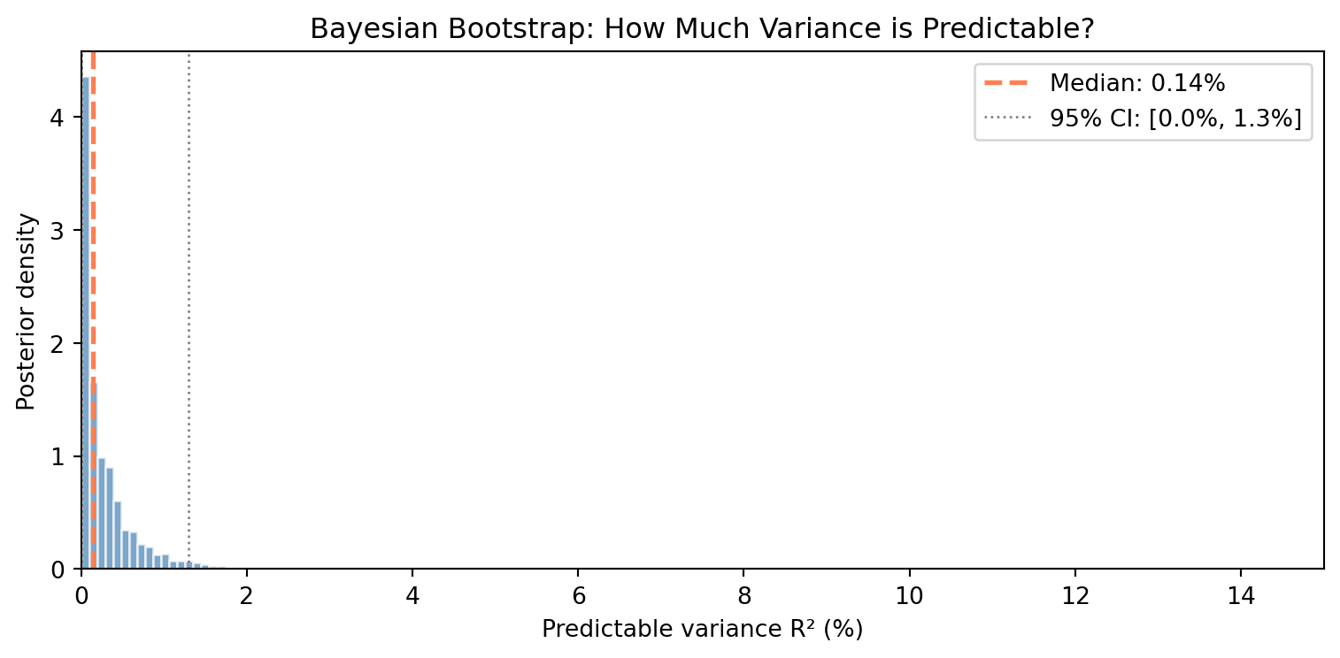
Reflection questions:
Interpret the width: Why is the 95% credible interval so wide relative to the median? What does this tell you about measuring predictability?
Upper bound matters: Even at the optimistic upper bound of the interval, what fraction of variance remains unpredictable noise?
Wide intervals are informative: A point estimate (R² = X%) hides uncertainty. How does the posterior distribution change your interpretation compared to a single number?
Try real data: If you have access to Bloomberg data or another source, replace the simulated returns with actual daily returns for SPY, AAPL, or another asset. How do the results compare?
This exercise connects to Fischer Black’s insight that “we are forced to act largely in the dark.” The posterior distribution quantifies exactly how dark: even with hundreds of observations, we cannot precisely measure how little predictability exists. This is the fundamental challenge of financial inference that motivates everything in this course.
import matplotlib.pyplot as plt
plt.savefig('lab01_last_figure.png', dpi=150)
"Saved: lab01_last_figure.png"
'Saved: lab01_last_figure.png'<Figure size 672x480 with 0 Axes>Before you leave, note one or two of the following (no submission):