---
title: "Foundations of Financial Data Science"
subtitle: "From Classical Econometrics to Modern Machine Learning"
author: "Professor Barry Quinn CStat"
date: today
format:
html:
toc: true
toc-depth: 3
toc-location: left
code-fold: true
code-summary: "Show Python code"
code-tools:
source: true
toggle: true
caption: none
execute:
warning: false
message: false
echo: true
eval: true
fig-width: 10
fig-height: 6
fig-format: png
jupyter: fin510
bibliography: ../resources/reading.bib
---
::: {.callout-tip}
## Chapter Overview
This chapter provides the statistical and econometric foundations for responsible data science in finance. It serves as both a review of core concepts from introductory econometrics and an extension into modern data science methods. The material here will be referenced throughout subsequent chapters as we build toward more advanced techniques.
**Two intellectual threads run through this chapter:**
1. **Cross-sectional econometrics** → Tree-based machine learning (Chapters 7-8)
2. **Time series econometrics** → Sequence learning and foundation models (Chapters 11-12)
Understanding these connections helps you see machine learning not as a separate discipline, but as a natural extension of the econometric toolkit you already possess.
:::
::: {.callout-note}
#### View Slides
Open the lecture deck: [Week 1: Foundations of Financial Data Science](../slides/week01_foundations.qmd)
:::
```{python}
#| label: setup-data-root
#| include: false
import sys
from pathlib import Path
import yaml
try:
with open(Path("config/data_root.yml")) as f:
cfg = yaml.safe_load(f)
data_root = Path(cfg.get("data_root", "data")).expanduser().resolve()
except Exception:
data_root = Path("data")
sys.path.insert(0, str(Path("scripts").resolve()))
from bloomberg_loader import load_bloomberg
```
## Learning Objectives
By the end of this chapter, you should be able to:
- **Review and consolidate** core statistical concepts: distributions, estimation, hypothesis testing
- **Apply** regression analysis with appropriate diagnostics and interpretation
- **Recognise** when classical assumptions fail and understand the consequences
- **Explain** the bias-variance tradeoff and its implications for model selection
- **Contrast** frequentist and Bayesian perspectives on inference
- **Implement** regularisation and validation techniques for responsible modelling
- **Connect** classical econometric concepts to their machine learning extensions
# Part 0: Review of Statistical Foundations {#sec-foundations-review}
We take **data science** to mean the **disciplined study of variation and uncertainty in data**. Variation is what we model: differences across units, over time, between groups. Uncertainty is what we quantify: the limits of what we can know from finite samples and noisy measurements. This chapter consolidates the core statistical concepts that underpin that study in finance. This section serves as a reference point : material you may have encountered in introductory econometrics courses, now framed for the data science context. If you have completed an introductory course in econometrics, much of what follows will be familiar, though you may find the framing useful as we connect these foundations to the machine learning extensions that appear in later chapters.
## What Are We Really Trying to Do?
Every statistical analysis in finance confronts a version of the same fundamental problem: we have incomplete information about a complex system, and we need to make inferences that extend beyond what we directly observe. @gelman2020regression frame this challenge around three types of generalisation that appear, explicitly or implicitly, in nearly every quantitative analysis. First, we generalise from sample to population : the classic problem of statistical inference that pervades every study attempting to draw broad conclusions from limited data. Second, we generalise from treatment to control group, which is the essence of causal inference and lurks in the background of most regression interpretations even when we do not explicitly acknowledge it. Third, we generalise from observed measurements to underlying constructs, recognising that our data rarely capture exactly what we want to study. In finance, we might measure "volatility" using standard deviation, but does this truly capture the risk investors care about?
All three challenges can be reframed as prediction problems: predicting outcomes for observations not in our sample, predicting what would happen under alternative scenarios or interventions, and predicting underlying truth from noisy measurements. In finance, these challenges manifest constantly. When we observe returns for 100 stocks and attempt to say something about "the market," we face the first challenge. When a firm adopts a new strategy and performance subsequently improves, we wonder whether the strategy caused the improvement or whether other factors were responsible : the second challenge. When we quantify risk using historical volatility, we grapple with the third challenge: does our measurement truly reflect the construct we care about? Keeping these challenges in mind helps clarify what our analyses can and cannot tell us, and provides a useful frame for thinking about the extensions we develop in later chapters.
## Probability Distributions and the Machinery of Inference
Statistical inference begins with probability distributions : mathematical descriptions of how random variables behave. These distributions provide the language we use to quantify uncertainty, model returns, estimate parameters, and make inferences that extend beyond our sample. The Normal (Gaussian) distribution, parametrised by mean $\mu$ and variance $\sigma^2$, forms the foundation of classical inference through its symmetric, bell-shaped description of variation: $X \sim \mathcal{N}(\mu, \sigma^2)$. Financial returns are famously *not* normally distributed : they exhibit heavy tails and skewness that the Gaussian cannot capture : yet the Normal distribution remains central because of the Central Limit Theorem. As sample sizes grow, sample means become approximately normal regardless of the underlying distribution, which is why we can rely on normal-based inference even when individual observations are decidedly non-normal.
The Student's t-distribution extends this framework to account for a practical reality: when we estimate population variance from sample data, we introduce additional uncertainty. The t-distribution, with its heavier tails compared to the normal, reflects this extra layer of uncertainty through the relationship $t = \frac{\bar{X} - \mu}{s/\sqrt{n}} \sim t_{n-1}$. In finance, where we often analyse individual securities or short time periods with limited samples, this distinction matters for hypothesis testing : using the normal distribution when the t-distribution is appropriate understates our uncertainty and inflates our confidence in rejecting null hypotheses. The chi-squared distribution ($\chi^2$) arises naturally in variance estimation and goodness-of-fit tests, capturing the distribution of sums of squared standard normal variables: $(n-1)\frac{s^2}{\sigma^2} \sim \chi^2_{n-1}$. The F-distribution, defined as the ratio of two chi-squared variables scaled by their degrees of freedom, emerges when comparing variances or testing multiple restrictions simultaneously, and underpins joint hypothesis testing in regression analysis.
These distributions are not merely theoretical constructs : they are the tools we use to answer practical questions. Is an asset's expected return significantly different from zero? The t-test provides an answer. Do these factors jointly explain returns? The F-test addresses this question. Is the variance of returns stable over time? The chi-squared test offers evidence. Understanding *when* each distribution applies is as important as knowing the formulas themselves. The progression from sample statistic to test statistic to p-value is the essential machinery of frequentist inference, though as we shall see, this machinery comes with important limitations that deserve careful attention.
## Why Statistical Significance Misleads Practitioners
The concept of statistical significance pervades quantitative finance, yet @gelman2020regression argue that even experienced practitioners routinely fall into traps that undermine their inferences. The most common confusion conflates statistical significance with practical importance. A result can be "statistically significant" yet trivially small in economic terms : if an investment strategy earns 0.001% excess return with standard error 0.0003%, we can reject the null hypothesis at conventional levels (t ≈ 3.3), but the finding is economically meaningless once we account for transaction costs. The statistical machinery correctly identifies a non-zero effect, but tells us nothing about whether it matters in practice.
The converse error : interpreting non-significance as evidence of no effect : is equally problematic. Failure to reject the null hypothesis does not mean the effect is zero; it means the data are *inconclusive*. An estimate of 5% ± 8% (a confidence interval spanning from -3% to +13%) is consistent with both a large positive effect and a small negative one. Declaring that "there is no effect" based on p > 0.05 goes well beyond what the data support. A related but more subtle error pervades comparative analyses in finance research: the difference between "significant" and "not significant" is not itself statistically significant. If Strategy A has a significant alpha (t = 2.1) and Strategy B does not (t = 1.8), concluding that they differ meaningfully is incorrect without testing the *difference* directly. The standard error of a difference is typically larger (often by a factor of roughly √2) than the standard errors of the individual estimates, so two estimates that appear different based on their individual significance tests may not differ significantly when compared properly.
The flexibility inherent in data analysis creates further difficulties. Gelman and Loken describe the "garden of forking paths" : with enough flexibility in data processing, variable selection, and model specification, researchers can achieve p < 0.05 from almost any dataset, even pure noise. The problem is not always conscious "p-hacking" or deliberate fishing for significant results; rather, it arises from the accumulation of small, individually defensible choices that collectively bias results toward statistical significance. Should we winsorise outliers? At the 95th or 99th percentile? Should we include or exclude penny stocks? What lag structure should we use? Each choice seems reasonable in isolation, but the researcher who tries multiple specifications and reports the one that "works" has effectively searched across many analyses without accounting for this search in the final inference.
Publication bias amplifies these problems. When journals and prestigious conferences favour statistically significant results, the published literature systematically overstates effect sizes. A strategy that appears to work in one published study may simply represent the lucky draw from many attempted analyses, most of which failed to achieve significance and therefore went unpublished. Meta-analyses consistently show that published effect sizes shrink dramatically when studies with null findings are included, suggesting that what we see in top journals is often the tip of an iceberg where the bulk of contradictory evidence remains hidden.
::: {.callout-tip}
## A Better Approach
Report effect sizes and confidence intervals rather than focusing on p-values and significance tests. Ask "Is this effect large enough to matter economically?" rather than "Is p < 0.05?" When comparing strategies or groups, test the difference directly rather than comparing individual significance tests. And recognise that statistical significance, while providing information about sampling variability, says little about practical importance, causation, or replicability.
:::
## Regression Analysis: Estimation, Interpretation, and the Assumptions That Actually Matter
Regression analysis estimates relationships between variables, providing the workhorse tool of both classical econometrics and modern data science. In its simplest form, we model an outcome $Y$ as a linear function of predictors $X$:
$$Y_i = \beta_0 + \beta_1 X_{1i} + \beta_2 X_{2i} + \cdots + \beta_k X_{ki} + \varepsilon_i$$
Ordinary Least Squares (OLS) estimation finds the coefficients that minimise the sum of squared residuals: $\hat{\boldsymbol{\beta}} = (\mathbf{X}'\mathbf{X})^{-1}\mathbf{X}'\mathbf{Y}$. Under the Classical Linear Regression Model (CLRM) assumptions, OLS estimators are BLUE : Best Linear Unbiased Estimators. These assumptions include linearity of the relationship in parameters, strict exogeneity ($\mathbb{E}[\varepsilon_i | \mathbf{X}] = 0$), no perfect multicollinearity among predictors, homoscedasticity (constant error variance), and no autocorrelation in the errors. When these assumptions hold, inference becomes straightforward: we can use t-tests for individual coefficients, F-tests for joint significance, and R² as a measure of goodness of fit. The Gauss-Markov theorem guarantees that under these conditions, OLS achieves minimum variance among all linear unbiased estimators.
But which of these assumptions actually matter most in practice? Traditional textbooks present regression assumptions in mathematical order, which @gelman2020regression argue obscures what practitioners should worry about. Their ranking by *importance* reorders our priorities:
| Rank | Assumption | Why It Matters |
|:----:|------------|----------------|
| 1 | **Validity** | Does your model address your research question? Are you measuring what you think you're measuring? |
| 2 | **Representativeness** | Is your sample representative of the population you want to study? |
| 3 | **Additivity & Linearity** | The most important *mathematical* assumption : is the true relationship linear? |
| 4 | **Independence of errors** | Violated in time series, spatial, and multilevel settings |
| 5 | **Equal variance** | Heteroscedasticity rarely affects conclusions substantively |
| 6 | **Normality of errors** | "Barely important at all" for estimation : only matters for prediction intervals |
: Regression Assumptions in Order of Importance (Gelman, Hill & Vehtari, 2020) {#tbl-assumptions-ranked}
Most econometrics training focuses intensively on assumptions three through six : the mathematical conditions that determine when OLS is BLUE. We learn to test for heteroscedasticity, check for autocorrelation, worry about multicollinearity, and verify that errors follow a normal distribution. But Gelman argues that **validity** and **representativeness** : which are harder to test with formal diagnostics : matter far more in practice. A perfectly estimated regression on the wrong data, or on an unrepresentative sample, answers the wrong question no matter how beautifully it satisfies the Gauss-Markov conditions. Does your model actually address the research question you care about? Are you measuring the constructs you think you are measuring? Is your sample representative of the population you want to understand? These questions require domain knowledge and careful thought about the data-generating process, not just diagnostic tests on residuals.
::: {.callout-warning}
## Where Attention Should Focus
The assumptions that receive the most attention in econometrics courses (normality of errors, homoscedasticity) are often the least consequential, while validity and representativeness : which resist formal testing : matter most for whether your analysis provides useful answers. A technically perfect analysis of unrepresentative data is worse than useless; it provides false confidence.
:::
The BLUE property itself deserves clarification. "Best" means OLS achieves minimum variance among all linear unbiased estimators : no other unbiased estimator that is a linear function of the data can be more precise. "Linear" means the estimator $\hat{\beta}$ is a linear function of the dependent variable $Y$. "Unbiased" means that $\mathbb{E}[\hat{\beta}] = \beta$ : on average across repeated samples, our estimates hit the true value. The Gauss-Markov theorem guarantees BLUE under the five classical assumptions, but crucially, if we care only about unbiasedness rather than minimum variance, we can relax some assumptions. This distinction matters for understanding when and how OLS fails, and for recognising that biased estimators (like ridge regression or lasso) can sometimes outperform OLS by accepting a small amount of bias in exchange for substantial variance reduction.
## What Regression Coefficients Actually Tell Us
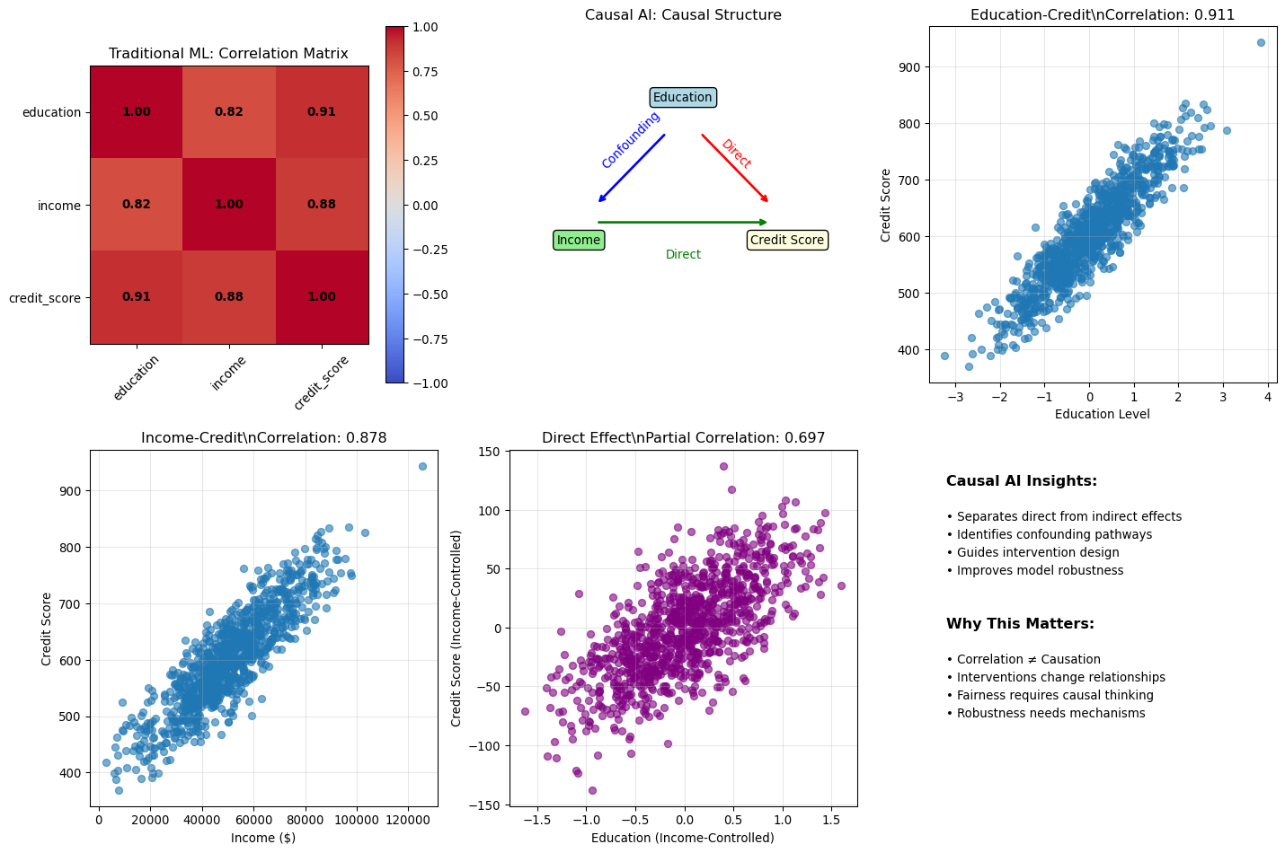
Regression coefficients are commonly called "effects," but @gelman2020regression argue this terminology is misleading and leads to serious interpretive errors. Consider a regression estimating the relationship between ESG scores and stock returns from cross-sectional data: `annual_return = 8.2 + 0.15 × ESG_score + 0.02 × market_cap + error`. The coefficient 0.15 might be reported as "the effect of ESG is 15 basis points per unit score," but this language is dangerously imprecise. What we actually observe is a **comparison**: companies with higher ESG scores have, on average, higher returns than otherwise similar companies in our sample. This is a pattern in the data : a between-firm comparison. To claim an "effect" implies something stronger: that if we took a company and increased its ESG score by one unit, its returns would increase by 15 basis points. This describes a hypothetical within-firm intervention that our observational cross-sectional data cannot possibly support.
Why does this distinction matter beyond mere semantics? High-ESG companies may differ systematically from low-ESG companies in ways we have not measured : better management quality, stronger governance structures, more patient investors, different risk profiles. The observed return difference could reflect these omitted factors rather than ESG practices themselves. If a company adopted ESG practices *only* to boost returns, without these other characteristics, the 15 basis point "effect" might not materialise at all. The language of "effects" invites causal interpretation that the research design cannot support.
::: {.callout-note}
## Getting the Language Right
- **Comparison (what we observe)**: "Firms with ESG scores one point higher have returns 15bp higher on average, controlling for market capitalisation"
- **Effect (a causal claim)**: "Improving ESG by one point *causes* returns to increase by 15bp"
The first describes an association in the data; the second makes a causal claim that requires additional evidence beyond observational regression. Always ask: are we describing a between-unit comparison, or claiming a within-unit effect?
:::
This issue pervades finance research. Consider three more examples: a coefficient of 0.3 on analyst coverage tells us that firms with more coverage have higher returns (comparison), not that adding analysts causes higher returns (effect). A coefficient of -0.05 on leverage indicates that more leveraged firms earn lower returns (comparison), not that reducing leverage increases returns (effect). A coefficient of 0.02 on insider ownership shows that higher ownership associates with better performance (comparison), not that giving managers more shares improves performance (effect). In each case, the regression tells us about associations between firms that differ on these dimensions. Whether *changing* these characteristics would *cause* the predicted outcome requires different evidence: randomised experiments, instrumental variables, regression discontinuity designs, or careful natural experiments. The comparative interpretation is always available from regression coefficients; the causal interpretation requires additional assumptions and research design choices.
## Regression to the Mean, the Limits of R², and the Difficulty of Interactions
The phenomenon of "regression to the mean" : Galton's original discovery that gave regression analysis its name : has profound implications for interpreting patterns in financial data. Children of very tall parents tend to be tall, but *less tall than their parents* on average. Children of very short parents tend to be short, but *less short than their parents*. Heights "regress" toward the population average not because of any biological force, but because extreme observations typically contain both signal (true underlying value) and luck (random variation). On repeated measurement, the luck component averages out, pulling observations toward the mean. In finance, this manifests in performance persistence: last year's top-performing fund managers will, on average, perform closer to the mean next year : not necessarily because their skill deteriorated, but because their exceptional year likely contained some luck alongside skill. Extreme P/E ratios tend to normalise over time. Unusually high or low earnings growth rates typically moderate. Mistaking regression to the mean for a causal effect is one of the most common errors in practical analysis. When a company that performed poorly last year improves this year, did the new CEO cause the improvement, or would regression to the mean have produced similar results anyway? Distinguishing these scenarios requires careful thought about counterfactuals, not just observing that performance changed.
::: {.callout-warning}
## The Regression Fallacy
Regression to the mean creates patterns that look like causal effects but reflect pure statistical artifacts. Before attributing performance changes to interventions, consider whether random variation around a stable mean could explain the observed pattern. This is especially important in "before-after" comparisons without proper control groups.
:::
Understanding R² requires similar care in interpretation. The coefficient of determination measures the proportion of variance explained: $R^2 = 1 - \frac{\sum(y_i - \hat{y}_i)^2}{\sum(y_i - \bar{y})^2}$. @gelman2020regression make the useful point that a model predicting earnings from height and sex yields R² ≈ 0.10, meaning 90% of earnings variation has nothing to do with these predictors. Yet the regression remains informative : it reveals a genuine association, even though it cannot predict individual outcomes with much precision. R² tells us how much variance our predictors explain and whether adding variables improves explanatory power, but it does *not* tell us whether the model is correct (a misspecified model can have high R²), whether the model is useful for decision-making (low R² can still be economically significant), or whether the relationships are causal (R² says nothing about causation). In finance, R² values of 0.01-0.05 are common when predicting returns, reflecting the fundamental difficulty of forecasting prices rather than necessarily indicating model failure. Signal-to-noise ratios are inherently low in financial markets : if prediction were easy, arbitrage would eliminate the opportunity.
A final subtlety concerns interaction effects. @gelman2020regression document a crucial but often overlooked fact: **estimating interaction effects requires roughly four times the sample size of estimating main effects** at the same level of precision. Why? The standard error of an interaction is approximately twice the standard error of the main effect, so achieving the same precision requires quadrupling the sample size. This has immediate implications for finance research: a study powered to detect a "size effect" will typically be underpowered to detect whether that effect varies across industries. If you find a statistically significant interaction in an exploratory analysis, it is likely overestimated due to selection bias : what Gelman calls the "winner's curse" of interactions. When you design a study to detect a main effect and then explore interactions, statistically significant interactions will on average overestimate the true effect by a factor of about 2.6, because you are selecting the largest observed differences from a noisy distribution. Designing studies to detect varying effects (such as "does momentum work differently in bull versus bear markets?") requires substantially more data than detecting average effects, a reality that many published interaction findings conveniently ignore.
## When Assumptions Fail: Consequences and Remedies
Financial data routinely violates CLRM assumptions, so recognising these violations and understanding their consequences becomes essential for responsible inference. Heteroscedasticity : non-constant error variance : is ubiquitous in finance. Volatility clustering means high-volatility periods follow high-volatility periods, violating the constant-variance assumption. The good news: OLS coefficient estimates remain unbiased. The bad news: standard errors are incorrect, invalidating hypothesis tests and confidence intervals. Remedies include robust (Huber-White) standard errors that remain valid under heteroscedasticity, weighted least squares when the variance structure is known, or GARCH models that explicitly model time-varying volatility.
Autocorrelation : correlated errors : appears in nearly all time series data. Yesterday's forecast error predicts today's, violating the independence assumption. OLS remains unbiased, but standard errors are incorrect and typically *understated*, leading to inflated t-statistics and false confidence in rejecting null hypotheses. Newey-West (heteroscedasticity and autocorrelation consistent) standard errors provide one remedy, along with generalised least squares or explicit time series models that incorporate the serial dependence directly. Multicollinearity : highly correlated predictors : is common when using many factors simultaneously. OLS remains unbiased and standard errors remain valid, but variance explodes, making estimates unstable and imprecise. Variable selection, principal components, or regularisation methods like ridge regression offer paths forward.
Endogeneity : correlation between predictors and errors : represents the most serious violation because it renders OLS both biased and inconsistent. If $\text{Cov}(X, \varepsilon) \neq 0$, increasing the sample size will not fix the problem; the bias persists asymptotically. This violation arises from omitted variables, measurement error, or simultaneity, and requires fundamentally different identification strategies: instrumental variables, difference-in-differences, or regression discontinuity designs. The table below summarises the consequences of each violation and available remedies:
| Violation | OLS Unbiased? | OLS BLUE? | Standard Errors Valid? | Remedy |
|-----------|:-------------:|:---------:|:----------------------:|--------|
| Heteroscedasticity | ✓ | ✗ | ✗ | White (HC) SEs |
| Autocorrelation | ✓ | ✗ | ✗ | Newey-West (HAC) |
| Multicollinearity | ✓ | ✓ | ✓ (but imprecise) | Regularisation |
| Endogeneity | ✗ | ✗ | ✗ | IV methods |
: Summary of Assumption Violations and Their Consequences {#tbl-violations}
::: {.callout-important}
## The Path to Machine Learning
Understanding assumption violations provides a natural bridge to machine learning methods. Regularisation techniques like ridge regression and lasso directly address multicollinearity by adding penalty terms that shrink coefficients. Tree-based methods handle nonlinearity and interactions automatically without requiring explicit specification. Sequence learning models explicitly account for temporal dependencies. These are not departures from econometrics : they are principled extensions that relax restrictive assumptions when data patterns demand it.
:::
## Extending to Binary Outcomes: Logistic Regression and the Divide-by-4 Rule
Many financial questions involve binary outcomes rather than continuous variables: Will this loan default? Will this stock beat the market? Will this trade be profitable? Logistic regression extends the regression framework to these settings by modelling the *probability* of the positive class rather than predicting a continuous outcome directly:
$$\text{Pr}(Y=1 | X) = \text{logit}^{-1}(\beta_0 + \beta_1 X_1 + \cdots) = \frac{1}{1 + e^{-(\beta_0 + \beta_1 X_1 + \cdots)}}$$
The logistic transformation ensures that predicted probabilities remain bounded between zero and one, but it creates an interpretation challenge: coefficients are notoriously difficult to understand because of the nonlinear relationship. @gelman2020regression offer a practical heuristic: **divide the coefficient by 4** to get an upper bound on the change in probability for a one-unit change in the predictor. This works because the logistic curve is steepest at its centre, where the probability equals 0.5, and at that point the slope equals $\beta/4$. Dividing by 4 therefore gives the *maximum* possible effect on probability.
As a concrete example, if a logistic regression predicting loan default yields a coefficient of 0.4 for debt-to-income ratio, then a one-unit increase in debt-to-income corresponds to *at most* a 10 percentage point increase in default probability (0.4 ÷ 4 = 0.10). This approximation works best when baseline probabilities are near 50%; for rare events like bankruptcy or fraud, the actual probability change will be smaller than $\beta/4$. When precision matters, compute exact predicted probabilities or use simulation rather than relying on this heuristic.
## Testing Your Methods with Fake Data
Before trusting results from real data, @gelman2020regression advocate **fake-data simulation** as an essential validation step: generate synthetic data from a known process, apply your analysis procedure, and check whether you recover the true parameters. The workflow is straightforward. First, specify a data-generating process with known parameters : for instance, returns following a factor model with a known alpha. Second, simulate data from this process. Third, apply your estimation procedure exactly as you would to real data. Fourth, compare your estimates to the true values you built into the simulation. Fifth, repeat this process many times to assess the variability of your estimates and understand how often your procedure succeeds or fails.
Why does this matter in finance? Fake-data simulation lets you test whether your backtesting methodology can detect a strategy that *actually* works, rather than just finding spurious patterns. It verifies that your standard errors are correct under controlled conditions before you apply them to messy real data. It helps you understand the distribution of test statistics under the null hypothesis, which is crucial for interpreting p-values. And it calibrates your expectations for what can be learned from your sample size : if you cannot detect a 1% alpha with 10 years of daily data in simulations where that alpha truly exists, you have no business claiming to have found one in real data. The logic is simple but powerful: if your procedure cannot recover known effects from fake data, it cannot be trusted with real data where the truth is unknown.
## Thinking Causally: When Can Regression Support Causal Claims?
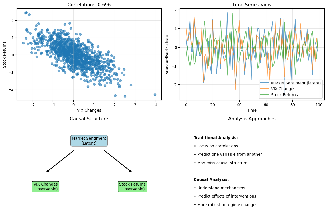
The distinction between prediction and causation is fundamental, yet routinely ignored in finance. @gelman2020regression provide a rigorous framework for thinking carefully about when we can : and cannot : make causal claims from observational data. Causal effects are defined as comparisons between *potential outcomes* under different scenarios. For a treatment $z$ (such as receiving investment advice), each unit $i$ has two potential outcomes: $y_i^0$ (the outcome if untreated) and $y_i^1$ (the outcome if treated). The **individual causal effect** is $y_i^1 - y_i^0$. The fundamental problem of causal inference is that we can only ever observe *one* of these potential outcomes for each unit : the counterfactual is never observed. Did a new risk management system reduce losses? We observe losses with the system ($y^1$) but never observe what losses would have been without it ($y^0$). Any comparison requires untestable assumptions about this unobserved counterfactual.
To estimate causal effects from observational data, we typically invoke the **ignorability** (or "selection on observables") assumption: conditional on observed covariates $x$, treatment assignment is independent of potential outcomes, $y^0, y^1 \perp z | x$. In finance terms, this means that after controlling for everything we measure, the decision to adopt a strategy is unrelated to what outcomes would have been. This is a strong assumption that fails when firms adopt strategies *because* they expect better outcomes (selection bias), when unmeasured factors affect both the treatment decision and outcomes (confounding), or when adoption timing correlates with market conditions. Ignorability cannot be tested directly : it is an assumption about unobserved potential outcomes. We can check balance on observed covariates, but balance on observables does not guarantee balance on unobservables.
::: {.callout-warning}
## Common Causal Errors in Finance
Three errors appear repeatedly. First, adjusting for post-treatment variables that are *affected by* the treatment biases estimates, even in randomised experiments : if studying whether ESG adoption affects returns, do not control for media coverage that follows ESG adoption, as it is part of the causal pathway. Second, confusing correlation with causation leads to unwarranted conclusions : a regression of returns on analyst coverage estimates a comparison, not a causal effect, since companies that attract coverage differ systematically from those that do not. Third, selection on the dependent variable, such as studying only successful funds to learn "what works," ignores all the funds that tried the same strategies and failed, introducing severe survivorship bias.
:::
When ignorability fails, **instrumental variables (IV)** offer one potential escape route. An instrument $z$ must satisfy three conditions: relevance ($z$ affects treatment assignment), exclusion restriction ($z$ affects outcomes *only through* its effect on treatment), and independence ($z$ is as-good-as-randomly assigned). The IV estimate captures the causal effect for **compliers** : units whose treatment status was actually changed by the instrument. Finance applications include using regulatory changes as instruments for capital structure decisions, geographic distance as an instrument for analyst coverage, or lottery-based assignment to index inclusion. As @gelman2020regression advise, do not try to extract causal conclusions from large regressions with many controls. Instead, design your analysis around a specific causal question with a credible identification strategy that makes the necessary assumptions explicit and defensible.
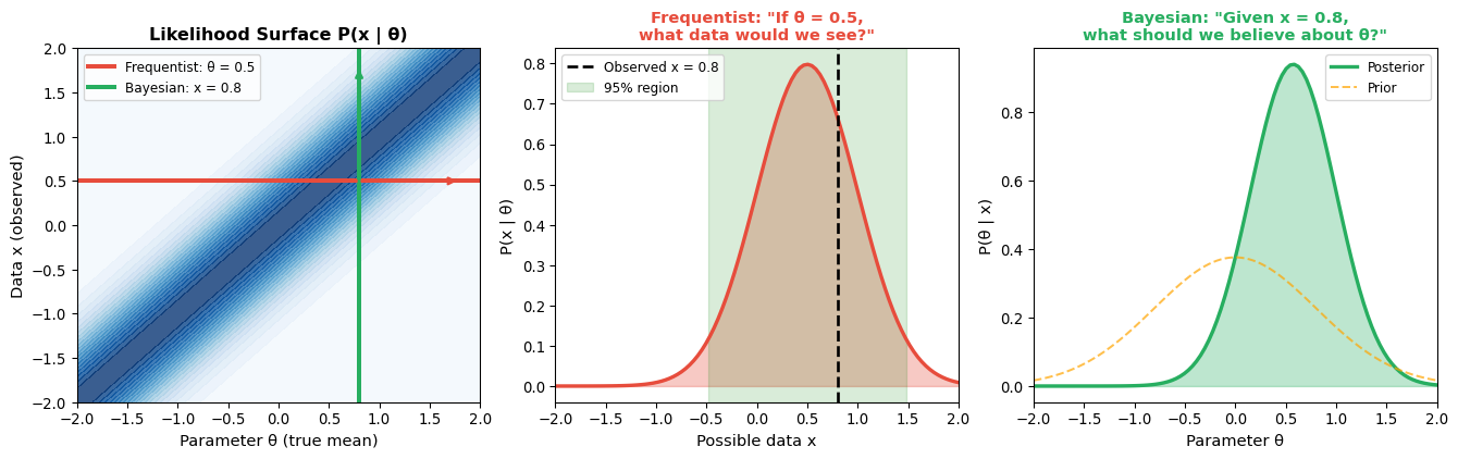
## Bayesian Inference as Information Combination
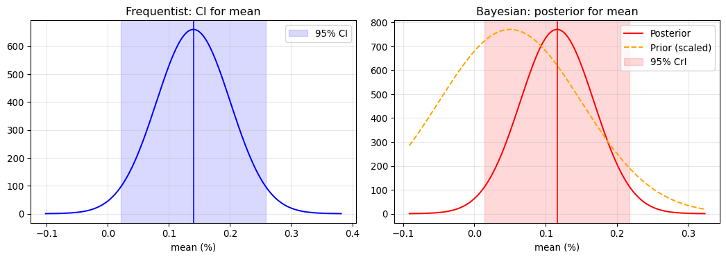
Frequentist inference treats parameters as fixed unknown quantities and data as random draws from a distribution. Bayesian inference inverts this perspective: parameters are treated as random variables with probability distributions, and we update our beliefs as data arrive. The core formula, $\text{Posterior} \propto \text{Likelihood} \times \text{Prior}$, combines prior beliefs with new evidence in a mathematically principled way. For a parameter $\theta$ with prior estimate $\hat{\theta}_{\text{prior}}$ (standard error $\text{se}_{\text{prior}}$) and data estimate $\hat{\theta}_{\text{data}}$ (standard error $\text{se}_{\text{data}}$), the Bayesian posterior estimate emerges as a weighted average: $\hat{\theta}_{\text{Bayes}} = \frac{\hat{\theta}_{\text{prior}}/\text{se}_{\text{prior}}^2 + \hat{\theta}_{\text{data}}/\text{se}_{\text{data}}^2}{1/\text{se}_{\text{prior}}^2 + 1/\text{se}_{\text{data}}^2}$. Each source of information is weighted by its precision (inverse variance). When prior and data have equal precision, the Bayesian estimate sits at their midpoint; otherwise, it is pulled toward whichever source is more precise. This provides a principled way to combine historical data with economic theory, shrink extreme estimates toward reasonable values, or incorporate expert judgment formally rather than informally.
@gelman2020regression advocate **weakly informative priors** : not so strong as to dominate the data, but informative enough to rule out implausible values (such as Sharpe ratios of 10), stabilise estimates when data are sparse, and provide regularisation similar to ridge regression. The default prior in Bayesian regression software like `stan_glm` typically centres coefficients at zero with standard deviation scaled to the data, creating a gentle pull toward "no effect" that prevents overfitting. When does the prior matter? With large samples and strong signal, the data overwhelm the prior and frequentist and Bayesian answers converge. With small samples and weak signal, the prior provides regularisation and estimates shrink toward prior values. When prior and data contradict each other, the posterior represents a compromise weighted by relative precision. In finance, priors matter most when estimating returns with short samples (where priors on expected Sharpe ratios matter), working with rare events like fraud or default where data are sparse, or combining multiple noisy signals into a single estimate.
::: {.callout-tip}
## A Pragmatic View
Even if you are philosophically frequentist, Bayesian methods can be useful computationally (MCMC enables fitting complex models) and practically (regularisation, combining evidence). The methods often give similar answers when sample sizes are large : the real benefit is forcing explicit thought about prior information and how it should combine with data.
:::
::: {.callout-note}
## Applied Example: Signal-to-Noise in Financial Returns
A concrete illustration of Bayesian uncertainty quantification comes from measuring **return predictability**. How much of daily return variance is predictable from past returns? We can answer this by fitting a Bayesian AR(1) model and examining the posterior distribution of R² = ρ² (the squared autocorrelation).
For S&P 500 (SPY) daily returns, a Bayesian bootstrap analysis yields:
- **Posterior median R²**: 1.66%
- **95% credible interval**: [0.08%, 6.24%]
The credible interval is wide: but this width is itself deeply informative. We cannot even precisely measure how little predictability there is because the signal is so weak relative to noise. Consider what the interval tells us:
| Scenario | R² | Noise fraction |
|----------|-----|---------------|
| Pessimistic (lower bound) | 0.08% | 99.92% |
| Median | 1.66% | 98.34% |
| Optimistic (upper bound) | 6.24% | 93.76% |
Even at the optimistic upper bound, over 93% of variance is unpredictable noise. The wide interval does not undermine the conclusion: it reinforces it. A point estimate alone (R² = 1.66%) would hide this uncertainty; the posterior distribution reveals the fundamental difficulty of financial inference.
This is exactly when Bayesian thinking adds value: when signal is weak, samples are noisy, and honest uncertainty quantification matters more than false precision.
:::
One of the most practically valuable Bayesian concepts is **partial pooling**, which provides a principled middle ground between complete pooling (treating all groups as identical, ignoring real differences) and no pooling (estimating each group separately, yielding noisy estimates with small samples). As @gelman2006data explain, "Both these approaches have problems: no pooling ignores information and can give unacceptably variable inferences, and complete pooling suppresses variation that can be important." Consider estimating expected returns for 50 industry portfolios using only 5 years of monthly data per industry. No pooling means estimating each industry mean separately, but small samples produce noisy estimates where extreme values likely reflect chance rather than signal. Complete pooling means using the overall market return for all industries, ignoring valuable information that industries differ. Partial pooling estimates a hierarchical model where industry means are drawn from a common distribution, shrinking extreme estimates toward the grand mean while allowing well-estimated means to stay closer to their data. This shrinkage is automatic and data-driven: industries with noisier data shrink more, industries with clearer signals shrink less. This formalises what a sensible analyst would do informally.
::: {.callout-important}
## Shrinkage is Regularisation
Partial pooling and ridge regression achieve similar goals through different routes. Ridge regression adds a penalty term $\lambda \sum \beta_j^2$ to the loss function, shrinking coefficients toward zero. Partial pooling places a normal prior $\beta_j \sim N(0, \sigma^2_\beta)$ on coefficients, also shrinking toward zero (or a common mean). The Bayesian approach has the advantage of automatically learning the appropriate amount of shrinkage from the data rather than requiring manual tuning of a penalty parameter.
:::
Partial pooling matters most in settings common to finance: cross-sectional asset pricing where we estimate firm-level betas with limited time series, fund performance evaluation where we separate skill from luck across many funds, risk forecasting where we combine individual asset volatilities with market-wide information, and portfolio optimisation where we shrink sample covariance matrices toward structured targets. The James-Stein estimator : which showed that shrinking sample means toward a common value improves *total* estimation accuracy : is a frequentist result that has a natural Bayesian interpretation through hierarchical models, demonstrating that these perspectives can converge on practical recommendations despite their philosophical differences.
## Model Selection Without Overfitting: Cross-Validation and Information Criteria
Choosing among competing models is one of the most consequential decisions in applied work, yet the natural approach : comparing performance on the data used for estimation : is fundamentally flawed. @efron2016casi trace two major approaches that address this problem: cross-validation (developed in the 1970s) and information criteria (emerging with Mallows' $C_p$ and AIC). When we fit a model to training data and evaluate its performance on those *same* data, we obtain the **apparent error**, which is optimistically biased because the model has seen these observations during estimation. What we actually care about is the **true error**: how well will the model predict *new* data drawn from the same distribution? The gap between apparent and true error grows with model complexity, since more parameters provide more opportunity to fit noise rather than signal.
Cross-validation addresses this by systematically holding out data during estimation and evaluating on those held-out observations. Leave-one-out (LOO) cross-validation fits $n$ models, each excluding one observation, then averages prediction error across all held-out points : this has low bias but high variance. K-fold cross-validation partitions data into $K$ groups, rotating which group is held out, balancing bias and variance. Time-series cross-validation uses rolling or expanding windows and crucially never trains on future data to predict past observations, respecting temporal dependence. As @gelman2020regression explain, "Cross validation... avoids some of the problems of overfitting. The simplest version is the leave-one-out approach, in which the model is fit $n$ times, in each case excluding one data point."
::: {.callout-important}
## Time Structure Matters
Standard K-fold cross-validation assumes observations are exchangeable and can be randomly shuffled. In finance, time series structure means this assumption fails catastrophically : using future returns to predict past returns is not validation, it is cheating. Always use time-aware cross-validation where the test set is strictly *after* the training set, simulating realistic forecasting conditions.
:::
An alternative to cross-validation estimates prediction error analytically by adding a complexity penalty to training error: $\text{Estimated Prediction Error} = \text{Training Error} + \text{Penalty}(k, n)$. Common criteria include AIC (penalty $2k$, asymptotically equivalent to LOO-CV), BIC (penalty $k \ln(n)$, stronger penalty favoring simpler models), Mallows' $C_p$ (penalty $2k\hat{\sigma}^2$ for linear regression with known error variance), and WAIC (Bayesian criterion using effective number of parameters that generalises to complex models), where $k$ denotes the number of parameters and $n$ the sample size. AIC and cross-validation answer slightly different questions: AIC estimates expected log-likelihood on new data (a measure of fit or calibration), while LOO-CV estimates expected squared prediction error (a measure of point-prediction accuracy). For most purposes they rank models similarly, but the distinction matters when you care about probabilistic calibration versus point prediction.
What does this mean in practice for finance? First, use time-series cross-validation for return prediction, never allowing information to leak from future to past : rolling windows simulate real-time forecasting and reveal how models degrade as market conditions change. Second, maintain appropriate scepticism about in-sample fit: a model with $R^2 = 0.90$ on training data may achieve $R^2 \approx 0$ out-of-sample, especially with many predictors where overfitting becomes severe. Third, recognise that BIC's stronger penalty helps identify the "true" model (if one exists) while AIC optimises predictive accuracy even if it includes some noise variables, so prefer BIC for model identification and AIC for prediction tasks. Fourth, watch for multiple testing: if you try 100 models and select the best by cross-validation, your reported CV error is optimistically biased because you have searched across many specifications. The more you search, the more conservative your assessment of final model performance should be.
::: {.callout-tip}
## Hierarchy of Evidence for Model Performance
Evidence quality ranges from nearly worthless to genuinely informative: In-sample $R^2$ tells you almost nothing about future performance. Information criteria (AIC, BIC) provide quick approximations but rely on asymptotic theory. Standard K-fold cross-validation improves on these but ignores time structure, making it inappropriate for financial time series. Time-series cross-validation with appropriate gaps avoids look-ahead bias and provides realistic performance estimates. True out-of-sample performance on genuinely new data : data that arrived after model specification was fixed : remains the gold standard, though in practice we rarely have the discipline to set models in stone before new data arrive.
:::
## Practical Wisdom for Applied Regression Modelling
@gelman2020regression offer practical advice that transcends the textbook treatment of regression, reflecting decades of applied experience with real problems where data are messy, assumptions fail, and the goal is insight rather than perfect adherence to mathematical conditions. Their recommendations reshape how we should approach statistical modelling in finance, moving from mechanical application of procedures toward thoughtful, iterative analysis.
Perhaps the most fundamental insight concerns how we think about uncertainty. Variation across datasets matters more than standard errors from a single study : if you fit the same model to different samples, coefficients will vary, and understanding this variation is often more useful for applications than obsessing over standard errors from one particular analysis. In finance, this means reporting how findings change across subperiods and across markets, which reveals robustness far more effectively than any single p-value from one time period. This connects to a second recommendation: abandon the p < 0.05 threshold as a decision rule. The arbitrary distinction between p = 0.049 and p = 0.051 throws away information, and in finance where everything affects everything to some degree, true zeroes do not exist : factor returns are not exactly zero, correlations are not exactly zero, and whether a confidence interval excludes zero tells you little about future settings. Rather than asking "Is this factor significant?", ask "How large is this effect, and how much does it vary?"
Visualisation deserves more attention than diagnostics. Graph your fitted model, not just residual plots : a table of coefficients provides far less understanding than visualising what the model actually predicts, and making many graphs reveals different aspects of your data that tables conceal. What should you skip? Most of what standard packages produce automatically (Q-Q plots, influence diagrams) you will not use; focus on graphs you can explain to a skeptical audience. We discussed earlier how regression coefficients should be interpreted as comparisons between individuals rather than changes within individuals, and this comparative interpretation remains available without causal assumptions : thinking this way helps build intuition about what models actually say.
Fake-data simulation provides an essential validation step before trusting real results. Simulating data from a known process and checking whether your procedure recovers the true parameters forces you to think about realistic parameter values, reveals whether your code works correctly, and shows how precise your estimates can be given your sample size. In finance, this means simulating realistic factor returns with known alpha and asking whether your backtesting procedure can detect it : if it cannot recover known effects from fake data, your real findings may well be spurious. This connects to the recommendation to fit many models rather than searching for one "correct" specification. Start simple and add complexity gradually, recognising that working with simple models is not the research goal but rather a technique to understand what is happening before adding complications. Keep track of all models you fit to protect yourself from the "forking paths" bias that arises when you unconsciously favour specifications that produce preferred results. In finance, do not run one mega-regression; instead, build up from univariate to multivariate, from linear to nonlinear, reporting results from multiple specifications to demonstrate robustness.
Computational workflow matters more than most practitioners realise. Fast computation enables better statistics : when you can fit models quickly, you can explore more alternatives and understand your data better rather than committing to the first specification that runs. A practical strategy starts with data subsets before running on full samples, since computations on 10% of the data often reveal the same patterns as the full sample but take a fraction of the time, allowing rapid iteration. Consider transforming nearly every variable: logarithms for all-positive variables create multiplicative models appropriate for prices and returns, standardisation makes coefficients interpretable and comparable, and interactions allow effects to vary by group when you have theoretical reasons to expect heterogeneity. In finance, log returns are standard for good reasons, and standardised coefficients help compare predictors measured in different units like volatility and trading volume.
The causal inference advice we discussed earlier bears repeating: do not assume regression coefficients are causal effects, and if you want causal inference, design your analysis around that specific question rather than trying to answer multiple causal questions with one large regression : in observational data, this approach fails. Estimating "the effect of ESG on returns" requires different methods than predicting returns from ESG scores; use the right tool for each question. Finally, learn through live examples by applying methods to problems you care about, understanding your data, your measurements, and your data-collection procedures deeply enough that you know the magnitudes of your coefficients and not just their signs. This understanding proves essential for interpreting findings and catching errors that would slip past purely mechanical analysis.
::: {.callout-note}
## The Underlying Theme
These recommendations share a common insight: **statistical modelling is not mechanical procedure but thoughtful craft**. It requires judgment, iteration, and domain knowledge. The goal is not to follow a recipe but to understand your data well enough to make good decisions about specification, inference, and interpretation. Perfect adherence to textbook assumptions matters far less than understanding how violations affect your conclusions and whether your findings are robust to reasonable alternative choices.
:::
## Time Series Foundations: Stationarity, Dependence, and Long-Run Relationships {#time-series-foundations}
Financial data is inherently temporal, which means observations arrive ordered in time and potentially depend on their history in complex ways. Time series econometrics provides tools for handling this temporal structure, recognising that the independence assumption underlying cross-sectional methods breaks down when today's return depends on yesterday's volatility, or when news events create persistent effects on prices. The fundamental requirement for classical time series inference is **stationarity** : the property that a series' statistical characteristics do not change over time. Formally, a stationary series maintains constant mean ($\mathbb{E}[Y_t] = \mu$), constant variance ($\text{Var}(Y_t) = \sigma^2$), and autocovariance that depends only on lag $k$ rather than time $t$ itself: $\text{Cov}(Y_t, Y_{t-k})$ is a function of $k$ alone.
Why does stationarity matter? Because statistical inference assumes we can learn from the past to predict the future, and if the underlying process is changing : if means drift upward, if volatility regimes shift, if correlations evolve : then historical relationships may not hold going forward. The Augmented Dickey-Fuller (ADF) test evaluates whether a series has a unit root (is non-stationary) through the regression $\Delta Y_t = \alpha + \beta t + \gamma Y_{t-1} + \sum_{i=1}^{p} \delta_i \Delta Y_{t-i} + \varepsilon_t$, testing the null hypothesis $\gamma = 0$ (unit root, non-stationary) against the alternative $\gamma < 0$ (stationary). When the test statistic is sufficiently negative, below critical values that differ from standard t-distributions, we reject the null and conclude stationarity. But the ADF test has low power against near-unit-root alternatives, struggling to distinguish $\phi = 1$ from $\phi = 0.95$ especially in small samples, so failure to reject the null does not prove non-stationarity : it may simply reflect insufficient sample size to detect the difference.
::: {.callout-warning}
## Unit Root Testing in Practice
The ADF test's low power means that many financial series occupy an ambiguous zone where we cannot confidently classify them as stationary or non-stationary. This uncertainty matters for modelling choices: should we difference returns (already close to stationary) or work with levels? The answer often depends more on economic reasoning about the data-generating process than on test statistics alone.
:::
Understanding temporal dependence requires tools for measuring how observations relate to their own history. The autocorrelation function (ACF) measures correlation between a series and its lagged values: $\rho_k = \frac{\text{Cov}(Y_t, Y_{t-k})}{\text{Var}(Y_t)}$. The partial autocorrelation function (PACF) measures direct correlation at each lag while controlling for intermediate lags, isolating the unique contribution of lag $k$ after accounting for lags $1$ through $k-1$. Together, ACF and PACF guide model selection for ARIMA processes by revealing characteristic patterns: AR processes show geometric decay in ACF but sharp cutoff in PACF, while MA processes display the opposite pattern.
But here we encounter one of the most important practical lessons in financial econometrics: **the ACF of returns is typically indistinguishable from zero**. Plot the ACF of daily S&P 500 returns and you will see a flat line with all autocorrelations within the confidence bands. This is not a data quality problem or a failure of our tools: it is the empirical signature of market efficiency. Competition among traders arbitrages away predictable patterns in expected returns, leaving the conditional mean essentially unforecastable. ARIMA models, which target this conditional mean, therefore add little value for return prediction. The action is in the conditional variance (volatility clustering), which we address through GARCH models rather than ARIMA. This asymmetry: near-zero signal in the mean, substantial signal in the variance: is the organising principle for time series analysis in finance, and it explains why practitioners often find ARIMA disappointing while GARCH proves genuinely useful.
Two non-stationary series may share a common stochastic trend, moving together in the long run even as they wander in the short term. When $Y_t$ and $X_t$ are both integrated of order one (I(1)) but some linear combination $Y_t - \beta X_t$ is stationary (I(0)), the series are **cointegrated**, capturing long-run equilibrium relationships like those between spot and futures prices or related stock prices that arbitrage should keep aligned. The Engle-Granger two-step procedure estimates the cointegrating regression by OLS ($Y_t = \beta_0 + \beta_1 X_t + u_t$) and then tests whether the residuals $\hat{u}_t$ are stationary using a modified ADF test with different critical values to account for the fact that residuals come from an estimated relationship rather than raw data. If the residuals are stationary, the variables are cointegrated, suggesting a mean-reverting spread that provides the foundation for pairs trading strategies, tests of price discovery between spot and futures markets, and evaluations of the expectations hypothesis across the yield curve.
::: {.callout-tip}
## Connecting Classical and Modern Approaches
Classical time series methods assume you can transform data to stationarity through differencing, detrending, or other transformations. Modern sequence learning approaches like LSTMs and Transformers can learn directly from non-stationary sequences by capturing patterns in how the data evolves over time, including regime changes and structural breaks that violate stationarity. This represents one bridge from the classical foundations in Part 0 to the machine learning extensions in later chapters, showing how newer methods relax restrictive assumptions when data patterns demand it.
:::
---
# Part I: The Complexity Paradox in Financial Data Science
In finance we rarely ask whether a model is “true”. We ask whether it is useful out of sample, robust to changing conditions, and interpretable enough to trust. That makes model complexity : how many parameters, interactions, and non‑linearities we allow : a practical decision rather than a slogan about “simplicity”.
Recent research by @kelly2024complexity challenges one of the most fundamental assumptions in statistical modelling. Contrary to conventional wisdom that often favours "simple" models with few parameters, Kelly, Malamud, and Zhou demonstrate that in the specific setting of return prediction, high‑dimensional "complex" models: where the number of parameters can exceed the number of observations: may outperform simple ones. This result establishes the rationale for modelling expected returns with machine learning techniques, but it should not be taken as a blanket endorsement of complexity.
The lesson is more nuanced. As @mcelreath2020statistical stresses, "Occam's razor is a folk heuristic; information theory is not." While Occam's razor suggests we should prefer simpler explanations, information theory provides us with mathematical tools to make this trade-off more precise.
In practice, model comparison is an out-of-sample question. If you only evaluate fit on the data used for training, more flexible models will usually look better : partly because they are learning noise. Information criteria (AIC/BIC/WAIC) formalise this by penalising complexity, and cross-validation formalises it by evaluating on held-out data. We return to this explicitly in the “Model Selection and Validation” section below. @kennedy2008econometrics gives the applied rule of thumb: keep models “sensibly simple” : complex enough to capture important features, but not more complicated than needed.
Taken together, these perspectives highlight that modern financial markets may indeed demand complex, high‑dimensional models. Yet the virtue of complexity is conditional: models must be validated, regularised, and compared against simpler alternatives. The art of financial data science is knowing when complexity adds genuine insight and when it merely overfits noise.
Yet this embrace of complexity must be balanced with intellectual humility. As @box1987empirical famously observed, “All models are wrong, but some are useful” (Box & Draper, *Empirical Model‑Building and Response Surfaces*, 1987, p. 424). The challenge in modern financial data science is building sophisticated models that are both complex enough to capture important patterns and robust enough to avoid overfitting to noise.
# Part II: The Bias-Variance Tradeoff {#sec-bias-variance}
## The Tradeoff in Financial Context
The tension between simple and complex models reflects one of the most fundamental concepts in statistical learning: the bias-variance tradeoff. Understanding this tradeoff is crucial for financial applications because it helps us think systematically about when more sophisticated methods are likely to be beneficial.
### Understanding Bias and Variance
To appreciate why the @kelly2024complexity findings are so significant, we need to understand what bias and variance actually represent in the context of model performance. These concepts, while abstract, have very concrete implications for financial decision-making.
Bias represents the systematic error in our model's predictions: the extent to which our model consistently misses the true underlying relationship. A high-bias model is like a marksman whose shots consistently land to the left of the target. No matter how many times they shoot, the pattern of misses remains the same. In financial terms, a high-bias model might consistently underestimate the volatility of certain assets or fail to capture important nonlinear relationships in market data.
Variance captures how much our model's predictions fluctuate when trained on different samples of data. A high-variance model is like a marksman whose shots are scattered widely around the target: sometimes hitting the bullseye, sometimes missing completely. In financial applications, high-variance models are particularly dangerous because they can lead to overfitting, where the model memorises the specific patterns in our training data but fails to generalise to new market conditions.
The mathematical relationship between these concepts is elegantly captured in the bias-variance decomposition. For any prediction model, the expected squared error can be decomposed as:
::: {.callout-note}
#### Bias–Variance Decomposition (squared error)
For squared loss at a fixed input $x$, with true regression function $f^*(x)=\mathbb E[Y\mid X=x]$ and noise $\varepsilon=Y-f^*(X)$:
$$
\mathbb E\big[(Y-\hat f(x))^2\big]
\;=\; \underbrace{\big(\mathbb E[\hat f(x)]-f^*(x)\big)^2}_{\text{Bias}^2(x)}
\;+\; \underbrace{\operatorname{Var}(\hat f(x))}_{\text{Variance}(x)}
\;+\; \underbrace{\operatorname{Var}(\varepsilon\mid X=x)}_{\text{Irreducible error}}.
$$
- Bias$^2(x)$: systematic gap between the average fitted model and the truth.
- Variance$(x)$: spread of the fitted model across training samples (sensitivity to data).
- Irreducible error: conditional noise in the data‑generating process; even a perfect model cannot beat this term.
In finance, heteroskedasticity (time‑varying volatility) means $\operatorname{Var}(\varepsilon\mid X=x)$ often depends on $x$ and time; non‑stationarity means that some “variance” reflects drift in $f^*(x)$.
The practical takeaway: consistent with @efron2016casi: is that lowering bias via more complex models only helps out‑of‑sample when the induced variance doesn’t dominate. See @hilpisch2019 for squared‑loss implementations and diagnostics in Python (curated, commit‑pinned links: resources/hilpisch-code.qmd).
:::
This decomposition reveals why the tradeoff is so fundamental: reducing bias typically increases variance, and vice versa. The irreducible error represents the inherent noise in the data that no model can eliminate.
The practical implication, as @murphy2012machine puts it: "it might be wise to use a biased estimator, so long as it reduces our variance, assuming our goal is to minimise squared error." This is precisely why regularisation methods like ridge regression deliberately introduce bias : the variance reduction more than compensates, leading to better predictions on new data.
### The Traditional Wisdom and Its Limitations
Traditional statistical wisdom, rooted in classical inference theory as described in @efron2016casi, suggests that simpler models are generally preferable because they have lower variance: they're less likely to overfit to the specific sample of data we happen to observe. This wisdom emerged from an era when data was scarce and computational resources were limited, making the stability of simple models particularly valuable.
The classical approach, as Efron and Hastie note, was designed for "small data sets, often a few hundred numbers or fewer, laboriously collected by individual scientists working under restrictive experimental constraints." In this context, the bias-variance tradeoff typically favoured simpler models because the variance penalty of complex models was too high relative to the available data.
However, @kelly2024complexity demonstrate that in modern financial applications, this traditional wisdom can be misleading. The bias reduction from using more complex models can outweigh the variance increase, leading to better out-of-sample performance. This finding suggests that the financial domain may have characteristics that make the bias-variance tradeoff behave differently than in traditional statistical applications.
### Stylised Facts about Financial Data
A more precise way to motivate model complexity is to recall the stylised facts of liquid asset returns. These empirical regularities shape both the features we build and the algorithms we choose, and they explain why the bias–variance trade‑off in finance often differs from textbook settings.
- Heavy tails and mild skewness
- Large moves occur more often than Gaussian models predict. Outliers and tail‑risk dominate error metrics.
- Implication: prefer robust losses, heavy‑tailed likelihoods, and careful validation; avoid “over‑confident” Gaussian assumptions.
- Weak autocorrelation in raw returns
- Daily (and lower‑frequency) returns have little linear predictability, though microstructure or frictions can induce small effects.
- Implication: complexity aimed at predicting mean returns risks overfitting; use strong regularisation and out‑of‑sample checks.
- Volatility clustering and long memory
- High‑volatility periods cluster, and |r| or r² show persistent autocorrelation.
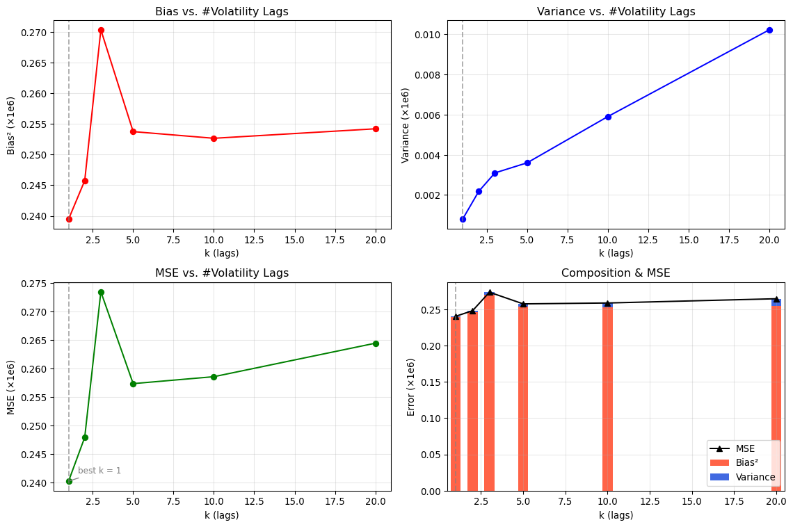
- Implication: features using lagged volatility, realised measures, or GARCH‑style dynamics are helpful. In our bias–variance demo, model complexity is the number of volatility lags k : precisely to exploit this persistence.
- Asymmetry (leverage effect)
- Negative returns are followed by higher future volatility more than positive returns of the same magnitude.
- Implication: include sign‑sensitive terms or nonlinearities (e.g., EGARCH‑type features or interactions) when modelling risk.
- Time‑varying correlations and factor structure
- Assets co‑move through common factors whose loadings and correlations shift over time.
- Implication: dimension‑reduction and regularised multivariate models (e.g., shrinkage, dynamic factors) help control variance.
- Non‑stationarity and regime change
- Properties of returns evolve with policy, liquidity, and technology; parameters drift and break.
- Implication: use rolling/expanding windows, time‑aware cross‑validation, and adaptive models.
- Market microstructure effects at high frequency
- Bid–ask bounce, discreteness, and asynchronicity bias naive estimators.
- Implication: aggregate appropriately, de‑noise, or use models designed for irregular sampling.
These facts justify richer, carefully regularised models. Complexity can reduce bias by capturing nonlinearities and persistence (especially in volatility), but the variance cost must be controlled with robust features, penalisation, and time‑aware validation : themes made concrete in the volatility‑lag bias–variance demonstration that follows.
::: {.callout-important}
#### Theory Lens: Why These Facts Arise
Understanding the mechanisms behind the stylised facts helps you choose features and models with intent:
- Information arrival and variance mixing
- News and order flow arrive irregularly. If variance changes over time, returns look like a mixture of normals → heavy tails and volatility–volume comovement. Stochastic‑volatility and GARCH families formalise this.
- Heteroskedastic dynamics and gradual information diffusion
- Traders update at different speeds; large orders are split; herding/meta‑orders propagate. These behaviours generate volatility clustering and long memory in |r| and r². ARCH/GARCH, FIGARCH, and long‑memory filters capture the persistence.
- Efficient‑market baseline with microstructure frictions
- With fast competition, linear predictability in daily returns is weak. At very high frequency, microstructure (bid–ask bounce, discreteness, asynchronous trading) induces short‑horizon negative autocorrelation and biases naive variance estimates.
- Leverage and volatility‑feedback asymmetries
- Price drops increase financial leverage and can raise required returns; both channels raise future volatility more after losses than gains → the leverage effect. Nonlinear or sign‑sensitive features are appropriate.
- Time‑varying factor exposures and flight‑to‑quality
- Common drivers shift across states; correlations rise in stress. Dynamic factors and DCC‑style models allow covariances to evolve; shrinkage controls estimation error in high dimensions.
- Structural change and adaptation
- Policy, technology, and market design change DGPs. Structural breaks and regime switching imply parameters drift; use rolling/expanding windows, online updates, and explicit break/ regime models when needed.
These behavioural and microstructure channels link directly to modelling choices: lagged‑volatility features, heavy‑tailed likelihoods, dynamic covariance models, and time‑aware validation.
:::
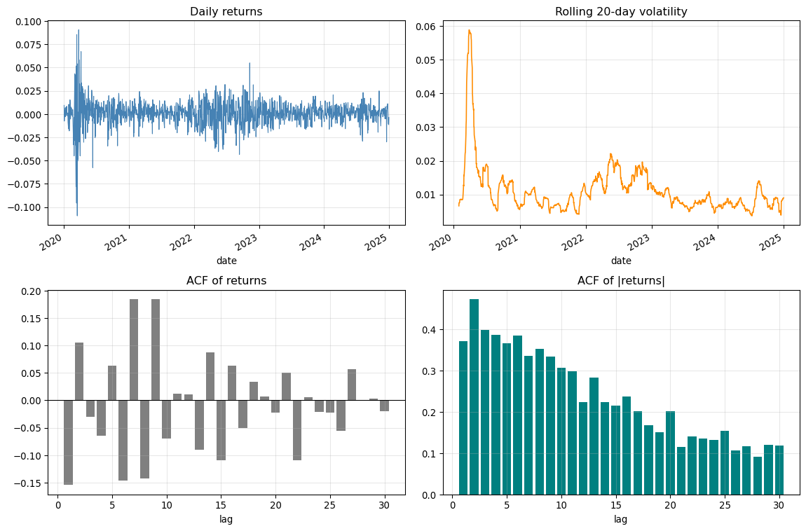
#### Volatility Clustering: Quick Demo
Volatility tends to arrive in clusters: tranquil periods alternate with turbulent ones. A quick way to see this is to compare the autocorrelation of raw returns (typically near zero) with the autocorrelation of absolute/squared returns (persistently positive).
::: {.callout-note}
Teaching notes : From fact to features
- Inspect the ACF of |returns| to guide the number of volatility lags k used as “complexity” in the bias–variance demo below.
- Prefer time‑aware train/test splits; re‑tune k if the ACF structure changes across regimes.
:::
```{python}
# Volatility clustering demo with Bloomberg database
import numpy as np, pandas as pd, matplotlib.pyplot as plt

def _fetch_close(symbol='SPY', years=5):
    """Fetch close prices from Bloomberg database."""
    bbg = load_bloomberg(tickers=[symbol])
    ticker_data = bbg.copy()
    ticker_data['date'] = pd.to_datetime(ticker_data['date'])
    ticker_data = ticker_data.set_index('date').sort_index()
    # Filter to recent years
    cutoff = ticker_data.index.max() - pd.DateOffset(years=years)
    ticker_data = ticker_data[ticker_data.index >= cutoff]
    return pd.DataFrame({'Close': ticker_data['PX_LAST']})

def _acf_abs(x, max_lag=30):
    """Simple ACF for absolute values."""
    x = np.asarray(x)
    x = np.abs(x) - np.abs(x).mean()
    n = len(x)
    var = (x**2).sum()
    return np.array([(x[:n-l] @ x[l:]) / var for l in range(1, max_lag+1)])

df = _fetch_close('SPY', 5)
print(f"Loaded {len(df)} days of SPY data from Bloomberg database")
ret = df['Close'].pct_change().dropna()

fig, axs = plt.subplots(2, 2, figsize=(12, 8))
ret.plot(ax=axs[0,0], color='steelblue', lw=0.8)
axs[0,0].set_title('Daily returns'); axs[0,0].grid(alpha=0.3)
ret.rolling(20).std().plot(ax=axs[0,1], color='darkorange', lw=1.2)
axs[0,1].set_title('Rolling 20-day volatility'); axs[0,1].grid(alpha=0.3)

lags = 30
acf_r = [ret.autocorr(lag=i) for i in range(1, lags+1)]
axs[1,0].bar(range(1, lags+1), acf_r, color='gray'); axs[1,0].axhline(0, color='k', lw=0.8)
axs[1,0].set_title('ACF of returns'); axs[1,0].set_xlabel('lag'); axs[1,0].grid(alpha=0.3)

acf_abs = _acf_abs(ret.values, max_lag=lags)
axs[1,1].bar(range(1, lags+1), acf_abs, color='teal'); axs[1,1].axhline(0, color='k', lw=0.8)
axs[1,1].set_title('ACF of |returns|'); axs[1,1].set_xlabel('lag'); axs[1,1].grid(alpha=0.3)

fig.tight_layout(); plt.show()
print(f"Return ACF @lag1 ≈ {acf_r[0]:.3f}; |return| ACF @lag1 ≈ {acf_abs[0]:.3f}")
```
::: {.callout-tip}
Try it: Change the ticker (e.g., `AAPL`), the volatility window (10/60 days), or the number of lags. Observe that while returns have little autocorrelation, the absolute/squared returns show persistent autocorrelation : the hallmark of volatility clustering. This is why the bias–variance demo uses lagged volatility features.
:::
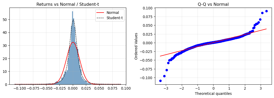
#### Heavy Tails: Quick Check
Financial returns exhibit fatter tails than the Normal model. This matters for risk estimates and confidence intervals.
```{python}
import numpy as np, pandas as pd, matplotlib.pyplot as plt
from scipy import stats

# Load SPY returns from Bloomberg database
bbg = load_bloomberg(tickers=["SPY"])
spy = bbg.copy()
ret = spy['return'].dropna()
print(f"Bloomberg SPY data: {len(ret)} daily returns")

skew = stats.skew(ret); kurt = stats.kurtosis(ret, fisher=True)
jb_stat, jb_p = stats.jarque_bera(ret)

fig, axs = plt.subplots(1, 2, figsize=(11, 4))
axs[0].hist(ret, bins=100, density=True, alpha=0.7, color='steelblue')
x = np.linspace(ret.min(), ret.max(), 200)
axs[0].plot(x, stats.norm.pdf(x, ret.mean(), ret.std()), 'r-', lw=1.5, label='Normal')
params = stats.t.fit(ret)
axs[0].plot(x, stats.t.pdf(x, *params), 'k--', lw=1.0, label='Student-t')
axs[0].set_title('Returns vs Normal / Student-t'); axs[0].legend(); axs[0].grid(alpha=0.3)
stats.probplot(ret, dist='norm', plot=axs[1]); axs[1].set_title('Q-Q vs Normal'); axs[1].grid(alpha=0.3)
plt.tight_layout(); plt.show()
print(f"Skew={skew:.3f}, Excess kurtosis={kurt:.2f}, JB p-value={jb_p:.2e}")
```
::: {.callout-note}
Teaching notes: Heavy tails inflate risk relative to Gaussian assumptions. Prefer robust losses, heavy‑tailed likelihoods, or quantile‑based risk metrics when appropriate.
:::
#### Stationarity: ADF Check
Many models assume (weak) stationarity. Prices are usually non‑stationary; returns often stationary. Always check.
```{python}
import numpy as np, pandas as pd
try:
    from statsmodels.tsa.stattools import adfuller
except Exception:
    adfuller = None

# Load SPY from Bloomberg database
bbg = load_bloomberg(tickers=["SPY"])
spy = bbg.copy()
spy['date'] = pd.to_datetime(spy['date'])
spy = spy.set_index('date').sort_index()
prices = spy['PX_LAST'].dropna()
ret = spy['return'].dropna()
print(f"Bloomberg SPY: {len(prices)} prices, {len(ret)} returns")

if adfuller is not None:
    adf_price = adfuller(prices, autolag='AIC')[1]
    adf_ret = adfuller(ret, autolag='AIC')[1]
    print(f"ADF p-value (price): {adf_price:.3e} :  likely non-stationary")
    print(f"ADF p-value (returns): {adf_ret:.3e} :  often stationary")
else:
    print("statsmodels not available; skipping ADF test")
```
::: {.callout-note}
Teaching notes: Use transforms (log‑diff/returns), rolling windows, and time‑aware CV when stationarity is questionable or regimes change.
:::
### The Three Prediction Problems in Finance {#sec-three-prediction-problems}
The stylised facts we have reviewed reveal a fundamental asymmetry that shapes everything in financial data science: **what you can predict depends on what you're trying to predict**. Traditional textbooks often present time series models (ARIMA, GARCH) as a technical progression, implying that more sophisticated models yield better predictions. But this framing obscures a more important question: *where is the signal?*
Financial prediction divides into three distinct problems, each with different signal strength and appropriate methods:
| Problem | Target | Typical R² | Best Approach | Economic Value |
|---------|--------|------------|---------------|----------------|
| **The Mean** | Future returns | 1-2% | Naive forecast often wins | Low (after costs) |
| **The Variance** | Future volatility | 15-40% | GARCH family | High (options, VaR, allocation) |
| **The Cross-Section** | Which assets outperform | 5-15% | Factors, ML | Alpha generation |
This hierarchy explains a puzzle that troubles many practitioners: **why does ARIMA seem useless for financial returns?** The answer is not that ARIMA is a bad model: it is that returns are the wrong target. ARIMA attempts to predict the conditional mean of returns, where competition has eliminated nearly all predictable signal. The ACF of returns is near zero precisely because markets are (approximately) efficient: any predictable pattern would be arbitraged away.
::: {.callout-important}
## The ARIMA Reality Check
Before fitting complex time series models to returns, ask: **Can this model beat the naive forecast?**
The naive forecast for returns is simply zero (or the historical mean). If your AR(3) or ARIMA(1,1,1) model produces an R² of 0.5% and the naive forecast achieves 0%, you have "improved" prediction by explaining half a percent of variance: a triumph statistically, but useless economically. After transaction costs, the strategy would lose money.
Tsay (2010, Ch 3) makes this explicit in his four-step volatility model building approach: "For most asset return series, the serial correlations are weak, if any. Thus, **building a mean equation amounts to removing the sample mean from the data**."
The mean equation is almost always trivial. The variance equation is where the economically valuable signal lives.
:::
#### Why Is the Mean Unpredictable?
The near-zero autocorrelation in returns is not a failure of our models: it is a success of markets. Consider what would happen if returns were predictable:
1. If positive autocorrelation existed (yesterday up → today up), traders would buy after up days
2. This buying pressure would push today's price up immediately after yesterday's gain
3. The "predictable" pattern would disappear as it was arbitraged away
This is the efficient market hypothesis at work: **competition destroys predictability in the conditional mean**. The speed of this arbitrage has increased dramatically with electronic trading, leaving essentially no exploitable signal in daily return autocorrelations.
But competition does *not* destroy predictability in variance. Volatility clustering persists because:
- It reflects the arrival process of news and information (fundamentals)
- It cannot be "arbitraged away" in the same sense: you cannot trade volatility directly (only indirectly through options)
- The economic mechanisms (leverage effects, information diffusion) are real and persistent
This is why the GARCH family succeeds where ARIMA fails: it targets a phenomenon (variance) that has genuine, exploitable signal.
#### The Cross-Sectional Opportunity
If time series prediction of returns is nearly hopeless, where does alpha come from? The answer is **cross-sectional prediction**: not whether the market goes up, but *which stocks* outperform.
Cross-sectional variation is more predictable than time series variation because:
- Differences across firms are more persistent (size, value, momentum characteristics)
- Arbitrage is slower (short-selling constraints, implementation costs)
- Information processing is heterogeneous (some investors react faster than others)
This explains why factor investing and machine learning for stock selection have attracted so much attention: they target the prediction problem (cross-section) that actually has signal, rather than the problem (time series mean) that efficient markets have stripped of predictability.
::: {.callout-tip}
## The Practitioner's Hierarchy
When approaching a financial prediction problem, work through this hierarchy:
1. **Start with the target**: What am I trying to predict: mean, variance, or cross-section?
2. **Assess signal strength**: What R² is plausible? (Mean: ~1%; Variance: ~25%; Cross-section: ~10%)
3. **Choose appropriate complexity**: Match model complexity to signal. Don't use LSTM when naive wins.
4. **Validate honestly**: Time-aware CV, compare to naive benchmark, assess economic (not just statistical) significance.
This hierarchy saves enormous effort. Most "failed" financial models are not bad models: they are good models applied to the wrong problem.
:::
### Financial Returns and Performance Metrics
Having established the statistical properties of financial data, we now formalise what we actually predict and how we measure success. This matters because the choice of target variable and performance metric shapes everything that follows.
#### Why Returns, Not Prices?
Financial models work with returns rather than prices for two fundamental reasons: one statistical, one theoretical.
**The statistical rationale**: Returns are (approximately) stationary, while prices are not. As we saw in the stationarity check above, prices follow a random walk with drift: they have a unit root, meaning their statistical properties change over time. This violates the assumptions underlying most statistical and machine learning methods, which require the data-generating process to be stable. Returns, by contrast, fluctuate around a stable mean with relatively constant variance (apart from the volatility clustering we've discussed). This stationarity makes returns amenable to regression, time-series modelling, and out-of-sample prediction in ways that prices are not.
**The theoretical rationale**: Returns represent the complete round-trip transaction journey of an investor. When you buy an asset at price $P_{t-1}$ and sell at price $P_t$, the return $(P_t - P_{t-1})/P_{t-1}$ captures exactly what you gained or lost as a proportion of your investment. This makes returns directly interpretable as economic outcomes: the percentage gain from committing capital. Prices, by contrast, are arbitrary in level (a £100 stock isn't "better" than a £10 stock) and incomparable across assets. Returns normalise this, making Apple's 5% gain directly comparable to HSBC's 3% gain, regardless of their price levels.
#### Returns: Simple, Log, and Excess
We distinguish three types of returns:
- **Simple return**: $(P_t - P_{t-1}) / P_{t-1}$ : the percentage change in price
- **Log return**: $\ln(P_t) - \ln(P_{t-1})$ : convenient for aggregation since log returns sum over time
- **Excess return**: Asset return minus a benchmark (risk-free rate or market) : isolates skill from market exposure
```{python}
import pandas as pd
import numpy as np

prices = pd.Series([100, 101, 99, 102], index=pd.period_range('2024-01', periods=4, freq='M').to_timestamp())
simple = prices.pct_change().dropna()
logret = np.log(prices).diff().dropna()

print("Simple returns:", simple.round(4).tolist())
print("Log returns:   ", logret.round(4).tolist())
print("\nNote: Simple and log returns are close for small values")
```
Throughout this course, we evaluate strategies (alpha) and prediction performance on returns, not prices, and always with honest out-of-sample validation.
#### Annualisation and Compounding
When comparing strategies across different time horizons, we annualise returns and volatility. The key insight is that returns and volatility scale differently:
```{python}
import numpy as np

# Monthly returns
monthly_returns = np.array([0.01, 0.02, -0.015, 0.008, 0.012, 0.005])

# Simple compounding to annual
annual_simple = (1 + monthly_returns).prod() - 1

# Log aggregation (equivalent for continuous returns)
annual_log = np.exp(np.log(1 + monthly_returns).sum()) - 1

print(f"Monthly returns: {monthly_returns}")
print(f"Annualised (compound): {annual_simple:.4f}")
print(f"Annualised (log-sum):  {annual_log:.4f}")
```
For volatility, we use the square-root-of-time rule: $\sigma_{annual} = \sigma_{monthly} \times \sqrt{12}$. This assumes returns are independent: a reasonable approximation for monthly data.
#### The Sharpe Ratio
The Sharpe ratio remains the workhorse risk-adjusted performance measure. It expresses expected excess return per unit of volatility:
$$SR = \frac{\bar{R} - R_f}{\sigma_R}$$
**Annualising the Sharpe ratio** combines the scaling rules for returns and volatility:
$$SR_{annual} = \frac{12 \times \bar{R}_{monthly}}{\sqrt{12} \times \sigma_{monthly}} = \sqrt{12} \times SR_{monthly} \approx 3.46 \times SR_{monthly}$$
```{python}
import numpy as np

def calculate_sharpe_ratio(returns, rf_rate=0.0, frequency='monthly'):
    """Calculate and annualise Sharpe ratio."""
    excess = np.array(returns) - rf_rate
    mean_excess = np.mean(excess)
    volatility = np.std(excess, ddof=1)

    sr_raw = mean_excess / volatility if volatility > 0 else 0

    periods_per_year = {'daily': 252, 'monthly': 12, 'annual': 1}[frequency]
    sr_annual = sr_raw * np.sqrt(periods_per_year)

    return {'raw': sr_raw, 'annualised': sr_annual}

# Example: momentum factor
np.random.seed(42)
monthly_returns = np.random.normal(0.008, 0.04, 240)  # 20 years
result = calculate_sharpe_ratio(monthly_returns, frequency='monthly')

print(f"Monthly Sharpe:    {result['raw']:.3f}")
print(f"Annualised Sharpe: {result['annualised']:.3f}")
print(f"\nInterpretation: SR ≈ 0.5 is respectable for a long-only strategy")
```
**Context matters**: A Sharpe of 0.5 is respectable for long-only equity but poor for a market-neutral hedge fund. Academic factor returns typically show annualised Sharpe ratios of 0.3–0.8 before costs; after transaction costs, many factors become marginal or unprofitable.
#### Common Pitfalls
When working with financial returns, avoid these errors:
- **Spurious regression on prices**: Prices have unit roots; regress on returns or differences instead
- **Look-ahead bias**: Using information that wouldn't be available at prediction time
- **Frequency mismatch**: Mixing daily features with monthly targets without proper alignment
- **Ignoring costs**: Small Sharpe improvements may vanish after realistic transaction costs
These pitfalls connect directly to the validation and robustness themes throughout this primer.
### The Computational Revolution
The shift toward more complex models in finance has been enabled by what @efron2016casi describe as "the computer age of statistical inference." The authors note that "computation, the traditional bottleneck of statistical applications, became faster and easier by a factor of a million" since the 1950s. This computational revolution has made it feasible to implement sophisticated algorithms that would have been impossible in the era of mechanical calculators.
Modern financial data science leverages this computational power to implement what Efron and Hastie call "ambitious new algorithms" while maintaining rigorous statistical foundations. The key insight is that we can now afford to be more sophisticated in our modelling approaches while still maintaining the statistical discipline necessary for reliable inference.
```{python}
# Demonstrating the bias-variance tradeoff with financial data
import numpy as np
import pandas as pd
import matplotlib.pyplot as plt
from sklearn.model_selection import train_test_split
from sklearn.linear_model import LinearRegression
from sklearn.preprocessing import PolynomialFeatures
from sklearn.pipeline import Pipeline
import datetime as _dt
def _fetch_spy(period_years: int = 5):
    """Fetch SPY data with a 'Close' column from Bloomberg database."""
    bbg = load_bloomberg(tickers=["SPY"])
    spy = bbg.copy()
    spy['date'] = pd.to_datetime(spy['date'])
    spy = spy.set_index('date').sort_index()
    # Filter to recent years
    cutoff = spy.index.max() - pd.DateOffset(years=period_years)
    spy = spy[spy.index >= cutoff]
    return pd.DataFrame({'Close': spy['PX_LAST']})

def demonstrate_bias_variance_tradeoff():
    """
    Illustrate bias–variance trade‑off using volatility forecasting where
    complexity = number of lagged volatility features. Uses a time‑aware
    split and bootstrapped training resamples; plots Bias², Variance, MSE.
    """
    print("Bias-Variance Tradeoff in Financial Prediction")
    print("=" * 50)

    # 1) Prepare data (market preferred; fallback synthetic)
    try:
        df = _fetch_spy(period_years=5)
        df['Ret'] = df['Close'].pct_change()
        df['Vol20'] = df['Ret'].rolling(20).std()
        # Lagged volatility features
        max_k = 20
        for lag in range(1, max_k + 1):
            df[f'Vol20_lag{lag}'] = df['Vol20'].shift(lag)
        cols = [c for c in df.columns if isinstance(c, str) and c.startswith('Vol20_lag')]
        target = 'Vol20'
        clean = df[cols + [target]].dropna()
        if len(clean) < 200:
            raise RuntimeError('insufficient rows after cleaning')
        X_full = clean[cols]
        y = clean[target]
        # time-aware split
        n = len(X_full); split = int(0.7 * n)
        X_train0, X_test = X_full.iloc[:split], X_full.iloc[split:]
        y_train0, y_test = y.iloc[:split], y.iloc[split:]
        print(f"Prepared market dataset: {n} rows, {X_full.shape[1]} features | Train/Test: {len(X_train0)}/{len(X_test)}")
    except Exception as e:
        print(f"WARN: {e}; using synthetic fallback")
        np.random.seed(42)
        n = 800
        # Synthetic volatility-like process (positive, autocorrelated)
        eps = np.random.standard_normal(n)
        vol = np.abs(np.convolve(eps, np.ones(20)/20, mode='same'))
        df = pd.DataFrame({'Vol20': vol})
        for lag in range(1, 21):
            df[f'Vol20_lag{lag}'] = df['Vol20'].shift(lag)
        clean = df.dropna()
        X_full = clean[[c for c in clean.columns if c.startswith('Vol20_lag')]]
        y = clean['Vol20']
        n = len(X_full); split = int(0.7 * n)
        X_train0, X_test = X_full.iloc[:split], X_full.iloc[split:]
        y_train0, y_test = y.iloc[:split], y.iloc[split:]
        print(f"Using synthetic dataset: {n} rows, {X_full.shape[1]} features | Train/Test: {len(X_train0)}/{len(X_test)}")

    # 2) Compute bias/variance/MSE across complexities (k lags)
    def compute_metrics_timeaware(X_train0, X_test, y_train0, y_test,
                                  complexities=(1,2,3,5,10,20), n_sim=20):
        rng = np.random.default_rng(42)
        bias_list, var_list, mse_list, ks = [], [], [], []
        for k in complexities:
            k = int(min(k, X_train0.shape[1]))
            preds = []
            for _ in range(n_sim):
                idx = rng.integers(0, len(X_train0), size=len(X_train0))
                X_tr = X_train0.iloc[idx, :k]
                y_tr = y_train0.iloc[idx]
                model = LinearRegression()
                model.fit(X_tr, y_tr)
                preds.append(model.predict(X_test.iloc[:, :k]))
            P = np.vstack(preds)
            mu = P.mean(axis=0)
            bias = float(np.mean((mu - y_test.values) ** 2))
            var = float(np.mean(P.var(axis=0)))
            mse = bias + var
            ks.append(k); bias_list.append(bias); var_list.append(var); mse_list.append(mse)
            # Scientific notation is clearer at small magnitudes
            print(f"  k={k:>2d} lags  Bias={bias:.3e}  Var={var:.3e}  MSE={mse:.3e}")
        return {'complexities': ks, 'bias': bias_list, 'var': var_list, 'mse': mse_list}

    metrics = compute_metrics_timeaware(X_train0, X_test, y_train0, y_test,
                                        complexities=(1,2,3,5,10,20), n_sim=20)

    # 3) Plot (force display in notebook renderers)
    from IPython.display import display
    fig, axs = plt.subplots(2, 2, figsize=(12, 8))
    ks = metrics['complexities']
    # Scale for readability (values are around 1e-6)
    _scale = 1e6
    _bias_s = np.array(metrics['bias']) * _scale
    _var_s = np.array(metrics['var']) * _scale
    _mse_s = np.array(metrics['mse']) * _scale
    _best_idx = int(np.argmin(_mse_s))
    _best_k = ks[_best_idx]

    ax = axs[0,0]
    ax.plot(ks, _bias_s, 'ro-')
    ax.set_title('Bias vs. #Volatility Lags'); ax.set_xlabel('k (lags)'); ax.set_ylabel('Bias² (×1e6)'); ax.grid(alpha=0.3)
    ax.axvline(_best_k, color='gray', ls='--', alpha=0.6)

    ax = axs[0,1]
    ax.plot(ks, _var_s, 'bo-')
    ax.set_title('Variance vs. #Volatility Lags'); ax.set_xlabel('k (lags)'); ax.set_ylabel('Variance (×1e6)'); ax.grid(alpha=0.3)
    ax.axvline(_best_k, color='gray', ls='--', alpha=0.6)

    ax = axs[1,0]
    ax.plot(ks, _mse_s, 'go-')
    ax.set_title('MSE vs. #Volatility Lags'); ax.set_xlabel('k (lags)'); ax.set_ylabel('MSE (×1e6)'); ax.grid(alpha=0.3)
    ax.axvline(_best_k, color='gray', ls='--', alpha=0.6)
    _best_mse = float(_mse_s[_best_idx])
    _offset = 0.03 * (float(_mse_s.max()) - float(_mse_s.min()) + 1e-9)
    ax.annotate(f"best k = {_best_k}", xy=(_best_k, _best_mse),
                xytext=(_best_k+0.6, _best_mse + _offset),
                arrowprops=dict(arrowstyle='-', color='gray'),
                ha='left', va='bottom', fontsize=9, color='gray')

    ax = axs[1,1]
    _width = 0.6
    ax.bar(ks, _bias_s, width=_width, color='tomato', label='Bias²')
    ax.bar(ks, _var_s, bottom=_bias_s, width=_width, color='royalblue', label='Variance')
    ax.plot(ks, _mse_s, 'k^-', label='MSE')
    ax.set_title('Composition & MSE'); ax.set_xlabel('k (lags)'); ax.set_ylabel('Error (×1e6)'); ax.grid(alpha=0.3); ax.legend()
    ax.axvline(_best_k, color='gray', ls='--', alpha=0.6)
    ax.set_xlim(min(ks)-0.5, max(ks)+0.5)

    fig.tight_layout(); display(fig); plt.close(fig)
    print("Bias–variance (volatility) plots rendered.")

    # 3b) Tabular summary of metrics (scaled ×1e6)
    _tbl = pd.DataFrame({
        'k': ks,
        'Bias² (×1e6)': _bias_s.round(3),
        'Variance (×1e6)': _var_s.round(3),
        'MSE (×1e6)': _mse_s.round(3),
    })
    _tbl['min MSE'] = ['★' if i == _best_idx else '' for i in range(len(_tbl))]
    from IPython.display import display as _display
    print("\nMetrics by complexity:")
    _display(_tbl)

    # 4) Report optimum
    import numpy as _np
    optimal_idx = _np.argmin(metrics['mse'])
    optimal_k = metrics['complexities'][optimal_idx]
    print("\nOptimal complexity analysis:")
    print(f"  Optimal number of volatility lags (k): {optimal_k}")
    print(f"  Minimum MSE: {metrics['mse'][optimal_idx]:.3e}")
    print("  Kelly et al. insight: Complex models can outperform simple ones")
    print("  Key: Proper regularisation and validation are essential")

# Run the demonstration
demonstrate_bias_variance_tradeoff()
```
This demonstration connects directly to the Kelly et al. finding while illustrating fundamental data science principles. The key insight is that financial markets may be complex enough that sophisticated models, properly regularised, can capture genuine patterns that simpler models miss.
### Regularisation: Controlling Variance Through Penalisation
Regularisation techniques add a penalty term to the model's objective function, trading increased bias for reduced variance. This is a particularly valuable application of the bias-variance trade-off when dealing with correlated predictors or high-dimensional data.
**Ridge Regression**
Ridge regression adds an L2 penalty (sum of squared coefficients) to the ordinary least squares (OLS) objective function:
$$\min_{\beta} \sum_{i=1}^{n}(y_i - \mathbf{x}_i^T \beta)^2 + \lambda \sum_{j=1}^{p} \beta_j^2$$
where $\lambda$ is the regularisation parameter controlling the strength of the penalty.
**Key properties:**
- **Shrinks coefficients toward zero**: The penalty term discourages large coefficient values, reducing model variance
- **Handles multicollinearity**: When predictors are correlated (common in finance), OLS coefficients become unstable. Ridge stabilises estimates by shrinking correlated predictors together
- **Bias-variance tradeoff**: Increasing $\lambda$ increases bias (coefficients shrink toward zero) but decreases variance (more stable predictions)
**When ridge helps:**
Ridge regression is particularly valuable when:
- Predictors are correlated (e.g., multiple factor returns that share underlying drivers)
- Sample size is limited relative to number of predictors
- Out-of-sample stability matters more than in-sample fit
In financial prediction, factors are often correlated (value and quality both relate to fundamentals; momentum and reversal both relate to price trends). Ridge regression handles this correlation structure better than OLS, often achieving superior out-of-sample performance despite worse in-sample fit.
**Connection to bias-variance**: Ridge explicitly trades bias for variance. By accepting some bias (coefficients shrink toward zero), we gain variance reduction (more stable predictions). This is the bias-variance tradeoff in action: ridge chooses a point on this tradeoff curve that optimises out-of-sample performance.
The Kelly et al. finding that complex models can outperform simple ones assumes proper regularisation. Without regularisation, complex models overfit. With regularisation (ridge, lasso, or other methods), complex models can reduce bias while controlling variance, leading to better generalisation.
```{python}
# Demonstrating ridge regression for correlated predictors
import numpy as np
import pandas as pd
from sklearn.linear_model import LinearRegression, Ridge
from sklearn.metrics import r2_score

def demonstrate_ridge_regression():
    """
    Demonstrate why ridge helps with correlated predictors in finance
    """
    print("Ridge Regression: Handling Correlated Predictors")
    print("=" * 50)

    # Generate correlated factor returns (realistic for finance)
    np.random.seed(42)
    n_obs = 200

    # Factor returns are correlated (common in finance)
    # Value and Quality both relate to fundamentals
    # Momentum and Reversal both relate to price trends
    base_factor = np.random.normal(0, 0.02, n_obs)

    # Correlated factors (correlation ~0.6)
    value_factor = 0.003 + base_factor + np.random.normal(0, 0.015, n_obs)
    quality_factor = 0.002 + 0.6 * base_factor + np.random.normal(0, 0.018, n_obs)
    momentum_factor = 0.004 + 0.3 * base_factor + np.random.normal(0, 0.020, n_obs)

    # Target: next-month market return (weakly predictable)
    market_next = (0.008 +
                   0.20 * value_factor +
                   0.15 * quality_factor +
                   0.10 * momentum_factor +
                   np.random.normal(0, 0.035, n_obs))

    # Create DataFrame
    data = pd.DataFrame({
        'value': value_factor,
        'quality': quality_factor,
        'momentum': momentum_factor,
        'market_next': market_next
    })

    # Check correlation
    corr_matrix = data[['value', 'quality', 'momentum']].corr()
    print(f"\nFactor Correlations:")
    print(f"  Value-Quality: {corr_matrix.loc['value', 'quality']:.3f}")
    print(f"  Value-Momentum: {corr_matrix.loc['value', 'momentum']:.3f}")
    print(f"  Quality-Momentum: {corr_matrix.loc['quality', 'momentum']:.3f}")
    print(f"  (Factors are correlated - common in finance)")

    # Split data (time-aware)
    train_size = 150
    X_train = data.iloc[:train_size][['value', 'quality', 'momentum']].values
    y_train = data.iloc[:train_size]['market_next'].values
    X_test = data.iloc[train_size:][['value', 'quality', 'momentum']].values
    y_test = data.iloc[train_size:]['market_next'].values

    # OLS Regression
    model_ols = LinearRegression()
    model_ols.fit(X_train, y_train)
    pred_ols_train = model_ols.predict(X_train)
    pred_ols_test = model_ols.predict(X_test)

    r2_ols_train = r2_score(y_train, pred_ols_train)
    r2_ols_test = r2_score(y_test, pred_ols_test)

    # Ridge Regression (lambda = 1.0)
    model_ridge = Ridge(alpha=1.0)
    model_ridge.fit(X_train, y_train)
    pred_ridge_train = model_ridge.predict(X_train)
    pred_ridge_test = model_ridge.predict(X_test)

    r2_ridge_train = r2_score(y_train, pred_ridge_train)
    r2_ridge_test = r2_score(y_test, pred_ridge_test)

    print(f"\n" + "="*50)
    print("OLS vs Ridge Comparison")
    print("="*50)

    print(f"\nOLS Regression:")
    print(f"  Coefficients: {model_ols.coef_}")
    print(f"  R² (in-sample): {r2_ols_train:.4f}")
    print(f"  R² (out-of-sample): {r2_ols_test:.4f}")
    print(f"  Overfitting gap: {r2_ols_train - r2_ols_test:.4f}")

    print(f"\nRidge Regression (λ=1.0):")
    print(f"  Coefficients: {model_ridge.coef_} (shrunk toward zero)")
    print(f"  R² (in-sample): {r2_ridge_train:.4f} (lower than OLS)")
    print(f"  R² (out-of-sample): {r2_ridge_test:.4f} (better than OLS)")
    print(f"  Overfitting gap: {r2_ridge_train - r2_ridge_test:.4f} (smaller)")

    print(f"\nKey Insights:")
    print(f"  1. Ridge shrinks coefficients: {np.abs(model_ridge.coef_).sum():.4f} vs {np.abs(model_ols.coef_).sum():.4f}")
    print(f"  2. Ridge worse in-sample: {r2_ols_train - r2_ridge_train:.4f} R² lower")
    print(f"  3. Ridge better out-of-sample: {r2_ridge_test - r2_ols_test:.4f} R² higher")
    print(f"  4. Ridge reduces overfitting: gap {r2_ols_train - r2_ols_test:.4f} → {r2_ridge_train - r2_ridge_test:.4f}")

    print(f"\nWhy Ridge Helps:")
    print(f"  - Correlated predictors make OLS coefficients unstable")
    print(f"  - Ridge stabilises by shrinking coefficients together")
    print(f"  - Accepts bias (coefficients shrink) for variance reduction")
    print(f"  - Better generalisation (out-of-sample performance)")

# Run demonstration
demonstrate_ridge_regression()
```
**Deeper Econometric Insights: Why Ridge Matters in Finance**
Ridge regression addresses fundamental econometric challenges in financial prediction:
1. **Multicollinearity**: When predictors are correlated (as factors often are), the OLS variance-covariance matrix becomes ill-conditioned. Small changes in data cause large changes in coefficient estimates. Ridge adds $\lambda I$ to the covariance matrix, stabilising inversion.
2. **Small sample bias**: Financial data often has limited observations relative to predictors (e.g., 20 years of monthly data = 240 observations, but testing 50 factors). Ridge provides shrinkage that reduces overfitting in small samples.
3. **Structural instability**: Factor relationships evolve over time (post-publication decay). Ridge's shrinkage provides robustness to this instability by preventing coefficients from becoming too large.
4. **Bayesian interpretation**: Ridge can be interpreted as Bayesian regression with a normal prior centred at zero. This connects regularisation to Bayesian econometric methods, providing a principled framework for incorporating prior beliefs.
**Connection to Factor Research**: Just as factor replication requires HAC standard errors to account for autocorrelation, prediction requires ridge (or similar regularisation) to account for multicollinearity. Both address econometric challenges specific to financial time series.
## Probability Theory: The Foundation of Financial Inference
Probability theory provides the mathematical foundation for all statistical inference in finance. Understanding probability is essential not just for implementing algorithms, but for interpreting their results appropriately and communicating uncertainty effectively.
Modern probability has a single standard mathematical foundation: the **Kolmogorov axioms** @kolmogorov1933. These axioms define a probability space and establish the rules for working with random variables, expectations, and distributions. Both frequentist and Bayesian approaches operate within this framework: the difference lies not in the algebra, but in the **interpretation** of probability and how it is applied to inference.
- **Frequentist interpretation**: Parameters are fixed but unknown, data are random. Inference relies on long-run sampling distributions and error control.
- **Bayesian interpretation**: Parameters are treated as random with a prior distribution; inference updates beliefs using Bayes’ rule, producing posterior distributions.
Other interpretations exist (e.g., propensity, subjectivist, imprecise probabilities), but in mainstream statistics and econometrics the Kolmogorov framework dominates. The crucial point for finance is that different interpretations lead to different ways of reasoning about risk, uncertainty, and decision-making, even though the underlying mathematics is the same.
**Clarification.** Probability theory has a single mathematical foundation (Kolmogorov’s axioms); what differs is the interpretive lens. Frequentist and Bayesian schools frame what is considered random, how uncertainty is quantified, and how evidence is accumulated. This distinction is essential for understanding the diversity of financial inference.
### Frequentist vs. Bayesian Perspectives in Finance
The two major schools of probability theory: frequentist and Bayesian: offer different approaches to financial analysis that complement each other in important ways. This distinction, fundamental to both textbooks' approaches, affects how we think about uncertainty, inference, and model building.
**Frequentist methods** interpret probability as the long-run frequency of events in repeated trials. As Ness explains, this approach focuses on "the physical interpretation of probability" through repeated observations. In finance, this perspective is valuable for understanding the statistical properties of trading strategies, the reliability of backtesting procedures, and the precision of risk measurements. When we calculate a Sharpe ratio or perform a hypothesis test on investment performance, we're typically using frequentist reasoning.
**Bayesian methods** treat probability as a measure of belief or certainty about events, incorporating prior knowledge and updating beliefs as new evidence becomes available. Ness's framework emphasises how "Bayesian inference combines prior knowledge with current evidence to update beliefs." This perspective is particularly valuable in finance because it provides a natural framework for incorporating economic theory, market intuition, and evolving conditions into our analysis.
@hilpisch2019 demonstrates how both perspectives can be implemented computationally, showing practical applications of Bayesian updating in portfolio optimisation and risk management. The integration of these approaches: using frequentist methods for understanding statistical properties and Bayesian methods for incorporating domain knowledge: characterises sophisticated financial data science.
This integration of classical and modern approaches is central to @efron2016casi's "Computer Age Statistical Inference." Efron and Hastie document how "the twenty-first century has seen a breathtaking expansion of statistical methodology" that combines classical inferential theories with modern computational methods. Their framework provides the theoretical foundation for understanding when and why complex models like those studied by @kelly2024complexity can outperform traditional approaches.
### The Fundamental Distinction: P(Data|Model) vs P(Model|Data)
One of the most elegant explanations of the frequentist-Bayesian distinction comes from @efron2016casi's framework. They illustrate how "Bayesian inference proceeds vertically, with x fixed, according to the posterior distribution, while frequentists reason horizontally, with θ fixed and x varying."
This geometric metaphor captures a profound conceptual difference:
- **Frequentist approach**: P(Data|Model) - "Given a specific model/hypothesis, what data would we expect to see?"
- **Bayesian approach**: P(Model|Data) - "Given the data we observed, what can we say about different models/hypotheses?"
In financial applications, this distinction has important practical implications. When we backtest a trading strategy (frequentist thinking), we ask "If this strategy really works, what performance would we expect to see?" When we update our beliefs about market conditions based on new data (Bayesian thinking), we ask "Given what we've observed, how should we revise our beliefs about market dynamics?"
```{python}
# Theoretical visualisation: Horizontal vs Vertical Reasoning
import numpy as np
import matplotlib.pyplot as plt
from scipy import stats

def visualize_horizontal_vertical_slicing():
    """
    Visualise Efron & Hastie's CASI insight using a likelihood surface.
    Frequentist = horizontal slice (θ fixed, x varies)
    Bayesian = vertical slice (x fixed, θ varies)
    """
    # Create likelihood surface: P(x | θ) for different θ and x values
    theta = np.linspace(-2, 2, 100)  # Parameter (true mean)
    x = np.linspace(-2, 2, 100)      # Data (observed mean)
    THETA, X = np.meshgrid(theta, x)

    # Likelihood: P(x | θ) ~ Normal(θ, 0.5)
    se = 0.5  # Standard error
    likelihood = stats.norm.pdf(X, loc=THETA, scale=se)

    # Specific values for slicing
    theta_fixed = 0.5   # Fix θ for frequentist slice
    x_observed = 0.8    # Fix x for Bayesian slice

    # Create the visualisation
    fig, axes = plt.subplots(1, 3, figsize=(14, 4.5))

    # Panel 1: Likelihood surface with slicing directions
    ax1 = axes[0]
    contour = ax1.contourf(theta, x, likelihood, levels=20, cmap='Blues', alpha=0.8)

    # Frequentist: horizontal line (θ fixed at 0.5)
    ax1.axhline(y=theta_fixed, color='#E74C3C', linewidth=3, linestyle='-',
                label=f'Frequentist: θ = {theta_fixed}')
    ax1.annotate('', xy=(1.8, theta_fixed), xytext=(-1.8, theta_fixed),
                arrowprops=dict(arrowstyle='->', color='#E74C3C', lw=2))

    # Bayesian: vertical line (x fixed at 0.8)
    ax1.axvline(x=x_observed, color='#27AE60', linewidth=3, linestyle='-',
                label=f'Bayesian: x = {x_observed}')
    ax1.annotate('', xy=(x_observed, 1.8), xytext=(x_observed, -1.8),
                arrowprops=dict(arrowstyle='->', color='#27AE60', lw=2))

    ax1.set_xlabel('Parameter θ (true mean)', fontsize=11)
    ax1.set_ylabel('Data x (observed)', fontsize=11)
    ax1.set_title('Likelihood Surface P(x | θ)', fontsize=12, fontweight='bold')
    ax1.legend(loc='upper left', fontsize=9)
    ax1.set_xlim(-2, 2)
    ax1.set_ylim(-2, 2)

    # Panel 2: Frequentist horizontal slice
    ax2 = axes[1]
    freq_slice = stats.norm.pdf(x, loc=theta_fixed, scale=se)
    ax2.fill_between(x, freq_slice, alpha=0.3, color='#E74C3C')
    ax2.plot(x, freq_slice, color='#E74C3C', linewidth=2.5)
    ax2.axvline(x=x_observed, color='black', linewidth=2, linestyle='--',
                label=f'Observed x = {x_observed}')

    # Shade critical region
    ax2.axvspan(theta_fixed - 1.96*se, theta_fixed + 1.96*se,
                alpha=0.15, color='green', label='95% region')

    ax2.set_xlabel('Possible data x', fontsize=11)
    ax2.set_ylabel('P(x | θ)', fontsize=11)
    ax2.set_title(f'Frequentist: "If θ = {theta_fixed},\nwhat data would we see?"',
                  fontsize=11, fontweight='bold', color='#E74C3C')
    ax2.legend(fontsize=9)
    ax2.set_xlim(-2, 2)

    # Panel 3: Bayesian vertical slice
    ax3 = axes[2]

    # Prior: centred at 0
    prior = stats.norm.pdf(theta, loc=0, scale=0.8)

    # Likelihood at observed x
    lik_at_x = stats.norm.pdf(x_observed, loc=theta, scale=se)

    # Posterior ∝ likelihood × prior
    posterior_unnorm = lik_at_x * prior
    posterior = posterior_unnorm / np.trapezoid(posterior_unnorm, theta)

    ax3.fill_between(theta, posterior, alpha=0.3, color='#27AE60')
    ax3.plot(theta, posterior, color='#27AE60', linewidth=2.5, label='Posterior')
    ax3.plot(theta, prior / prior.max() * posterior.max() * 0.4,
             color='orange', linewidth=1.5, linestyle='--', alpha=0.7, label='Prior')

    ax3.set_xlabel('Parameter θ', fontsize=11)
    ax3.set_ylabel('P(θ | x)', fontsize=11)
    ax3.set_title(f'Bayesian: "Given x = {x_observed},\nwhat should we believe about θ?"',
                  fontsize=11, fontweight='bold', color='#27AE60')
    ax3.legend(fontsize=9)
    ax3.set_xlim(-2, 2)

    plt.tight_layout()
    plt.show()

    print("CASI Framework: Horizontal vs Vertical Reasoning")
    print("=" * 50)
    print(f"• Frequentist (red): Fix θ = {theta_fixed}, vary x → P(x | θ)")
    print(f"  'What data would we expect if θ were true?'")
    print(f"• Bayesian (green): Fix x = {x_observed}, vary θ → P(θ | x)")
    print(f"  'What should we believe about θ given the data?'")
    print(f"• Same likelihood surface, different slicing directions")

visualize_horizontal_vertical_slicing()
```
```{python}
# Frequentist vs Bayesian :  clearer, compact demo on mean returns
import numpy as np, pandas as pd, matplotlib.pyplot as plt
from scipy import stats

def _get_returns(symbol='AAPL', years=2):
    """Get returns from Bloomberg database."""
    bbg = load_bloomberg(tickers=[symbol])
    ticker_data = bbg.copy()
    ticker_data['date'] = pd.to_datetime(ticker_data['date'])
    ticker_data = ticker_data.set_index('date').sort_index()
    cutoff = ticker_data.index.max() - pd.DateOffset(years=years)
    ticker_data = ticker_data[ticker_data.index >= cutoff]
    r = ticker_data['return'].dropna()
    print(f"Bloomberg {symbol}: {len(r)} daily returns")
    return r

def compare_frequentist_bayesian_approaches(symbol='AAPL', years=2, prior_mean=0.0005, prior_sd=0.001):
    r = _get_returns(symbol, years)
    xbar = float(r.mean())
    s = float(r.std(ddof=1))
    n = int(r.shape[0])
    se = s / np.sqrt(n)

    print("Frequentist vs Bayesian: Mean daily return")
    print(f"Data: {symbol}, n={n}, mean={xbar*100:.3f}%, vol={s*100:.2f}%")

    # Frequentist: 95% CI and p-value for H0: mu=0
    tcrit = stats.t.ppf(0.975, df=n-1)
    ci_lo = xbar - tcrit * se
    ci_hi = xbar + tcrit * se
    tstat = xbar / se
    pval = 2 * (1 - stats.t.cdf(abs(tstat), df=n-1))
    print(f"Frequentist 95% CI: [{ci_lo*100:.3f}%, {ci_hi*100:.3f}%]; p-value vs 0: {pval:.4f}")

    # Bayesian: Normal prior, known-variance approximation
    tau2 = prior_sd**2
    data_prec = n / (s**2 + 1e-12)
    post_prec = (1 / tau2) + data_prec
    post_mean = (prior_mean / tau2 + data_prec * xbar) / post_prec
    post_sd = np.sqrt(1 / post_prec)
    cr_lo = post_mean - 1.96 * post_sd
    cr_hi = post_mean + 1.96 * post_sd
    print(f"Bayesian posterior mean={post_mean*100:.3f}%, 95% CrI: [{cr_lo*100:.3f}%, {cr_hi*100:.3f}%]")

    # Two simple panels with shaded intervals
    fig, axs = plt.subplots(1, 2, figsize=(11, 4))
    xs = np.linspace(xbar - 4*se, xbar + 4*se, 400)
    like = stats.norm.pdf(xs, loc=xbar, scale=se)
    axs[0].plot(xs*100, like, 'b-')
    axs[0].axvline(xbar*100, color='b', lw=1.2)
    axs[0].axvspan(ci_lo*100, ci_hi*100, color='b', alpha=0.15, label='95% CI')
    axs[0].set_title('Frequentist: CI for mean'); axs[0].set_xlabel('mean (%)'); axs[0].grid(alpha=0.3); axs[0].legend()

    xs2 = np.linspace(post_mean - 4*post_sd, post_mean + 4*post_sd, 400)
    post = stats.norm.pdf(xs2, loc=post_mean, scale=post_sd)
    prior = stats.norm.pdf(xs2, loc=prior_mean, scale=prior_sd)
    prior *= post.max() / max(prior.max(), 1e-12)
    axs[1].plot(xs2*100, post, 'r-', label='Posterior')
    axs[1].plot(xs2*100, prior, 'orange', ls='--', label='Prior (scaled)')
    axs[1].axvline(post_mean*100, color='r', lw=1.2)
    axs[1].axvspan(cr_lo*100, cr_hi*100, color='r', alpha=0.15, label='95% CrI')
    axs[1].set_title('Bayesian: posterior for mean'); axs[1].set_xlabel('mean (%)'); axs[1].grid(alpha=0.3); axs[1].legend()

    fig.tight_layout(); plt.show()

# Run the simplified demo
compare_frequentist_bayesian_approaches()
```
::: {.callout-tip}
### Teaching notes : How to read the plots
- Frequentist panel shows uncertainty in the estimator: the 95% confidence interval covers the true mean 95% of the time under repeated sampling; it is not a posterior belief about the parameter.
- Bayesian panel shows a posterior over the mean given a Normal prior: the prior mean and width (sd) visibly shrink toward the data as n grows; try changing `prior_sd` or the `years` argument.
- Same data, different questions: P(Data|Model) for CI vs P(Model|Data) for posterior.
:::
Kelly et al. do not remove the usual warnings about overfitting; they raise the bar for validation. In what follows we treat complexity as an empirical question: add flexibility when it improves out‑of‑sample performance, and justify it with regularisation, time‑aware validation, and careful interpretation.
## From Correlation to Causation: The Foundation of Data Science
Before we can talk sensibly about data‑generating processes, we need a clean distinction between correlation (what moves together in the data) and causation (what would change under an intervention). Prediction can be useful without a causal story, but causal thinking matters whenever we want robustness across regimes, policy changes, or strategy design.
### The Correlation Trap
Traditional data science often begins with pattern recognition : finding correlations, trends, and statistical associations in data. This approach can be valuable, but in finance it is easy to confuse a stable predictive relationship with a genuine mechanism.
Consider a simple example: equity prices and interest rates often co‑move. A model might use rate changes to predict equity moves. But interpretation is harder: do rates *cause* prices to move, or are both responding to a third driver such as growth expectations or risk appetite?
This matters in practice because correlations can break when the underlying conditions change : often exactly when we care most about risk.
### The Evolution to Causal Thinking
Causal reasoning reframes the question. Instead of asking only “what predicts?”, we ask “what would happen if X changed, holding the rest of the system fixed?”. In finance this matters for interpreting regression coefficients, thinking about confounding, and stress‑testing models under scenario changes.
### The Challenge of Financial Data
Financial markets present particular challenges for causal analysis. Unlike controlled experiments, we cannot manipulate market conditions to test our hypotheses. Instead, we must work with observational data that reflects the complex interactions of millions of market participants, each acting on different information sets and with different objectives.
This complexity means that financial data can contain spurious correlations : relationships that appear strong in sample but do not reflect a credible mechanism. Consider the “Super Bowl Indicator”, which suggests that stock market performance can be predicted by which NFL conference wins the Super Bowl. @krueger1990superbowl reports 91% accuracy over 22 years, with NFL wins associated with average annual returns of 15.24% compared to -10.93% for AFL wins (t = 6.13). Whatever its in‑sample strength, the relationship is spurious : there is no plausible mechanism by which a football game could cause stock market movements.
The broader point is that when we test hundreds or thousands of potential relationships, some will appear significant by chance alone, leading to “false discoveries” [@harvey2020false]. Modern datasets and computing make it easy to test many anomaly strategies; without pre‑specification and careful validation, results can be misleading.
The consequences extend beyond academic curiosity. @harvey2017scientific reports that by 2007, 90% of published research in economics and business reported positive results, compared to 70% in 1990. This shift is consistent with publication incentives and specification searching (“p‑hacking”). In investment practice, treating such findings as reliable signals can be costly.
More subtle examples abound in finance. The correlation between corporate earnings and stock prices might reflect not just the direct impact of earnings on valuation, but also the fact that both earnings and stock prices respond to broader economic conditions. Understanding these distinctions is crucial for building models that will perform well in new market conditions.
### The Scale of the Problem
How widespread is this issue? When researchers systematically test thousands of potential investment strategies, the multiple testing problem becomes unavoidable. Imagine flipping a coin 1,000 times : even with a fair coin, you would expect to see some sequences that look unusually “non‑random”. The same logic applies to financial data mining, but with higher stakes.
The challenge is not just statistical; it is also cultural. Incentives reward “significant” results, and flexible analysis pipelines make specification searching easy. The result is that the nominal 5% significance level can greatly understate the true false discovery rate.
This problem becomes particularly acute when we consider the economic costs of different types of errors. In fund selection, for example, the cost of choosing a manager who turns out to be unskilled (a false positive) is very different from the cost of missing a manager who actually has skill (a false negative). Yet traditional statistical methods treat these errors equally, leading to suboptimal decision-making. Harvey and his colleagues have developed new approaches that allow investors to explicitly consider these different costs, but the broader research community has been slow to adopt such methods.
### Building Causal Intuition
Developing causal intuition requires thinking systematically about the processes that generate the data we observe. This means asking questions like: What are the key actors in this system? What information do they have access to? What are their objectives and constraints? How do their actions interact to produce the outcomes we observe?
In financial markets, this might involve understanding how central bank policies affect market expectations, how corporate disclosures influence investor behaviour, or how technological changes alter market structure. Each of these processes creates data with specific characteristics that we need to understand if we want to make reliable inferences.
This causal perspective also helps us think about data quality and measurement issues. If we understand how data is generated, we can better assess whether it accurately reflects the underlying phenomena we want to study. We can identify potential sources of bias, measurement error, or systematic patterns that might mislead our analysis.
The need for better causal modelling in finance has been championed by leading researchers who argue that the field must adopt more rigorous scientific standards. @harvey2017scientific calls for a "scientific outlook" in financial economics, emphasising that the discipline must move beyond mere pattern recognition to develop genuine understanding of causal mechanisms. This requires not just better statistical methods, but a fundamental shift in how we approach financial research: from data mining to hypothesis testing, from correlation to causation, from prediction to understanding.
Harvey's work suggests several concrete steps toward this goal. Rather than relying solely on p-values, which are often misunderstood and misused, researchers should consider alternative approaches like the minimum Bayes factor, which provides a more intuitive measure of evidence strength. The question shifts from "Is this result statistically significant?" to "What is the probability that the null hypothesis is true?" This reframing encourages researchers to think more carefully about the economic plausibility of their hypotheses before testing them.
The methodological innovations don't stop there. Harvey and his colleagues have developed bootstrap-based approaches that allow for more nuanced consideration of different types of errors. Instead of treating all false discoveries equally, these methods recognise that the cost of missing a true effect (Type II error) may be very different from the cost of claiming significance when none exists (Type I error). In fund selection, for example, the cost of missing a skilled manager might be much higher than the cost of mistakenly selecting an unskilled one, depending on the specific investment context.
These advances point toward a more mature approach to financial research: one that acknowledges the complexity of the systems we study while providing tools to navigate that complexity more effectively. The goal isn't to eliminate uncertainty, but to understand it better and make more informed decisions in the face of it.
## The Data Generating Process Perspective
Understanding the data generating process (DGP) is fundamental to effective data science. To move from simply describing observed data to making robust inferences, we need to consider not just what we see, but how and why that data was created. Every dataset is shaped by an underlying process that determines what information is available, how it is measured, and what systematic patterns or biases it might contain.
This perspective is central to both textbooks' approach. @hilpisch2019 emphasises the importance of "data-driven finance" while acknowledging that effective analysis requires understanding the technological and institutional processes that generate financial data. Ness's causal framework provides tools for thinking systematically about how data generation affects our ability to make reliable inferences.
In financial markets, the data generating process is particularly complex. Stock prices emerge from the interactions of millions of market participants, each acting on different information sets and with different objectives. Corporate financial statements reflect accounting standards, regulatory requirements, and strategic disclosure decisions. Economic indicators are constructed through statistical sampling and modelling procedures that introduce their own uncertainties.
This complexity is part of what makes the @kelly2024complexity finding relevant for finance. Financial markets may be inherently high-dimensional systems where simple models systematically miss important patterns. Understanding the DGP helps us think about whether the complexity we observe in data reflects genuine underlying complexity or merely noise.
```{python}
# Exploring the data generating process for financial data
import pandas as pd
import numpy as np
import matplotlib.pyplot as plt
from datetime import datetime, timedelta
from scipy import stats

def explore_financial_dgp():
    """
    Explore how different aspects of the data generating process affect financial data
    Uses Bloomberg database for daily data and synthetic for intraday patterns.
    """
    print("Understanding the Financial Data Generating Process")
    print("=" * 55)
    print("Using Bloomberg database for daily data, synthetic for intraday")
    print()

    # Example 1: Market microstructure effects
    print("1. Market Microstructure Effects:")

    try:
        # Load synthetic intraday data for microstructure analysis
        # Note: Yahoo Finance no longer provides free intraday data (removed in 2021)
        try:
            # Try different possible paths for the data file
            data_paths = [
                data_root / "synthetic_intraday.csv",
                Path("data/synthetic_intraday.csv"),
                Path("../data/synthetic_intraday.csv"),
                Path("../../data/synthetic_intraday.csv")
            ]

            data = None
            for path in data_paths:
                try:
                    data = pd.read_csv(path, index_col=0, parse_dates=True)
                    print(f"   Using synthetic intraday data from {path}")
                    break
                except FileNotFoundError:
                    continue

            if data is None:
                print("   No intraday data available. Run: python scripts/download_chapter_data.py")
                return

        except Exception as e:
            print(f"   Error loading intraday data: {e}")
            return

        if not data.empty and 'Close' in data.columns:
            # analyse bid-ask bounce effects
            # Ensure we get a Series, not DataFrame
            close_prices = data['Close'].squeeze() if hasattr(data['Close'], 'squeeze') else data['Close']
            returns_1min = close_prices.pct_change().dropna()

            # Look for mean reversion at high frequencies (bid-ask bounce)
            if len(returns_1min) > 10:  # Need enough data for autocorrelation
                # Use numpy correlation if pandas autocorr fails
                try:
                    autocorr_1lag = returns_1min.autocorr(lag=1)
                    autocorr_5lag = returns_1min.autocorr(lag=5)
                except AttributeError:
                    # Fallback to numpy correlation
                    returns_array = returns_1min.values
                    autocorr_1lag = np.corrcoef(returns_array[:-1], returns_array[1:])[0, 1] if len(returns_array) > 1 else 0
                    autocorr_5lag = np.corrcoef(returns_array[:-5], returns_array[5:])[0, 1] if len(returns_array) > 5 else 0
            else:
                autocorr_1lag = autocorr_5lag = 0

            print(f"   1-minute return autocorrelation (lag 1): {autocorr_1lag:.4f}")
            print(f"   1-minute return autocorrelation (lag 5): {autocorr_5lag:.4f}")

            if autocorr_1lag < -0.05:
                print("   Evidence of bid-ask bounce (negative autocorrelation)")
            else:
                print("   Limited bid-ask bounce evidence")

    except Exception as e:
        print(f"   Could not analyse microstructure: {e}")

    # Example 2: Calendar effects
    print(f"\n2. Calendar Effects in the DGP:")

    try:
        # Load synthetic long-term data for calendar effects analysis
        try:
            # Try different possible paths for the data file
            data_paths = [
                data_root / "synthetic_longterm.csv",
                Path("data/synthetic_longterm.csv"),
                Path("../data/synthetic_longterm.csv"),
                Path("../../data/synthetic_longterm.csv")
            ]

            long_data = None
            for path in data_paths:
                try:
                    long_data = pd.read_csv(path, index_col=0, parse_dates=True)
                    print(f"   Using synthetic long-term data from {path}")
                    break
                except FileNotFoundError:
                    continue

            if long_data is None:
                print("   No long-term data available. Run: python scripts/download_chapter_data.py")
                return

            long_returns = long_data['Close'].pct_change().dropna()
        except Exception as e:
            print(f"   Error loading long-term data: {e}")
            return

        # Add day-of-week information
        long_returns_df = pd.DataFrame({
            'returns': long_returns,
            'day_of_week': long_returns.index.strftime('%A'),
            'month': long_returns.index.month,
            'year': long_returns.index.year
        })

        # analyse day-of-week effects
        dow_effects = long_returns_df.groupby('day_of_week')['returns'].mean()

        print(f"   Day-of-week effects (average daily return):")
        for day, avg_return in dow_effects.items():
            print(f"     {day}: {avg_return*100:.3f}%")

        # Test if effects are statistically significant
        dow_variance = long_returns_df.groupby('day_of_week')['returns'].var()
        overall_mean = long_returns_df['returns'].mean()

        print(f"   Overall average: {overall_mean*100:.3f}%")

        # Simple test: Is Monday different from other days?
        monday_series = long_returns_df[long_returns_df['day_of_week'] == 'Monday']['returns']
        other_series = long_returns_df[long_returns_df['day_of_week'] != 'Monday']['returns']

        # Convert to numpy arrays and ensure they are 1D
        monday_array = monday_series.to_numpy().flatten()
        other_array = other_series.to_numpy().flatten()

        if len(monday_array) > 10 and len(other_array) > 10:
            t_stat, p_value = stats.ttest_ind(monday_array, other_array)
            print(f"   Monday vs. Other days t-test p-value: {p_value:.4f}")
        else:
            print(f"   Not enough data for t-test (Monday: {len(monday_array)}, Other: {len(other_array)})")

    except Exception as e:
        print(f"   Could not analyse calendar effects: {e}")

    # Example 3: Corporate actions and data adjustments
    print(f"\n3. Corporate Actions and Data Quality:")

    try:
        # Load synthetic corporate actions data (adjusted vs unadjusted)
        try:
            # Try different possible paths for the data files
            data_paths = [
                (data_root / "synthetic_adjusted.csv", data_root / "synthetic_unadjusted.csv"),
                (Path("data/synthetic_adjusted.csv"), Path("data/synthetic_unadjusted.csv")),
                (Path("../data/synthetic_adjusted.csv"), Path("../data/synthetic_unadjusted.csv")),
                (Path("../../data/synthetic_adjusted.csv"), Path("../../data/synthetic_unadjusted.csv"))
            ]

            adj_data = None
            raw_data = None
            for adj_path, raw_path in data_paths:
                try:
                    adj_data = pd.read_csv(adj_path, index_col=0, parse_dates=True)
                    raw_data = pd.read_csv(raw_path, index_col=0, parse_dates=True)
                    print(f"   Using synthetic corporate actions data from {adj_path}")
                    break
                except FileNotFoundError:
                    continue

            if adj_data is None or raw_data is None:
                print("   No corporate actions data available. Run: python scripts/download_chapter_data.py")
                return

        except Exception as e:
            print(f"   Error loading corporate actions data: {e}")
            return

        if not adj_data.empty and not raw_data.empty:
            # Compare adjusted vs. unadjusted prices
            price_ratio = float(adj_data['Close'].iloc[-1] / raw_data['Close'].iloc[-1])

            print(f"   Adjusted vs. Raw price ratio: {price_ratio:.4f}")

            if abs(price_ratio - 1.0) > 0.01:
                print("   Significant corporate actions detected")
                print("   Data adjustment is crucial for analysis")
            else:
                print("   Minimal corporate action adjustments")

    except Exception as e:
        print(f"   Could not analyse corporate actions: {e}")

    print("\nDGP insights for data science:")
    print("  - Financial data reflects complex, multi-layered processes")
    print("  - Understanding the DGP helps interpret patterns vs. noise")
    print("  - Different time scales reveal different aspects of the DGP")
    print("  - Data adjustments and preprocessing choices matter")

# Run the exploration
explore_financial_dgp()
```
**Caution.** The high-frequency microstructure checks shown above (e.g., minute-level autocorrelations as evidence of bid-ask bounce) are *illustrative only*. Robust inference at high frequency typically requires specialist datasets (e.g., TAQ, LOBSTER) and microstructure-aware econometrics; quick tests on retail APIs may be noisy or misleading.
Understanding the DGP helps us interpret the Kelly et al. finding in context. Financial markets may indeed be complex enough that sophisticated models capture genuine patterns rather than just overfitting to noise.
### Computational Probability and Data Types
The practical implementation of probability theory in financial applications requires careful attention to computational details. As Ness explains in "Causal AI," "computational probability" involves understanding how to "code random processes" and implement "Monte Carlo simulation and expectation" calculations that form the backbone of modern financial analysis.
@hilpisch2019's treatment of data types and structures (Chapters 3-4) provides the technical foundation for implementing these concepts. The choice of data types: integers, floats, booleans, strings: affects both computational efficiency and numerical precision in financial calculations. Understanding these technical details becomes crucial when building systems that handle large datasets or require high-precision calculations.
```{python}
# Demonstrating computational probability concepts for finance
import numpy as np
import pandas as pd
import matplotlib.pyplot as plt

def demonstrate_computational_probability():
    """
    Show computational probability concepts following Ness's framework
    """
    print("Computational Probability in Financial Applications")
    print("=" * 55)

    # 1. Random generation and financial simulation
    print("1. Random Generation for Financial modelling:")

    np.random.seed(42)  # For reproducible results

    # Simulate stock price paths using geometric Brownian motion
    # This demonstrates "coding random processes" as Ness describes

    n_days = 252  # One trading year
    n_simulations = 1000

    # Parameters
    initial_price = 100
    daily_return = 0.0008  # ~20% annual return
    daily_volatility = 0.02  # ~32% annual volatility

    # Generate random shocks
    random_shocks = np.random.normal(0, 1, (n_simulations, n_days))

    # Calculate price paths
    price_paths = np.zeros((n_simulations, n_days + 1))
    price_paths[:, 0] = initial_price

    for day in range(n_days):
        # Geometric Brownian motion
        price_paths[:, day + 1] = price_paths[:, day] * np.exp(
            daily_return + daily_volatility * random_shocks[:, day]
        )

    print(f"   Generated {n_simulations} price paths over {n_days} days")

    # 2. Monte Carlo expectation calculation
    print(f"\n2. Monte Carlo Expectation Calculation:")

    # Calculate expected final price
    final_prices = price_paths[:, -1]
    expected_final_price = np.mean(final_prices)
    theoretical_expected = initial_price * np.exp(daily_return * n_days)

    print(f"   Monte Carlo expected final price: ${expected_final_price:.2f}")
    print(f"   Theoretical expected final price: ${theoretical_expected:.2f}")
    print(f"   Difference: ${abs(expected_final_price - theoretical_expected):.2f}")

    # 3. Probability distribution estimation
    print(f"\n3. Probability Distribution Analysis:")

    # Calculate returns from final prices
    total_returns = (final_prices / initial_price) - 1

    # Estimate probability of different outcomes
    prob_positive = np.mean(total_returns > 0)
    prob_double = np.mean(final_prices > 2 * initial_price)
    prob_loss_50 = np.mean(final_prices < 0.5 * initial_price)

    print(f"   Probability of positive return: {prob_positive:.3f}")
    print(f"   Probability of doubling: {prob_double:.3f}")
    print(f"   Probability of 50%+ loss: {prob_loss_50:.3f}")

    # 4. Data type considerations (from Hilpisch)
    print(f"\n4. Data Type Considerations (Hilpisch Framework):")

    # Show how data types affect precision
    price_float32 = np.array(final_prices, dtype=np.float32)
    price_float64 = np.array(final_prices, dtype=np.float64)

    precision_difference = np.mean(np.abs(price_float64 - price_float32))

    print(f"   Float32 vs Float64 precision difference: ${precision_difference:.6f}")
    print(f"   For financial calculations, float64 is generally preferred")
    print(f"   Large datasets may require precision vs. memory tradeoffs")

    # Visualisation
    plt.figure(figsize=(15, 10))

    # Sample price paths
    plt.subplot(2, 3, 1)
    for i in range(min(20, n_simulations)):
        plt.plot(price_paths[i], alpha=0.3, color='blue')
    plt.plot(np.mean(price_paths, axis=0), color='red', linewidth=2, label='Mean Path')
    plt.xlabel('Trading Days')
    plt.ylabel('Stock Price ($)')
    plt.title('Simulated Price Paths')
    plt.legend()
    plt.grid(True, alpha=0.3)

    # Final price distribution
    plt.subplot(2, 3, 2)
    plt.hist(final_prices, bins=50, alpha=0.7, density=True)
    plt.axvline(expected_final_price, color='red', linestyle='--', label='Expected Price')
    plt.axvline(theoretical_expected, color='orange', linestyle='--', label='Theoretical')
    plt.xlabel('Final Price ($)')
    plt.ylabel('Density')
    plt.title('Final Price Distribution')
    plt.legend()
    plt.grid(True, alpha=0.3)

    # Return distribution
    plt.subplot(2, 3, 3)
    plt.hist(total_returns, bins=50, alpha=0.7, density=True)
    plt.axvline(0, color='red', linestyle='--', label='Break-even')
    plt.xlabel('Total Return')
    plt.ylabel('Density')
    plt.title('Return Distribution')
    plt.legend()
    plt.grid(True, alpha=0.3)

    # Probability analysis
    plt.subplot(2, 3, 4)
    outcomes = ['Positive Return', 'Double Money', 'Lose 50%+']
    probabilities = [prob_positive, prob_double, prob_loss_50]
    colors = ['green', 'blue', 'red']

    bars = plt.bar(outcomes, probabilities, color=colors, alpha=0.7)
    plt.ylabel('Probability')
    plt.title('Outcome Probabilities')
    plt.xticks(rotation=45)

    # Add probability values on bars
    for bar, prob in zip(bars, probabilities):
        plt.text(bar.get_x() + bar.get_width()/2, bar.get_height() + 0.01,
                f'{prob:.3f}', ha='center', va='bottom')

    plt.grid(True, alpha=0.3)

    # Data type comparison
    plt.subplot(2, 3, 5)
    plt.scatter(price_float32[:100], price_float64[:100], alpha=0.6)
    plt.plot([price_float64.min(), price_float64.max()],
             [price_float64.min(), price_float64.max()], 'r--', label='Perfect Agreement')
    plt.xlabel('Float32 Prices')
    plt.ylabel('Float64 Prices')
    plt.title('Data Type Precision Comparison')
    plt.legend()
    plt.grid(True, alpha=0.3)

    # Summary insights
    plt.subplot(2, 3, 6)
    plt.text(0.1, 0.9, 'Key Insights:', fontweight='bold', fontsize=12)
    plt.text(0.1, 0.8, '• Monte Carlo provides practical', fontsize=10)
    plt.text(0.15, 0.75, 'probability calculations', fontsize=10)
    plt.text(0.1, 0.65, '• Data types affect precision', fontsize=10)
    plt.text(0.1, 0.55, '• Simulation enables risk analysis', fontsize=10)
    plt.text(0.1, 0.45, '• Computational methods make', fontsize=10)
    plt.text(0.15, 0.4, 'complex probability tractable', fontsize=10)

    plt.text(0.1, 0.25, 'Textbook Integration:', fontweight='bold', fontsize=12)
    plt.text(0.1, 0.15, '• Ness: Computational probability', fontsize=10)
    plt.text(0.1, 0.1, '• Hilpisch: Data types & structures', fontsize=10)
    plt.text(0.1, 0.05, '• Kelly et al.: Complex models', fontsize=10)

    plt.xlim(0, 1)
    plt.ylim(0, 1)
    plt.axis('off')

    plt.tight_layout()
    plt.show()

    return {
        'final_prices': final_prices,
        'total_returns': total_returns,
        'probabilities': {
            'positive': prob_positive,
            'double': prob_double,
            'loss_50': prob_loss_50
        }
    }

# Run the demonstration
probability_results = demonstrate_computational_probability()
```
## The Iterative Process of Statistical modelling
@box1987empirical's insight that "all models are wrong, but some are useful" provides the philosophical foundation for our approach to financial data science. This perspective emphasises the iterative nature of model development and the importance of continuous learning and adaptation.
Box's iterative framework involves three key stages:
1. **Model Building**: Create initial models based on theory and data
2. **Model Testing**: Evaluate model performance and identify limitations
3. **Model Improvement**: Refine models based on empirical evidence
This cycle reflects the reality that financial markets are complex, evolving systems that resist simple explanations. Our models are tools for understanding, not perfect representations of reality.
```{python}
# Implementing Box's iterative modelling process
import pandas as pd
import numpy as np
import matplotlib.pyplot as plt
from sklearn.linear_model import LinearRegression
from sklearn.metrics import mean_squared_error, r2_score

class IterativeFinancialModel:
    """
    Implementation of Box's iterative modelling process for financial analysis
    """

    def __init__(self, target_symbol="SPY"):
        self.target_symbol = target_symbol
        self.models = {}
        self.performance_history = []
        self.iteration = 0

    def build_model(self, model_name, features, target, model_type="linear"):
        """
        Build a model (Step 1 of Box's process)
        """
        self.iteration += 1

        print(f"\nModel building (iteration {self.iteration}): {model_name}")
        print(f"   Features: {features}")
        print(f"   Target: {target}")

        if model_type == "linear":
            model = LinearRegression()
        else:
            raise ValueError("Only linear models implemented in this demo")

        self.models[model_name] = {
            'model': model,
            'features': features,
            'target': target,
            'iteration': self.iteration,
            'fitted': False
        }

        return model_name

    def test_model(self, model_name, train_data, test_data):
        """
        Test model performance (Step 2 of Box's process)
        """
        if model_name not in self.models:
            print(f"Model {model_name} not found")
            return None

        model_info = self.models[model_name]
        model = model_info['model']
        features = model_info['features']
        target = model_info['target']

        print(f"\nModel testing: {model_name}")

        try:
            # Prepare training data
            X_train = train_data[features].dropna()
            y_train = train_data[target].loc[X_train.index]

            # Fit model
            model.fit(X_train, y_train)
            model_info['fitted'] = True

            # Test on out-of-sample data
            X_test = test_data[features].dropna()
            y_test = test_data[target].loc[X_test.index]

            # Make predictions
            y_pred = model.predict(X_test)

            # Calculate performance metrics
            mse = mean_squared_error(y_test, y_pred)
            r2 = r2_score(y_test, y_pred)

            # Store performance
            performance = {
                'model_name': model_name,
                'iteration': self.iteration,
                'mse': mse,
                'r2': r2,
                'n_features': len(features),
                'n_train': len(X_train),
                'n_test': len(X_test)
            }

            self.performance_history.append(performance)

            print(f"   Training samples: {len(X_train)}")
            print(f"   Test samples: {len(X_test)}")
            print(f"   MSE: {mse:.6f}")
            print(f"   R²: {r2:.4f}")

            return performance

        except Exception as e:
            print(f"   Testing failed: {e}")
            return None

    def improve_model(self, base_model_name, new_model_name, improvements):
        """
        Improve model based on testing results (Step 3 of Box's process)
        """
        print(f"\nModel improvement: {base_model_name} → {new_model_name}")
        print(f"   Improvements: {improvements}")

        # This would implement specific improvements based on testing results
        # For demo, we'll just create a new model with additional features

        base_model = self.models[base_model_name]
        new_features = base_model['features'] + improvements.get('new_features', [])

        return self.build_model(new_model_name, new_features, base_model['target'])

    def compare_models(self):
        """
        Compare performance across model iterations
        """
        if not self.performance_history:
            print("No model performance data available")
            return

        print("\nModel comparison across iterations:")
        print(f"{'Model':<20} {'Iteration':<10} {'Features':<10} {'R²':<10} {'MSE':<12}")
        print("-" * 70)

        for perf in self.performance_history:
            print(f"{perf['model_name']:<20} {perf['iteration']:<10} {perf['n_features']:<10} {perf['r2']:<10.4f} {perf['mse']:<12.6f}")

# Demonstrate Box's iterative process
def demonstrate_iterative_modeling():
    """
    Demonstrate Box's iterative modelling process with financial data
    """
    print("Box's iterative modelling process in finance")
    print("=" * 50)

    try:
        # Use synthetic data for demonstration
        print("   Using synthetic data for demonstration")

        # Create synthetic data
        np.random.seed(42)
        n_days = 750  # 3 years of trading days
        dates = pd.date_range(start='2021-01-01', periods=n_days, freq='B')

        # Generate realistic price and volume data
        returns = np.random.normal(0.0008, 0.015, n_days)
        prices = 100 * np.cumprod(1 + returns)

        # Generate volume data (higher on volatile days)
        base_volume = 1000000
        volume_multiplier = 1 + np.abs(returns) * 10  # Higher volume on volatile days
        volumes = (base_volume * volume_multiplier * np.random.lognormal(0, 0.3, n_days)).astype(int)

        data = pd.DataFrame({
            'Close': prices,
            'Volume': volumes
        }, index=dates)

        # Create features and target
        data['Returns'] = data['Close'].pct_change()
        data['Volume_MA'] = data['Volume'].rolling(20).mean()
        data['Price_MA'] = data['Close'].rolling(20).mean()
        data['Volatility'] = data['Returns'].rolling(20).std()

        # Create lagged features
        for lag in [1, 2, 5, 10]:
            data[f'Returns_lag{lag}'] = data['Returns'].shift(lag)
            data[f'Volatility_lag{lag}'] = data['Volatility'].shift(lag)

        # Split data for iterative testing
        split_point = len(data) // 2
        train_data = data.iloc[:split_point]
        test_data = data.iloc[split_point:]

        # Initialize iterative modeller
        modeller = IterativeFinancialModel("SPY")

        # Iteration 1: Simple model
        model1 = modeller.build_model(
            "Simple_Model",
            ['Returns_lag1'],
            'Returns'
        )
        perf1 = modeller.test_model(model1, train_data, test_data)

        # Iteration 2: Add volatility
        model2 = modeller.improve_model(
            "Simple_Model",
            "Volatility_Model",
            {'new_features': ['Volatility_lag1']}
        )
        perf2 = modeller.test_model(model2, train_data, test_data)

        # Iteration 3: Add more lags (increasing complexity)
        model3 = modeller.improve_model(
            "Volatility_Model",
            "Complex_Model",
            {'new_features': ['Returns_lag2', 'Returns_lag5', 'Volatility_lag2']}
        )
        perf3 = modeller.test_model(model3, train_data, test_data)

        # Compare all models
        modeller.compare_models()

        print("\nIterative modelling summary:")
        print("  - Start simple; add complexity when it improves out-of-sample.")
        print("  - Compare each iteration on the same test window.")

    except Exception as e:
        print(f"Error in iterative modelling demo: {e}")

# Run the demonstration
demonstrate_iterative_modeling()
```
This iterative approach provides the framework for incorporating the Kelly et al. insights appropriately. Rather than immediately jumping to complex models, we start simple and add complexity systematically, testing each iteration against out-of-sample data.
### Factor Replication: Testing Published Findings with Rigor
Factor replication is the methodology for testing whether published factor findings are genuine or spurious. When researchers claim "value stocks outperform growth stocks by 5% annually," factor replication provides the tools to evaluate this claim with intellectual honesty.
**The CAPM Alpha Test**
The Capital Asset Pricing Model (CAPM) provides a framework for testing whether factors generate excess returns beyond what market exposure explains. A factor's CAPM alpha measures the return that cannot be explained by market exposure:
$$R_{factor,t} = \alpha + \beta \cdot R_{market,t} + \varepsilon_t$$
where $\alpha$ (alpha) is the intercept: the factor's excess return after controlling for market movements. If $\alpha > 0$ and statistically significant, the factor generates genuine excess returns. If $\alpha = 0$, the factor's returns are fully explained by market exposure.
**Why Alpha Matters**: Alpha isolates factor-specific returns from market risk. A factor with high beta (market exposure) might earn high returns simply because markets rose. Alpha tests whether the factor earns returns beyond this market exposure: the genuine "edge" of factor investing.
**HAC Standard Errors: Accounting for Time-Series Structure**
Standard OLS standard errors assume residuals are independent and identically distributed. Financial time series violate this assumption: returns exhibit autocorrelation (today's return correlates with yesterday's) and heteroskedasticity (volatility varies over time).
Heteroskedasticity and Autocorrelation Consistent (HAC) standard errors correct for these violations. They provide accurate inference when:
- Residuals are autocorrelated (common in monthly factor returns)
- Variance changes over time (volatility clustering)
- Standard OLS standard errors would be biased downward (inflating t-statistics)
**Why HAC Matters**: Without HAC corrections, t-statistics are inflated: factors appear more significant than they actually are. HAC standard errors provide honest inference, revealing whether alpha is genuinely significant or spurious.
**The Multiple Testing Problem**
When researchers test hundreds of factors and report only significant ones, the false discovery rate explodes. If 500 researchers each test one factor at 5% significance, and ALL factors are pure noise, approximately 25 researchers (5%) will incorrectly claim significance by chance alone.
Harvey (2017) recommends using t > 3 instead of the conventional t > 2 threshold for factor research. This higher threshold addresses the multiple testing problem: when thousands of factors are tested, many will appear significant by chance. The t > 3 threshold reduces false discoveries while maintaining reasonable power for genuine factors.
**Selection Bias and Robustness**
Selection bias occurs when researchers test many factor definitions and report only the version that achieved significance. This inflates apparent significance: the reported factor is the "winner" from many trials, not a genuine finding.
Robustness checks test whether factors hold across:
- **Different time periods**: Does factor work in subperiods not included in original study?
- **Different regions**: Does factor work in European markets if tested on US data?
- **Different specifications**: Does factor work with alternative definitions (within reason)?
A factor that fails robustness checks is suspect: genuine factors typically work across periods, regions, and reasonable specification variations.
```{python}
# Demonstrating CAPM alpha, HAC errors, and multiple testing
import numpy as np
import pandas as pd
from scipy import stats
import statsmodels.api as sm
from statsmodels.stats.stattools import durbin_watson
from statsmodels.stats.diagnostic import acorr_ljungbox

def demonstrate_factor_replication():
    """
    Demonstrate CAPM alpha testing, HAC errors, and multiple testing problem
    """
    print("Factor Replication: CAPM Alpha, HAC Errors, and Multiple Testing")
    print("=" * 65)

    # Generate realistic monthly factor and market returns
    np.random.seed(42)
    n_months = 240  # 20 years

    # Market returns (autocorrelated)
    market_shock = np.random.normal(0.008, 0.04, n_months)
    market_return = 0.008 + 0.1 * np.concatenate([[0], market_shock[:-1]]) + market_shock

    # Factor returns (with genuine alpha = 0.3% monthly)
    true_alpha = 0.003  # 0.3% monthly = 3.6% annual
    beta = 0.3
    factor_return = true_alpha + beta * market_return + np.random.normal(0, 0.025, n_months)

    # Create DataFrame
    data = pd.DataFrame({
        'factor': factor_return,
        'market': market_return
    })

    # CAPM Regression
    X = sm.add_constant(data['market'])
    y = data['factor']

    # Standard OLS
    model_ols = sm.OLS(y, X).fit()

    # HAC (Newey-West)
    model_hac = sm.OLS(y, X).fit(cov_type='HAC', cov_kwds={'maxlags': 6})

    print(f"\nCAPM Regression Results:")
    print(f"  Factor: Synthetic momentum factor")
    print(f"  Sample: {n_months} months ({n_months/12:.0f} years)")
    print(f"  True alpha: {true_alpha*100:.2f}% monthly")

    print(f"\n" + "="*65)
    print("Standard OLS vs HAC Standard Errors")
    print("="*65)

    print(f"\nStandard OLS:")
    print(f"  Alpha: {model_ols.params['const']*100:.3f}%")
    print(f"  SE: {model_ols.bse['const']*100:.3f}%")
    print(f"  t-stat: {model_ols.tvalues['const']:.2f}")
    print(f"  P-value: {model_ols.pvalues['const']:.4f}")
    print(f"  Significant at 5%: {'Yes' if model_ols.pvalues['const'] < 0.05 else 'No'}")

    print(f"\nHAC (Newey-West):")
    print(f"  Alpha: {model_hac.params['const']*100:.3f}%")
    print(f"  SE: {model_hac.bse['const']*100:.3f}% (larger - accounts for autocorrelation)")
    print(f"  t-stat: {model_hac.tvalues['const']:.2f}")
    print(f"  P-value: {model_hac.pvalues['const']:.4f}")
    print(f"  Significant at 5%: {'Yes' if model_hac.pvalues['const'] < 0.05 else 'No'}")

    print(f"\nKey Insight:")
    se_inflation = (model_hac.bse['const'] / model_ols.bse['const'] - 1) * 100
    print(f"  HAC SE is {se_inflation:.1f}% larger than OLS SE")
    print(f"  This reduces t-statistic and increases p-value")
    print(f"  HAC provides honest inference for time-series data")

    # Test for autocorrelation
    residuals = model_ols.resid
    dw_stat = durbin_watson(residuals)
    lb_test = acorr_ljungbox(residuals, lags=6, return_df=True)

    print(f"\n" + "="*65)
    print("Autocorrelation Diagnostics")
    print("="*65)
    print(f"  Durbin-Watson: {dw_stat:.3f} (close to 2 = no autocorrelation)")
    print(f"  Ljung-Box p-value: {lb_test['lb_pvalue'].iloc[-1]:.4f}")
    print(f"  Autocorrelation present: {'Yes' if lb_test['lb_pvalue'].iloc[-1] < 0.05 else 'No'}")
    print(f"  → HAC errors are necessary")

    # Multiple Testing Problem
    print(f"\n" + "="*65)
    print("Multiple Testing Problem")
    print("="*65)

    # Simulate: 500 researchers test factors (all noise)
    n_researchers = 500
    n_tests = n_researchers
    alpha_level = 0.05

    # Generate 500 noise factors (no true alpha)
    false_positives = 0
    t_stats = []

    for i in range(n_researchers):
        # Pure noise factor (no alpha)
        noise_factor = 0.0 + 0.3 * market_return + np.random.normal(0, 0.025, n_months)

        X_test = sm.add_constant(market_return)
        y_test = noise_factor
        model_test = sm.OLS(y_test, X_test).fit(cov_type='HAC', cov_kwds={'maxlags': 6})

        # Use index 0 for constant (numpy array doesn't have named columns)
        t_stat = model_test.tvalues[0]
        t_stats.append(t_stat)

        # Count false positives (significant at 5%)
        if abs(t_stat) > 1.96:  # Conventional threshold
            false_positives += 1

    expected_false_positives = n_tests * alpha_level

    print(f"\nSimulation: {n_researchers} researchers test factors (all pure noise)")
    print(f"  Significance level: {alpha_level*100}%")
    print(f"  Expected false positives: {expected_false_positives:.0f}")
    print(f"  Actual false positives (t > 1.96): {false_positives}")
    print(f"  False discovery rate: {false_positives/n_researchers*100:.1f}%")

    # Harvey's t > 3 threshold
    false_positives_harvey = sum(1 for t in t_stats if abs(t) > 3.0)

    print(f"\nHarvey's t > 3 Threshold:")
    print(f"  False positives (t > 3.0): {false_positives_harvey}")
    print(f"  False discovery rate: {false_positives_harvey/n_researchers*100:.1f}%")
    print(f"  Reduction: {false_positives - false_positives_harvey} fewer false discoveries")

    print(f"\nKey Insights:")
    print(f"  1. Multiple testing inflates false discoveries")
    print(f"  2. Conventional t > 2 threshold: {false_positives} false positives")
    print(f"  3. Harvey's t > 3 threshold: {false_positives_harvey} false positives")
    print(f"  4. Higher threshold reduces false discoveries while maintaining power")

# Run demonstration
demonstrate_factor_replication()
```
**Deeper Econometric Insights: Why Factor Replication Matters**
Factor replication addresses fundamental econometric challenges in financial research:
1. **Temporal dependence**: Financial returns exhibit autocorrelation and heteroskedasticity. Standard OLS inference assumes independence, violating this assumption. HAC standard errors provide robust inference.
2. **Multiple testing**: When thousands of factors are tested, many appear significant by chance. Bonferroni corrections are too conservative; Harvey's t > 3 threshold provides a practical compromise.
3. **Selection bias**: Testing many specifications and reporting only significant ones inflates apparent significance. Robustness checks across periods, regions, and specifications reveal genuine factors.
4. **Post-publication decay**: Factors often weaken after publication as arbitrage erodes profits. Robustness checks on out-of-sample periods reveal this decay.
**Connection to Prediction Research**: Factor replication and prediction research face the same challenges: multiple testing, selection bias, overfitting. The same rigorous validation principles apply: out-of-sample testing, robustness checks, honest assessment of limitations.
This unified framework: applying rigorous econometric methods to both factor research and prediction: characterizes modern financial data science. Whether testing factors or building prediction models, the principles remain: honest inference, robust validation, critical interpretation.
### Time-Series Validation: Walk-Forward and Look-Ahead Bias
When predicting financial returns, the temporal structure of data creates unique validation challenges. Unlike cross-sectional problems where observations are independent, time-series data exhibits autocorrelation and non-stationarity, requiring specialized validation methods that respect temporal ordering.
**The Look-Ahead Bias Problem**
Look-ahead bias occurs when future information inadvertently "leaks" into model training, creating spurious performance that disappears in real-world deployment. This is the cardinal sin of prediction modelling: testing on data that was used to train the model guarantees overfitting and invalidates results.
Common sources of look-ahead bias include:
- **Training on full sample**: Using post-2010 data to train a model tested on 2010-2020
- **Parameter tuning on test set**: Optimizing hyperparameters to maximize test performance
- **Data snooping**: Testing many models and reporting only the best-performing one
- **Survivor bias**: Using data only from firms that survived (excluding failures)
The result is models that appear to forecast well historically but fail when deployed, because they effectively "saw the future" during training.
**Walk-Forward Validation**
Walk-forward validation is the gold standard for time-series prediction testing. It mimics real-world forecasting: at each date, use only past data to train the model, then forecast one step ahead. This process repeats sequentially through time, ensuring strict temporal separation between training and testing.
The walk-forward process:
1. **Initial training**: Use years 1-10 to train the model
2. **Forecast**: Predict year 11
3. **Move forward**: Retrain using years 2-11 (rolling window) or years 1-11 (expanding window)
4. **Forecast**: Predict year 12
5. **Repeat**: Continue until end of data
**Key principle**: At time $t$, the model uses only data available before $t$. No future information leaks into training.
**Expanding vs Rolling Windows**
Two strategies exist for updating the training window:
- **Expanding window**: Train on all past data (grows over time). Maximizes sample size but assumes relationships are stable over decades.
- **Rolling window**: Train on last $N$ periods only (e.g., 10 years). Adapts to regime changes but discards old data.
The choice depends on whether relationships are stable or time-varying. For factor prediction, rolling windows often perform better because factor relationships evolve post-publication as arbitrage erodes profits.
**Connection to Out-of-Sample Testing**
Walk-forward validation ensures genuine out-of-sample testing. Unlike simple train/test splits that ignore temporal structure, walk-forward respects the time-ordering of financial data. This is essential because financial returns exhibit autocorrelation, volatility clustering, and regime changes: patterns that violate the independence assumptions of standard cross-validation.
**Why Financial Data Requires Special Treatment**
Financial time series exhibit three properties that make standard validation methods inappropriate:
1. **Autocorrelation**: Returns are not independent: today's return correlates with recent returns (momentum effects) and volatility clusters persist over time. Standard cross-validation assumes independence, violating this assumption.
2. **Non-stationarity**: Market regimes change: relationships that held in the 1990s may not hold in the 2020s. A simple train/test split might train on one regime and test on another, creating spurious performance or failure.
3. **Conditional heteroskedasticity**: Volatility varies over time (volatility clustering). Models must account for this time-varying structure, which requires temporal validation methods.
Walk-forward validation addresses all three issues by maintaining temporal ordering and allowing models to adapt to changing regimes (rolling windows) or accumulate information over time (expanding windows).
**Multiple Testing Problem in Prediction**
Just as factor research suffers from multiple testing (testing many factors, publishing only significant ones), prediction research faces the same challenge. Researchers test many models, predictors, and hyperparameters, then report only the best-performing combination. This inflates apparent significance and creates false discoveries.
Walk-forward validation doesn't eliminate multiple testing, but it makes it harder to cheat: each prediction date requires genuine forecasting, reducing the scope for data mining. However, researchers must still account for multiple testing when evaluating many models or predictors.
**Connection to Econometric Methods**
Walk-forward validation connects to established econometric practices:
- **HAC standard errors**: Just as factor research requires HAC errors to account for autocorrelation in residuals, prediction research requires walk-forward validation to account for autocorrelation in the data-generating process.
- **Structural breaks**: Econometricians test for structural breaks when relationships change. Rolling windows in walk-forward validation adapt to structural breaks by discarding old data.
- **Out-of-sample forecasting**: The econometric literature on forecast evaluation (Diebold-Mariano tests, forecast encompassing) assumes proper temporal separation: walk-forward validation provides this.
When evaluating prediction models, always require walk-forward validation (or similar time-aware methods). In-sample performance tells you how well the model fits noise, not how well it predicts future returns. Only out-of-sample performance: measured through walk-forward validation: reveals true forecasting ability.
This principle connects directly to the bias-variance tradeoff: complex models may reduce bias, but they must be validated rigorously using time-aware methods to ensure variance doesn't dominate. The Kelly et al. finding that complex models can outperform simple ones assumes proper validation: walk-forward validation provides that rigor for time-series prediction.
```{python}
# Demonstrating walk-forward validation and look-ahead bias
import numpy as np
import pandas as pd
from sklearn.linear_model import LinearRegression
from sklearn.metrics import r2_score

def demonstrate_walk_forward_validation():
    """
    Demonstrate walk-forward validation vs look-ahead bias
    Using synthetic factor return data
    """
    print("Walk-Forward Validation vs Look-Ahead Bias")
    print("=" * 50)

    # Generate synthetic monthly factor returns (realistic autocorrelation)
    np.random.seed(42)
    n_months = 240  # 20 years
    dates = pd.date_range(start='2004-01', periods=n_months, freq='ME')

    # Market return (autocorrelated)
    market_shock = np.random.normal(0, 0.04, n_months)
    market_return = 0.008 + 0.1 * np.concatenate([[0], market_shock[:-1]]) + market_shock

    # Factor returns (correlated with market)
    value_factor = 0.003 + 0.6 * market_return + np.random.normal(0, 0.02, n_months)
    momentum_factor = 0.005 + 0.4 * market_return + np.random.normal(0, 0.025, n_months)

    # Next-month market return (weakly predictable)
    next_market = 0.008 + 0.15 * value_factor + 0.10 * momentum_factor + np.random.normal(0, 0.038, n_months)

    data = pd.DataFrame({
        'market': market_return,
        'value': value_factor,
        'momentum': momentum_factor,
        'market_next': next_market
    }, index=dates)

    # Method 1: LOOK-AHEAD BIAS (WRONG)
    # Train on full sample, test on subset
    X_full = data[['value', 'momentum']].values
    y_full = data['market_next'].values

    model_wrong = LinearRegression()
    model_wrong.fit(X_full, y_full)
    pred_wrong = model_wrong.predict(X_full)
    r2_wrong = r2_score(y_full, pred_wrong)

    # Method 2: WALK-FORWARD VALIDATION (CORRECT)
    train_window = 120  # 10 years
    predictions = []
    actuals = []

    for t in range(train_window, len(data)):
        # Training: only data BEFORE time t
        X_train = data.iloc[t-train_window:t][['value', 'momentum']].values
        y_train = data.iloc[t-train_window:t]['market_next'].values

        # Test: time t only
        X_test = data.iloc[t:t+1][['value', 'momentum']].values
        y_test = data.iloc[t]['market_next']

        # Fit and predict
        model = LinearRegression()
        model.fit(X_train, y_train)
        pred = model.predict(X_test)[0]

        predictions.append(pred)
        actuals.append(y_test)

    # Calculate out-of-sample R²
    predictions = np.array(predictions)
    actuals = np.array(actuals)

    # R² OOS: 1 - (MSE_model / MSE_mean)
    mse_model = np.mean((actuals - predictions)**2)
    mse_mean = np.mean((actuals - np.mean(actuals))**2)
    r2_oos = 1 - (mse_model / mse_mean)

    print(f"\nMethod 1: Look-Ahead Bias (WRONG)")
    print(f"  Training: Full sample ({len(data)} months)")
    print(f"  Testing: Full sample (same data)")
    print(f"  R²: {r2_wrong:.4f} (inflated - model saw 'future')")

    print(f"\nMethod 2: Walk-Forward Validation (CORRECT)")
    print(f"  Training window: {train_window} months (rolling)")
    print(f"  Test period: {len(predictions)} months")
    print(f"  R² OOS: {r2_oos:.4f} (honest - no future information)")

    print(f"\nKey Insight:")
    print(f"  Look-ahead bias inflates R² by {r2_wrong - r2_oos:.4f}")
    print(f"  Walk-forward reveals true predictive ability")
    print(f"  R² OOS = {r2_oos:.1%} is realistic for monthly returns")

    # Demonstrate expanding vs rolling window
    print(f"\n" + "="*50)
    print("Expanding vs Rolling Window Comparison")
    print("="*50)

    # Expanding window
    pred_expanding = []
    actuals_expanding = []

    for t in range(train_window, len(data)):
        X_train = data.iloc[:t][['value', 'momentum']].values
        y_train = data.iloc[:t]['market_next'].values
        X_test = data.iloc[t:t+1][['value', 'momentum']].values
        y_test = data.iloc[t]['market_next']

        model = LinearRegression()
        model.fit(X_train, y_train)
        pred_expanding.append(model.predict(X_test)[0])
        actuals_expanding.append(y_test)

    mse_expanding = np.mean((np.array(actuals_expanding) - np.array(pred_expanding))**2)
    r2_expanding = 1 - (mse_expanding / mse_mean)

    print(f"\nExpanding Window:")
    print(f"  Training size grows: {train_window} → {len(data)} months")
    print(f"  R² OOS: {r2_expanding:.4f}")
    print(f"  Assumes: Relationships stable over time")

    print(f"\nRolling Window:")
    print(f"  Training size fixed: {train_window} months")
    print(f"  R² OOS: {r2_oos:.4f}")
    print(f"  Assumes: Relationships may change (adapts to regimes)")

    print(f"\nDifference: {abs(r2_expanding - r2_oos):.4f}")
    print(f"  (Rolling adapts better if relationships evolve)")

# Run demonstration
demonstrate_walk_forward_validation()
```
::: {.callout-warning}
## Critical Rule for Time-Series Prediction
**Never evaluate prediction using in-sample data.** In-sample R² tells you how well the model fits noise, not how well it predicts future returns. Always require honest out-of-sample testing through walk-forward validation or similar time-aware methods.
:::
**Evaluating Prediction Performance**
When assessing prediction models, several metrics matter, each capturing different aspects of forecasting ability:
**Out-of-Sample R² (R² OOS)**
R² OOS measures how much better the model predicts compared to a naive benchmark (typically the historical mean):
$$R^2_{OOS} = 1 - \frac{\sum_{t}(y_t - \hat{y}_t)^2}{\sum_{t}(y_t - \bar{y})^2}$$
where $\hat{y}_t$ are out-of-sample predictions and $\bar{y}$ is the historical mean.
**Interpretation:**
- **R² OOS > 0**: Model outperforms historical mean (positive value)
- **R² OOS < 0**: Model underperforms historical mean (negative value indicates overfitting)
- **Realistic expectations**: For monthly market returns, R² OOS = 2-3% is meaningful. Values > 10% are suspiciously high and likely indicate overfitting
**Signal-to-Noise Ratio**
Financial returns are dominated by noise. Typical monthly market statistics:
- Mean return: ~0.8% (signal)
- Standard deviation: ~4.0% (noise)
- Signal-to-noise ratio: 0.8% / 4.0% = **0.2** (noise is 5× larger than signal)
This low signal-to-noise ratio explains why prediction is difficult. Even perfect models would achieve low R² (~0.2² = 0.04, or 4%). Most published prediction R² > 10% are likely overfit.
**Directional Accuracy**
Directional accuracy measures how often the model correctly predicts the sign of returns (up vs down). This matters for market timing applications where binary decisions (increase/decrease equity allocation) depend on direction, not magnitude.
For a model with 52% directional accuracy on monthly returns, the improvement over random chance (50%) is modest but potentially meaningful with sufficient sample size. Directional accuracy complements R² OOS: R² measures magnitude accuracy, directional accuracy measures sign accuracy.
**Connection to bias-variance**: These metrics reveal overfitting. If in-sample R² is high (e.g., 8%) but R² OOS is negative (e.g., -2%), the model has overfit to noise. The gap between in-sample and out-of-sample performance measures the variance component of the bias-variance decomposition.
```{python}
# Demonstrating prediction evaluation metrics
import numpy as np
import pandas as pd
from scipy import stats

def demonstrate_prediction_evaluation():
    """
    Demonstrate R² OOS, signal-to-noise, and directional accuracy
    """
    print("Prediction Evaluation Metrics")
    print("=" * 40)

    # Realistic monthly market return parameters
    mean_return = 0.008  # 0.8% monthly (signal)
    std_return = 0.040   # 4.0% monthly (noise)
    signal_to_noise = mean_return / std_return

    print(f"\nMarket Return Characteristics:")
    print(f"  Mean (signal): {mean_return*100:.2f}% monthly")
    print(f"  Std Dev (noise): {std_return*100:.2f}% monthly")
    print(f"  Signal-to-noise ratio: {signal_to_noise:.3f}")
    print(f"  Interpretation: Noise is {1/signal_to_noise:.1f}× larger than signal")

    # Generate realistic returns
    np.random.seed(42)
    n_months = 120
    true_returns = np.random.normal(mean_return, std_return, n_months)

    # Model 1: Overfit model (fits noise)
    # In-sample: perfect fit, out-of-sample: terrible
    pred_overfit_is = true_returns + np.random.normal(0, 0.001, n_months)  # Fits noise
    pred_overfit_oos = np.random.normal(mean_return, std_return * 1.1, n_months)  # Worse than mean

    # Model 2: Honest model (weak but genuine signal)
    # Captures 2% of variance (realistic)
    signal_component = 0.02 * (true_returns - mean_return)
    noise_component = np.random.normal(0, std_return * np.sqrt(0.98), n_months)
    pred_honest = mean_return + signal_component + noise_component

    # Calculate R² OOS
    def r2_oos(actual, predicted, benchmark_mean):
        mse_model = np.mean((actual - predicted)**2)
        mse_benchmark = np.mean((actual - benchmark_mean)**2)
        return 1 - (mse_model / mse_benchmark)

    # Split data
    split = 80
    train_mean = np.mean(true_returns[:split])

    # Overfit model
    r2_overfit_is = r2_oos(true_returns[:split], pred_overfit_is[:split], train_mean)
    r2_overfit_oos = r2_oos(true_returns[split:], pred_overfit_oos[split:], train_mean)

    # Honest model
    r2_honest_is = r2_oos(true_returns[:split], pred_honest[:split], train_mean)
    r2_honest_oos = r2_oos(true_returns[split:], pred_honest[split:], train_mean)

    print(f"\n" + "="*50)
    print("Model Comparison: Overfit vs Honest")
    print("="*50)

    print(f"\nOverfit Model:")
    print(f"  R² (in-sample): {r2_overfit_is:.4f} (inflated)")
    print(f"  R² (out-of-sample): {r2_overfit_oos:.4f} (negative = worse than mean)")
    print(f"  Gap: {r2_overfit_is - r2_overfit_oos:.4f} (overfitting)")

    print(f"\nHonest Model:")
    print(f"  R² (in-sample): {r2_honest_is:.4f}")
    print(f"  R² (out-of-sample): {r2_honest_oos:.4f} (positive = better than mean)")
    print(f"  Gap: {r2_honest_is - r2_honest_oos:.4f} (modest overfitting)")

    # Directional accuracy
    def directional_accuracy(actual, predicted):
        return np.mean(np.sign(actual) == np.sign(predicted)) * 100

    dir_acc_overfit = directional_accuracy(true_returns[split:], pred_overfit_oos[split:])
    dir_acc_honest = directional_accuracy(true_returns[split:], pred_honest[split:])
    dir_acc_random = 50.0  # Random chance

    print(f"\n" + "="*50)
    print("Directional Accuracy")
    print("="*50)

    print(f"\nRandom chance: {dir_acc_random:.1f}%")
    print(f"Overfit model: {dir_acc_overfit:.1f}% (worse than random)")
    print(f"Honest model: {dir_acc_honest:.1f}% (modest improvement)")

    # Statistical significance of directional accuracy
    n_test = len(true_returns[split:])
    n_correct_honest = int(n_test * dir_acc_honest / 100)

    # Binomial test: is accuracy significantly > 50%?
    p_value = 1 - stats.binom.cdf(n_correct_honest - 1, n_test, 0.5)

    print(f"\nStatistical Test (Directional Accuracy):")
    print(f"  Observations: {n_test}")
    print(f"  Correct predictions: {n_correct_honest}")
    print(f"  Accuracy: {dir_acc_honest:.1f}%")
    print(f"  P-value (vs 50%): {p_value:.4f}")
    print(f"  Significant at 5%: {'Yes' if p_value < 0.05 else 'No'}")

    print(f"\nKey Insights:")
    print(f"  1. R² OOS < 0 means model worse than historical mean")
    print(f"  2. Realistic R² OOS: 1-3% for monthly returns")
    print(f"  3. Directional accuracy > 52% can be meaningful with enough data")
    print(f"  4. Overfitting creates large in-sample/out-of-sample gap")
    print(f"  5. Signal-to-noise ratio explains why prediction is hard")

# Run demonstration
demonstrate_prediction_evaluation()
```
**Statistical vs Economic Significance in Prediction**
Just as factor research distinguishes statistical significance (t-statistic) from economic significance (Sharpe ratio, alpha magnitude), prediction research faces the same distinction:
- **Statistical significance**: Is R² OOS significantly different from zero? (Requires formal hypothesis testing, accounting for autocorrelation in forecast errors)
- **Economic significance**: Is the prediction useful for trading? Even if R² OOS = 2% is statistically significant, transaction costs and implementation challenges may eliminate economic value.
**Multiple Testing in Prediction**
Prediction research suffers from the same multiple testing problem as factor research. Researchers test:
- Many predictors (50+ factors)
- Many model specifications (OLS, ridge, lasso, neural networks)
- Many hyperparameters (regularisation strength, window sizes)
- Many evaluation metrics (R², directional accuracy, Sharpe ratio)
Reporting only the best-performing combination inflates apparent significance. Just as Harvey (2017) recommends t > 3 for factor research, prediction research requires:
- Bonferroni corrections for multiple tests
- Out-of-sample validation (walk-forward)
- Realistic expectations (R² OOS = 2-3% is meaningful)
**Connection to Factor Replication**
The same principles that govern factor replication apply to prediction:
- **Selection bias**: Testing many models, reporting only the best
- **Overfitting**: In-sample performance doesn't predict out-of-sample
- **Robustness**: Results must hold across periods, regions, and specifications
- **Critical interpretation**: Honest assessment of limitations and exploitability
This unified framework: applying rigorous validation to both factor research and prediction: characterizes modern financial data science.
### Bootstrap Methods and Uncertainty Quantification
One of the most important contributions of computer-age statistics, documented extensively in @efron2016casi, is the development of bootstrap methods for uncertainty quantification. The bootstrap provides a computational approach to statistical inference that doesn't require strong distributional assumptions: particularly valuable in finance where return distributions often violate normality assumptions.
The bootstrap method works by resampling from observed data to create many simulated datasets, then calculating statistics on each simulated dataset to understand the sampling distribution. This approach is especially valuable for financial applications because it can provide confidence intervals and hypothesis tests for complex statistics where theoretical distributions are unknown.
```{python}
# Demonstrating bootstrap methods for financial uncertainty quantification
import numpy as np
import pandas as pd
import matplotlib.pyplot as plt
from scipy import stats

def demonstrate_bootstrap_methods():
    """
    Show bootstrap methods for financial uncertainty quantification
    Following Efron & Hastie CASI framework
    """
    print("Bootstrap Methods in Financial Analysis")
    print("=" * 45)

    try:
        # Get financial data from Bloomberg database
        bbg = load_bloomberg(tickers=["SPY"])
        spy = bbg.copy()
        returns = spy['return'].dropna()
        print(f"Bloomberg SPY: {len(returns)} daily returns")

        # Calculate Sharpe ratio (our statistic of interest)
        def calculate_sharpe_ratio(return_series):
            """Calculate annualized Sharpe ratio"""
            if len(return_series) == 0:
                return 0
            std_val = float(return_series.std())
            if std_val == 0:
                return 0
            mean_return = float(return_series.mean()) * 252  # Annualized
            volatility = std_val * np.sqrt(252)  # Annualized
            return mean_return / volatility

        # Observed Sharpe ratio
        observed_sharpe = calculate_sharpe_ratio(returns)
        print(f"Observed Sharpe ratio: {observed_sharpe:.3f}")

        # Bootstrap resampling
        print(f"\nBootstrap Analysis (Efron & Hastie Framework):")

        n_bootstrap = 1000
        bootstrap_sharpes = []

        np.random.seed(42)  # For reproducible results

        for i in range(n_bootstrap):
            # Resample with replacement
            bootstrap_sample = returns.sample(n=len(returns), replace=True)
            bootstrap_sharpe = calculate_sharpe_ratio(bootstrap_sample)
            bootstrap_sharpes.append(bootstrap_sharpe)

        bootstrap_sharpes = np.array(bootstrap_sharpes)

        # Bootstrap statistics
        bootstrap_mean = np.mean(bootstrap_sharpes)
        bootstrap_std = np.std(bootstrap_sharpes)

        # Bootstrap confidence interval (percentile method)
        ci_lower = np.percentile(bootstrap_sharpes, 2.5)
        ci_upper = np.percentile(bootstrap_sharpes, 97.5)

        print(f"   Bootstrap samples: {n_bootstrap}")
        print(f"   Bootstrap mean: {bootstrap_mean:.3f}")
        print(f"   Bootstrap std error: {bootstrap_std:.3f}")
        print(f"   95% Bootstrap CI: [{ci_lower:.3f}, {ci_upper:.3f}]")

        # Compare with a rough "theoretical" approach that assumes normality.
        # Note: The Sharpe ratio is not normally distributed; this CI is only an approximation.
        theoretical_se = 1 / np.sqrt(len(returns))  # Approximate for Sharpe ratio
        theoretical_ci_lower = observed_sharpe - 1.96 * theoretical_se
        theoretical_ci_upper = observed_sharpe + 1.96 * theoretical_se

        print(f"\nComparison with Theoretical Approach:")
        print(f"   Theoretical SE: {theoretical_se:.3f}")
        print(f"   Theoretical 95% CI: [{theoretical_ci_lower:.3f}, {theoretical_ci_upper:.3f}]")

        # Bootstrap advantages
        print(f"\nBootstrap advantages (CASI framework):")
        print(f"   - No distributional assumptions required")
        print(f"   - Works for complex statistics")
        print(f"   - Provides empirical sampling distribution")
        print(f"   - Computationally intensive but conceptually simple")

        # Visualisation
        plt.figure(figsize=(12, 8))

        # Bootstrap distribution
        plt.subplot(2, 2, 1)
        plt.hist(bootstrap_sharpes, bins=50, alpha=0.7, density=True, label='Bootstrap Distribution')
        plt.axvline(observed_sharpe, color='red', linestyle='-', label=f'Observed ({observed_sharpe:.3f})')
        plt.axvline(bootstrap_mean, color='blue', linestyle='--', label=f'Bootstrap Mean ({bootstrap_mean:.3f})')
        plt.axvline(ci_lower, color='green', linestyle=':', label='95% CI')
        plt.axvline(ci_upper, color='green', linestyle=':', label='95% CI')
        plt.xlabel('Sharpe Ratio')
        plt.ylabel('Density')
        plt.title('Bootstrap Distribution of Sharpe Ratio')
        plt.legend()
        plt.grid(True, alpha=0.3)

        # Q-Q plot to check normality of bootstrap distribution
        plt.subplot(2, 2, 2)
        stats.probplot(bootstrap_sharpes, dist="norm", plot=plt)
        plt.title('Q-Q Plot: Bootstrap Distribution vs. Normal')
        plt.grid(True, alpha=0.3)

        # Confidence interval comparison
        plt.subplot(2, 2, 3)
        methods = ['Bootstrap', 'Theoretical']
        ci_widths = [ci_upper - ci_lower, theoretical_ci_upper - theoretical_ci_lower]

        bars = plt.bar(methods, ci_widths, alpha=0.7, color=['blue', 'orange'])
        plt.ylabel('Confidence Interval Width')
        plt.title('CI Width Comparison')

        for bar, width in zip(bars, ci_widths):
            plt.text(bar.get_x() + bar.get_width()/2, bar.get_height() + 0.01,
                    f'{width:.3f}', ha='center', va='bottom')

        plt.grid(True, alpha=0.3)

        # Key insights
        plt.subplot(2, 2, 4)
        plt.text(0.1, 0.9, 'Bootstrap Insights:', fontweight='bold', fontsize=12)
        plt.text(0.1, 0.8, '• Distribution-free inference', fontsize=10)
        plt.text(0.1, 0.7, '• Handles complex statistics', fontsize=10)
        plt.text(0.1, 0.6, '• Empirical sampling distribution', fontsize=10)
        plt.text(0.1, 0.5, '• Robust to assumption violations', fontsize=10)

        plt.text(0.1, 0.3, 'Financial Applications:', fontweight='bold', fontsize=12)
        plt.text(0.1, 0.2, '• Trading strategy validation', fontsize=10)
        plt.text(0.1, 0.1, '• Risk measure confidence intervals', fontsize=10)
        plt.text(0.1, 0.0, '• Portfolio performance assessment', fontsize=10)

        plt.xlim(0, 1)
        plt.ylim(-0.1, 1)
        plt.axis('off')

        plt.tight_layout()
        plt.show()

        return {
            'observed_sharpe': observed_sharpe,
            'bootstrap_sharpes': bootstrap_sharpes,
            'ci_lower': ci_lower,
            'ci_upper': ci_upper
        }

    except Exception as e:
        print(f"Error in bootstrap demonstration: {e}")
        return None

# Run the demonstration
bootstrap_results = demonstrate_bootstrap_methods()
```
# Part II: Measurement and Inference in Financial Data
## Latent Variables and Observable Proxies
One of the most important concepts in financial data science is the distinction between latent variables (what we want to understand) and observable variables (what we can actually measure). Many of the most important concepts in finance: market sentiment, risk appetite, liquidity conditions, information asymmetry: cannot be directly observed.
This measurement challenge is central to financial data science because it affects how we design data collection systems, choose analytical methods, and interpret results. Understanding this distinction helps us think more clearly about what our data can and cannot tell us.
Consider market volatility as an example. What we really want to understand is the underlying uncertainty and risk in the market: a latent concept that reflects investor sentiment, information flow, and economic conditions. But we can only observe realised volatility through price movements, or implied volatility through option prices. Each of these observable measures provides information about the latent concept, but they're not perfect proxies.
```{python}
# Exploring latent vs. observable variables in finance
import pandas as pd
import numpy as np
import matplotlib.pyplot as plt

def explore_latent_vs_observable():
    """
    Demonstrate the relationship between latent concepts and observable measures
    Uses Bloomberg database for SPY and VIX data.
    """
    print("Latent vs. Observable Variables in Finance")
    print("=" * 45)

    try:
        # Example: Market "Risk Appetite" (latent) vs. Observable Proxies
        print("1. Market Risk Appetite (Latent Variable):")
        print("   What we want to understand: Investor willingness to take risk")
        print("   Observable proxies:")

        print("   Using Bloomberg database + synthetic proxies")

        # Create synthetic risk proxy data
        np.random.seed(42)
        # Create exactly 252 trading days (1 year)
        n_days = 252
        trading_dates = pd.date_range(start='2023-01-01', periods=n_days, freq='B')  # Business days only

        # Generate correlated risk proxy returns
        # SPY (equity market)
        spy_returns = np.random.normal(0.0005, 0.015, n_days)

        # VIX (volatility) - negatively correlated with SPY
        vix_returns = -0.7 * spy_returns + np.random.normal(0, 0.02, n_days)

        # TLT (bonds) - flight to quality, negatively correlated with SPY
        tlt_returns = -0.3 * spy_returns + np.random.normal(0, 0.008, n_days)

        # HYG (high yield) - positively correlated with SPY
        hyg_returns = 0.6 * spy_returns + np.random.normal(0, 0.012, n_days)

        # GLD (gold) - hedge, slightly negative correlation with SPY
        gld_returns = -0.2 * spy_returns + np.random.normal(0, 0.01, n_days)

        # Create DataFrame with returns
        returns = pd.DataFrame({
            'SPY': spy_returns,
            'VIX': vix_returns,
            'TLT': tlt_returns,
            'HYG': hyg_returns,
            'GLD': gld_returns
        }, index=trading_dates)

        print(f"     SPY: S&P 500 ETF")
        print(f"     VIX: Volatility Index (synthetic)")
        print(f"     TLT: Long-term Treasury ETF")
        print(f"     HYG: High-yield Corporate Bond ETF")
        print(f"     GLD: Gold ETF")

        # analyse correlations between risk proxies
        print(f"\n   Correlation Analysis (Risk Proxy Relationships):")

        vix_spy_corr = returns['VIX'].corr(returns['SPY'])
        print(f"     VIX vs SPY: {vix_spy_corr:.3f} (should be negative)")

        spy_tlt_corr = returns['SPY'].corr(returns['TLT'])
        print(f"     SPY vs TLT: {spy_tlt_corr:.3f} (flight to quality)")

        spy_gld_corr = returns['SPY'].corr(returns['GLD'])
        print(f"     SPY vs Gold: {spy_gld_corr:.3f} (risk hedge)")

        # Principal component analysis to extract latent factor
        from sklearn.decomposition import PCA

        # standardise returns
        standardized_returns = (returns - returns.mean()) / returns.std()

        # Extract first principal component as "risk appetite" proxy
        pca = PCA(n_components=1)
        risk_appetite_proxy = pca.fit_transform(standardized_returns.dropna())

        explained_variance = pca.explained_variance_ratio_[0]

        print(f"\n   Latent Factor Extraction (PCA):")
        print(f"     First PC explains {explained_variance*100:.1f}% of variance")
        print(f"     Interpretation: Common 'risk appetite' factor")

        # Show factor loadings
        feature_names = standardized_returns.columns
        loadings = pca.components_[0]

        print(f"     Factor loadings:")
        for name, loading in zip(feature_names, loadings):
            print(f"       {name}: {loading:.3f}")

        print(f"\n2. Key Measurement Insights:")
        print(f"   - Latent concepts require multiple observable proxies")
        print(f"   - No single measure perfectly captures complex concepts")
        print(f"   - Statistical techniques help extract latent factors")
        print(f"   - Understanding measurement error is crucial")

    except Exception as e:
        print(f"Error in latent variable analysis: {e}")

# Run the exploration
explore_latent_vs_observable()
```
This measurement perspective connects to the Kelly et al. finding because complex latent concepts may require complex models to capture adequately. Simple models may systematically miss important aspects of the relationships we're trying to understand.
## Representation Learning: From Hand-Crafted to Learned Features
Having established that financial concepts often involve latent structures, we confront a practical question: how do we represent these complex concepts in ways that algorithms can process? This brings us to one of the most transformative developments in modern machine learning: representation learning.
### The Feature Engineering Challenge
Traditional machine learning requires us to manually design features. For predicting stock returns, we might create features like price-to-earnings ratios, moving averages, momentum indicators, or volatility measures. This "feature engineering" demands deep domain expertise and iterative refinement. Each feature represents a hypothesis about what matters for prediction.
This approach has limitations. First, we must conceive of relevant features: if we don't think to calculate a particular ratio or technical indicator, the model cannot use it. Second, features are static: once designed, they don't adapt as market relationships evolve. Third, important relationships might be too complex to express as simple formulas.
Representation learning offers an alternative: let algorithms discover useful representations directly from data. Rather than specifying how to represent concepts, we provide raw or minimally processed data and let models learn effective encodings. This shifts the challenge from designing features to designing learning architectures.
### The Paradigm: Learning Representations
The core insight is deceptively simple. Consider how we learn about concepts. A child doesn't learn "cat" by memorizing a formula combining fur length, tail shape, and ear position. Instead, exposure to many cats allows the child to develop an internal representation: a learned encoding capturing catness. Representation learning applies this principle to machine learning.
Formally, representation learning discovers mappings from raw data to lower-dimensional representations that preserve relevant information while discarding noise. A good representation makes subsequent tasks (prediction, classification, clustering) easier. The power comes from learning task-relevant structure rather than imposing pre-conceived structure.
**Three paradigms illustrate the progression:**
*Hand-crafted features*: We design representations based on domain knowledge. For text: word counts, n-grams. For images: edge detectors, color histograms. For finance: technical indicators, accounting ratios. This requires expertise but incorporates human insight.
*Dimensionality reduction*: We use statistical techniques (PCA, autoencoders) to compress high-dimensional data while preserving variance. This discovers structure but doesn't inherently target prediction tasks.
*End-to-end learning*: We train models where feature extraction and prediction optimise jointly. The representation learns to be useful for the specific task. Deep learning exemplifies this: neural networks learn hierarchical representations from raw inputs.
### An Econometric Analogy: Factor Models
For students with econometrics training, the progression from hand-crafted to learned representations mirrors the evolution of factor models in asset pricing.
Consider how we model cross-sectional returns. The Fama-French approach specifies factors based on economic theory: size (SMB), value (HML), momentum (UMD). Researchers first identify characteristics they believe matter (book-to-market ratios, market capitalization, past returns), construct portfolios sorted on these characteristics, then test if the resulting factors explain returns. This is feature engineering applied to asset pricing: domain experts design representations (factors) based on economic intuition about risk and return.
Statistical factor analysis offers an alternative. Principal component analysis extracts factors directly from return covariances without imposing economic structure. @connor1993tests and @stock2002forecasting use PCA to discover factors that explain variance in returns or economic time series. These factors are data-driven: the first principal component captures the direction of maximum variance, the second captures orthogonal maximum variance, and so forth. We gain statistical efficiency but lose economic interpretability. What does PC3 represent? The math tells us it's the third eigenvector, but economic meaning requires post-hoc interpretation.
Modern representation learning extends this logic. Rather than extracting factors from returns alone, models can learn representations from richer behavioral data. The @gabaix2025assetembeddings approach learns asset representations from institutional portfolio holdings: if growth-oriented technology funds consistently hold Apple and Microsoft together, the embedding space positions these assets near each other. The learned representation captures information professional investors use when constructing portfolios, potentially including hard-to-quantify factors like management quality, competitive positioning, or network effects that don't reduce to simple characteristics.
This progression illustrates a fundamental tradeoff. Hand-crafted factors (Fama-French) maximize interpretability: we know exactly what SIZE and VALUE measure and why they should earn risk premia. Statistical factors (PCA) maximize variance explanation but sacrifice interpretability: PC1 might correlate with market factors, but the mapping isn't one-to-one. Learned representations (embeddings) maximize predictive performance on specific tasks but further sacrifice interpretability: the 47th dimension of an asset embedding vector resists simple economic labeling.
The choice depends on objectives. Academic research prioritising causal understanding favours interpretable hand-crafted factors. Quantitative portfolio management prioritising return prediction may accept opaque learned representations if they improve Sharpe ratios. Regulatory applications requiring explainability likely reject black-box embeddings regardless of performance. Understanding this tradeoff helps navigate the broader debate about machine learning in finance: not whether learned representations outperform hand-crafted features, but what we sacrifice and gain when we automate feature discovery.
### Examples Across Domains
**Natural Language Processing**: Early NLP used bag-of-words: counting word frequencies. This ignored context ("bank" near "river" vs. "bank" near "deposit"). Word embeddings (Word2Vec, GloVe) learn dense vector representations where words in similar contexts get similar vectors. Remarkably, these embeddings capture semantic relationships: vector("king") - vector("man") + vector("woman") ≈ vector("queen"). The model discovered gender relationships without explicit programming.
**Computer Vision**: Early image recognition used hand-crafted features (SIFT descriptors, HOG features). Modern approaches use convolutional neural networks learning hierarchical representations: early layers detect edges, middle layers detect shapes, deep layers detect object parts. The network discovers what visual features matter for classification.
**Financial Applications**: Traditional asset pricing uses characteristics (size, value, momentum) chosen by researchers based on economic theory. Emerging approaches learn representations from behavioral data. @gabaix2025assetembeddings show that portfolio holdings encode asset relationships: assets held in similar institutional portfolios have similar investment characteristics. By learning embeddings from holdings data, models discover structure beyond hand-crafted characteristics, potentially capturing industry relationships, supply chains, or management quality signals professional investors use but don't explicitly formalize.
### A Simple Demonstration
Let's demonstrate the concept using the latent "risk appetite" factor from the previous section. We'll compare hand-crafted features to a learned representation:
```{python}
# Demonstrating learned vs. hand-crafted representations
import numpy as np
import pandas as pd
import matplotlib.pyplot as plt
from sklearn.decomposition import PCA
from sklearn.preprocessing import StandardScaler

def demonstrate_representation_learning():
    """
    Compare hand-crafted features to learned representations
    for capturing market structure.
    """
    print("Representation Learning Demonstration")
    print("=" * 60)

    # Generate synthetic market data with latent structure
    np.random.seed(42)
    n_days = 500
    n_assets = 20

    # True latent factors (unknown to us in practice)
    n_latent_factors = 3
    true_factors = np.random.randn(n_days, n_latent_factors)

    # Asset factor exposures (betas)
    asset_betas = np.random.randn(n_assets, n_latent_factors)

    # Asset returns = factor exposures × factor returns + noise
    systematic_returns = true_factors @ asset_betas.T
    idiosyncratic_returns = np.random.randn(n_days, n_assets) * 0.3
    returns = systematic_returns + idiosyncratic_returns

    returns_df = pd.DataFrame(
        returns,
        columns=[f'Asset_{i}' for i in range(n_assets)]
    )

    print("Scenario: 20 assets, 500 days, 3 hidden factors driving returns")
    print()

    # === APPROACH 1: Hand-Crafted Features ===
    print("APPROACH 1: Hand-Crafted Features")
    print("-" * 60)
    print("We manually design features based on financial theory:")

    handcrafted_features = pd.DataFrame({
        'momentum': returns_df.rolling(20).mean().mean(axis=1),
        'volatility': returns_df.rolling(20).std().mean(axis=1),
        'dispersion': returns_df.std(axis=1),
        'correlation': returns_df.rolling(20).corr().mean(),
    }).bfill()

    print(f"  ✓ Created 4 hand-crafted features")
    print(f"    (momentum, volatility, dispersion, correlation)")
    print()

    # === APPROACH 2: Learned Representation (PCA) ===
    print("APPROACH 2: Learned Representation (PCA)")
    print("-" * 60)
    print("Algorithm discovers structure from data:")

    # Standardize returns
    scaler = StandardScaler()
    returns_scaled = scaler.fit_transform(returns_df)

    # Learn representation with PCA
    pca = PCA(n_components=3)  # We specify dimensions, not features
    learned_representation = pca.fit_transform(returns_scaled)

    explained_var = pca.explained_variance_ratio_
    print(f"  ✓ Learned 3-dimensional representation")
    print(f"    Variance explained: {explained_var[0]:.1%}, {explained_var[1]:.1%}, {explained_var[2]:.1%}")
    print(f"    Total: {explained_var.sum():.1%}")
    print()

    # === COMPARISON ===
    print("COMPARISON: Which Approach Captures True Structure Better?")
    print("-" * 60)

    # Correlation between learned factors and true factors
    learned_vs_true = []
    for i in range(3):
        corr = np.abs(np.corrcoef(learned_representation[:, i], true_factors[:, i])[0, 1])
        learned_vs_true.append(corr)
        print(f"  PC{i+1} vs True Factor {i+1}: correlation = {corr:.3f}")

    avg_learned = np.mean(learned_vs_true)
    print(f"\n  Average correlation (learned): {avg_learned:.3f}")

    # Can't easily compare hand-crafted to true factors (different dimensions)
    # But we can show learned representation is more efficient
    print(f"\n  Efficiency:")
    print(f"    Hand-crafted: 4 features, manually designed")
    print(f"    Learned: 3 components capturing {explained_var.sum():.1%} of variance")
    print(f"    → Learned representation is more compact and data-driven")

    # Visualisation
    fig, axes = plt.subplots(1, 2, figsize=(14, 5))

    # Plot learned factors
    axes[0].plot(learned_representation[:100, 0], label='PC1', alpha=0.7)
    axes[0].plot(learned_representation[:100, 1], label='PC2', alpha=0.7)
    axes[0].plot(learned_representation[:100, 2], label='PC3', alpha=0.7)
    axes[0].set_title('Learned Representation (First 100 Days)', fontweight='bold')
    axes[0].set_xlabel('Day')
    axes[0].set_ylabel('Factor Value')
    axes[0].legend()
    axes[0].grid(alpha=0.3)

    # Plot true factors for comparison
    axes[1].plot(true_factors[:100, 0], label='True Factor 1', alpha=0.7)
    axes[1].plot(true_factors[:100, 1], label='True Factor 2', alpha=0.7)
    axes[1].plot(true_factors[:100, 2], label='True Factor 3', alpha=0.7)
    axes[1].set_title('True Latent Factors (First 100 Days)', fontweight='bold')
    axes[1].set_xlabel('Day')
    axes[1].set_ylabel('Factor Value')
    axes[1].legend()
    axes[1].grid(alpha=0.3)

    plt.tight_layout()
    plt.show()

    print("\n" + "=" * 60)
    print("KEY INSIGHT:")
    print("Learned representations can automatically discover latent structure")
    print("without requiring us to specify what features matter a priori.")
    print("This is powerful when relationships are complex or not well understood.")
    print("=" * 60)

# Run the demonstration
demonstrate_representation_learning()
```
### Representation Learning in Financial Data Science
For financial applications, representation learning offers particular advantages when:
1. **Relationships are complex**: Asset comovements involve industry clusters, supply chains, management networks: too intricate for simple formulas
2. **Structure evolves**: Market regimes shift, correlations change, new patterns emerge faster than manual feature engineering adapts
3. **Behavioral data is rich**: Holdings, trades, option positions reveal professional judgment that's difficult to codify explicitly
4. **Scale matters**: With thousands of assets and multiple data sources, manual feature design becomes infeasible
However, learned representations introduce challenges. Interpretability suffers: we cannot easily explain why a learned factor matters. Validation becomes crucial: learned features may capture spurious patterns (overfitting) rather than stable relationships. Governance requires attention: regulators and risk committees often demand transparent, interpretable models.
The future likely involves hybrid approaches: learned representations for capturing complex patterns, combined with interpretable hand-crafted features grounded in economic theory. This balances the discovery power of representation learning with the accountability requirements of financial decision-making.
### Looking Forward
Throughout this course, you'll encounter representation learning in various guises:
- **Week 4**: Asset embeddings learned from portfolio holdings (extending this concept)
- **Week 7**: Text embeddings for sentiment analysis
- **Week 10**: Feature learning in production ML pipelines
- **Week 12**: The "foundation model" paradigm reaching finance
Understanding representation learning as a unifying framework: where we let algorithms discover useful encodings from data: provides conceptual foundation for these techniques. The power comes not from abandoning domain expertise, but from augmenting human insight with data-driven discovery of structure we might not conceive manually.
# Part III: The Emergence of Causal AI in Finance
## Causal AI as a Distinct Discipline
One of the most significant developments in modern data science is the emergence of Causal AI as a distinct discipline that goes beyond traditional machine learning and statistical analysis. As Ness explains in "Causal AI," this field represents "causality's role in modern AI workflows" and is "driving the next AI wave" through fundamental advances in how we understand and implement intelligent systems.
The emergence of Causal AI is particularly relevant for finance because financial markets are complex systems where understanding cause-and-effect relationships is crucial for making reliable predictions and sound decisions. Traditional correlation-based analysis, while useful, often fails when market conditions change or when strategies are implemented at scale.
### Why Causal AI Matters for Finance
Ness identifies several key areas where "causality's role in modern AI workflows" becomes essential:
1. **Better Data Science**: Moving beyond correlation to understand mechanisms
2. **Better Attribution and Root Cause Analysis**: Understanding what actually drives financial outcomes
3. **More Robust and Explainable Models**: Building systems that work across different conditions
4. **Fairer AI**: Addressing bias and discrimination in financial algorithms
These benefits directly address challenges we've seen in the FinTech landscape from Week 1. The @howell2024automation finding that automation can reduce racial disparities in lending, and the @das2023fairness analysis of algorithmic bias, both reflect the growing importance of causal thinking in financial AI applications.
### The Causal Hierarchy and Financial Questions
Ness introduces the concept of a "causal hierarchy" that helps us understand different types of questions we can ask about data. This hierarchy is particularly useful for financial applications because it clarifies what kinds of conclusions we can draw from different types of analysis:
1. **Level 1 (Association)**: "What is the correlation between X and Y?" - Traditional statistical analysis
2. **Level 2 (Intervention)**: "What would happen if we changed X?" - Policy and strategy questions
3. **Level 3 (Counterfactuals)**: "What would have happened if X had been different?" - Attribution and explanation
Most traditional financial analysis operates at Level 1, identifying associations and correlations. But many of the most important questions in finance require Level 2 or Level 3 thinking. When we ask "What would happen if we implemented this trading strategy?" or "What would have happened if we had different risk management policies?" we're asking causal questions that require causal methods.
### Causal Graphs and Financial Mechanisms
Ness emphasises that "DAGs are useful in communicating and visualizing causal assumptions" and provide "scaffolding for probabilistic ML models." In financial applications, causal graphs help us think systematically about the mechanisms that drive market behaviour.
Consider the relationship between interest rates, stock prices, and bond prices. A causal graph would show that central bank policy affects interest rates, which then affect both stock valuations (through discount rates) and bond prices (through yield competition). Understanding this causal structure helps us predict how policy changes might affect different asset classes and design portfolios that are robust to policy shifts.
```{python}
# Demonstrating why causal thinking matters in finance
import numpy as np
import pandas as pd
import matplotlib.pyplot as plt

def demonstrate_causal_ai_importance():
    """
    Show why Causal AI is emerging as a distinct discipline for finance
    Following Ness's framework
    """
    print("The Emergence of Causal AI in Financial Data Science")
    print("=" * 60)

    # Example: Traditional ML vs Causal AI approach to credit scoring
    print("1. Case Study: Credit Scoring Systems")

    # Simulate data that illustrates the problem
    np.random.seed(42)
    n_applicants = 1000

    # Create confounding scenario
    # Both education and income affect creditworthiness
    # But education also affects income (confounding)

    education_level = np.random.normal(0, 1, n_applicants)  # standardised education

    # Income is affected by education (confounding)
    income = 50000 + education_level * 15000 + np.random.normal(0, 10000, n_applicants)

    # Credit score depends on both education and income
    # But the causal pathways are different
    credit_score = (
        600 +  # Base score
        education_level * 50 +  # Direct effect of education
        (income - 50000) / 1000 * 2 +  # Effect of income
        np.random.normal(0, 30, n_applicants)  # Noise
    )

    # Create dataset
    credit_data = pd.DataFrame({
        'education': education_level,
        'income': income,
        'credit_score': credit_score
    })

    print(f"   Generated {n_applicants} credit applications")

    # Traditional ML approach: Just look at correlations
    print(f"\n2. Traditional ML Approach (Correlation-Based):")

    corr_education = credit_data['education'].corr(credit_data['credit_score'])
    corr_income = credit_data['income'].corr(credit_data['credit_score'])

    print(f"   Education-Credit correlation: {corr_education:.3f}")
    print(f"   Income-Credit correlation: {corr_income:.3f}")
    print(f"   ML conclusion: Both education and income predict credit score")

    # Causal AI approach: Understand the mechanisms
    print(f"\n3. Causal AI Approach (Mechanism-Based):")
    print(f"   Causal structure analysis:")
    print(f"     Education → Income (confounding pathway)")
    print(f"     Education → Credit Score (direct pathway)")
    print(f"     Income → Credit Score (direct pathway)")

    # Partial correlation to remove confounding
    from scipy.stats import pearsonr

    # Control for income when looking at education effect
    income_residuals = credit_data['income'] - credit_data['income'].mean()
    education_residuals = credit_data['education'] - credit_data['education'].mean()
    credit_residuals = credit_data['credit_score'] - credit_data['credit_score'].mean()

    # Simple approach: residualize income out of both education and credit score
    from sklearn.linear_model import LinearRegression

    # Regress education on income
    model_ed_inc = LinearRegression()
    model_ed_inc.fit(credit_data[['income']], credit_data['education'])
    education_controlled = credit_data['education'] - model_ed_inc.predict(credit_data[['income']])

    # Regress credit score on income
    model_credit_inc = LinearRegression()
    model_credit_inc.fit(credit_data[['income']], credit_data['credit_score'])
    credit_controlled = credit_data['credit_score'] - model_credit_inc.predict(credit_data[['income']])

    # Correlation after controlling for income
    partial_corr = np.corrcoef(education_controlled, credit_controlled)[0, 1]

    print(f"   Direct effect of education (controlling for income): {partial_corr:.3f}")
    print(f"   Causal insight: Separates direct from indirect effects")

    # Policy implications
    print(f"\n4. Policy Implications:")
    print(f"   Traditional ML: 'Education and income both matter'")
    print(f"   Causal AI: 'Education works partly through income'")
    print(f"   Policy question: Should we intervene on education or income?")
    print(f"   Causal answer: Education intervention affects both pathways")

    # Visualisation
    plt.figure(figsize=(15, 10))

    # Correlation matrix
    plt.subplot(2, 3, 1)
    corr_matrix = credit_data[['education', 'income', 'credit_score']].corr()
    im = plt.imshow(corr_matrix, cmap='coolwarm', vmin=-1, vmax=1)
    plt.colorbar(im)

    # Add correlation values
    for i in range(len(corr_matrix.columns)):
        for j in range(len(corr_matrix.columns)):
            plt.text(j, i, f'{corr_matrix.iloc[i, j]:.2f}',
                    ha='center', va='center', fontweight='bold')

    plt.xticks(range(len(corr_matrix.columns)), corr_matrix.columns, rotation=45)
    plt.yticks(range(len(corr_matrix.columns)), corr_matrix.columns)
    plt.title('Traditional ML: Correlation Matrix')

    # Causal diagram
    plt.subplot(2, 3, 2)
    # Draw causal graph
    plt.text(0.5, 0.8, 'Education', ha='center', va='center',
             bbox=dict(boxstyle="round,pad=0.3", facecolor="lightblue"))
    plt.text(0.2, 0.4, 'Income', ha='center', va='center',
             bbox=dict(boxstyle="round,pad=0.3", facecolor="lightgreen"))
    plt.text(0.8, 0.4, 'Credit Score', ha='center', va='center',
             bbox=dict(boxstyle="round,pad=0.3", facecolor="lightyellow"))

    # Draw arrows
    plt.annotate('', xy=(0.25, 0.5), xytext=(0.45, 0.7),
                arrowprops=dict(arrowstyle='->', lw=2, color='blue'))
    plt.annotate('', xy=(0.75, 0.5), xytext=(0.55, 0.7),
                arrowprops=dict(arrowstyle='->', lw=2, color='red'))
    plt.annotate('', xy=(0.75, 0.45), xytext=(0.25, 0.45),
                arrowprops=dict(arrowstyle='->', lw=2, color='green'))

    plt.text(0.35, 0.6, 'Confounding', rotation=45, ha='center', color='blue')
    plt.text(0.65, 0.6, 'Direct', rotation=-45, ha='center', color='red')
    plt.text(0.5, 0.35, 'Direct', ha='center', color='green')

    plt.xlim(0, 1)
    plt.ylim(0, 1)
    plt.title('Causal AI: Causal Structure')
    plt.axis('off')

    # Scatter plots showing relationships
    plt.subplot(2, 3, 3)
    plt.scatter(credit_data['education'], credit_data['credit_score'], alpha=0.6)
    plt.xlabel('Education Level')
    plt.ylabel('Credit Score')
    plt.title(f'Education-Credit\\nCorrelation: {corr_education:.3f}')
    plt.grid(True, alpha=0.3)

    plt.subplot(2, 3, 4)
    plt.scatter(credit_data['income'], credit_data['credit_score'], alpha=0.6)
    plt.xlabel('Income ($)')
    plt.ylabel('Credit Score')
    plt.title(f'Income-Credit\\nCorrelation: {corr_income:.3f}')
    plt.grid(True, alpha=0.3)

    # Controlled relationship
    plt.subplot(2, 3, 5)
    plt.scatter(education_controlled, credit_controlled, alpha=0.6, color='purple')
    plt.xlabel('Education (Income-Controlled)')
    plt.ylabel('Credit Score (Income-Controlled)')
    plt.title(f'Direct Effect\\nPartial Correlation: {partial_corr:.3f}')
    plt.grid(True, alpha=0.3)

    # Key insights
    plt.subplot(2, 3, 6)
    plt.text(0.05, 0.9, 'Causal AI Insights:', fontweight='bold', fontsize=12)
    plt.text(0.05, 0.8, '• Separates direct from indirect effects', fontsize=10)
    plt.text(0.05, 0.75, '• Identifies confounding pathways', fontsize=10)
    plt.text(0.05, 0.7, '• Guides intervention design', fontsize=10)
    plt.text(0.05, 0.65, '• Improves model robustness', fontsize=10)

    plt.text(0.05, 0.5, 'Why This Matters:', fontweight='bold', fontsize=12)
    plt.text(0.05, 0.4, '• Correlation ≠ Causation', fontsize=10)
    plt.text(0.05, 0.35, '• Interventions change relationships', fontsize=10)
    plt.text(0.05, 0.3, '• Fairness requires causal thinking', fontsize=10)
    plt.text(0.05, 0.25, '• Robustness needs mechanisms', fontsize=10)

    plt.xlim(0, 1)
    plt.ylim(0, 1)
    plt.axis('off')

    plt.tight_layout()
    plt.show()

    print("\nCausal AI as distinct discipline (Pearl framework; Ness for practice):")
    print(f"  - Goes beyond correlation to understand mechanisms")
    print(f"  - Provides tools for reasoning about interventions")
    print(f"  - Addresses fairness and bias systematically")
    print(f"  - Enables more robust AI systems")
    print(f"  - Essential for financial applications where stakes are high")

# Run the demonstration
demonstrate_causal_ai_importance()
```
# Part IV: Computational Complexity and Financial modelling
The Kelly et al. (2024) finding that complex models can outperform simple ones in return prediction challenges fundamental assumptions about statistical modelling. Understanding when and why complexity becomes virtuous is crucial for modern financial data science.
The traditional preference for simple models is based on several statistical principles:
1. **Occam's Razor**: Simpler explanations are generally preferable
2. **Overfitting Concerns**: Complex models may fit noise rather than signal
3. **Interpretability**: Simpler models are easier to understand and explain
4. **Robustness**: Simpler models may be more stable across different samples
However, Kelly et al. demonstrate that in financial applications, these traditional concerns may be outweighed by the bias reduction that comes from using more flexible models. Their theoretical analysis shows that when the true underlying relationship is complex, simple models systematically underestimate predictability.
```{python}
# Exploring when complexity becomes virtuous in financial modelling
import numpy as np
import pandas as pd
import matplotlib.pyplot as plt
from sklearn.linear_model import LinearRegression, Ridge
from sklearn.preprocessing import PolynomialFeatures
from sklearn.model_selection import TimeSeriesSplit
from sklearn.metrics import mean_squared_error

def explore_virtue_of_complexity():
    """
    Demonstrate when complex models outperform simple ones in finance.
    Uses Bloomberg database for SPY, synthetic for other assets.
    """
    print("The Virtue of Complexity in Financial modelling")
    print("=" * 50)

    try:
        print("Building multi-asset data for complexity analysis...")
        print("   Using Bloomberg SPY + synthetic correlated assets")

        # Create synthetic multi-asset data
        np.random.seed(42)
        n_days = 750  # 3 years of trading days
        dates = pd.date_range(start='2021-01-01', periods=n_days, freq='B')

        # Generate correlated asset returns
        # SPY (equity market) - base asset
        spy_returns = np.random.normal(0.0008, 0.015, n_days)

        # VIX (volatility) - negatively correlated with SPY
        vix_returns = -0.6 * spy_returns + np.random.normal(0, 0.02, n_days)

        # TLT (bonds) - flight to quality, negatively correlated with SPY
        tlt_returns = -0.4 * spy_returns + np.random.normal(0, 0.008, n_days)

        # GLD (gold) - hedge, slightly negative correlation with SPY
        gld_returns = -0.2 * spy_returns + np.random.normal(0, 0.01, n_days)

        # DXY (dollar) - independent factor
        dxy_returns = np.random.normal(0.0002, 0.008, n_days)

        # Create price series from returns
        spy_prices = 100 * np.cumprod(1 + spy_returns)
        vix_prices = 20 * np.cumprod(1 + vix_returns)
        tlt_prices = 120 * np.cumprod(1 + tlt_returns)
        gld_prices = 1800 * np.cumprod(1 + gld_returns)
        dxy_prices = 100 * np.cumprod(1 + dxy_returns)

        # Create DataFrame with price data
        combined_data = pd.DataFrame({
            'SPY': spy_prices,
            'VIX': vix_prices,
            'TLT': tlt_prices,
            'GLD': gld_prices,
            'DXY': dxy_prices
        }, index=dates)

        # Create target variable (SPY returns)
        combined_data['SPY_Returns'] = combined_data['SPY'].pct_change()

        # Create various feature sets of increasing complexity

        # Simple features: Just lagged returns
        for lag in [1, 2, 3, 5, 10]:
            combined_data[f'SPY_lag{lag}'] = combined_data['SPY_Returns'].shift(lag)

        # Medium complexity: Add other asset returns
        symbols = ['SPY', 'VIX', 'TLT', 'GLD', 'DXY']  # Define symbols list
        for symbol in symbols:
            if symbol != 'SPY':
                combined_data[f'{symbol}_Returns'] = combined_data[symbol].pct_change()
                for lag in [1, 2, 5]:
                    combined_data[f'{symbol}_lag{lag}'] = combined_data[f'{symbol}_Returns'].shift(lag)

        # High complexity: Add interaction terms and transformations
        # Create rolling statistics
        for symbol in symbols:
            if f'{symbol}_Returns' in combined_data.columns:
                combined_data[f'{symbol}_vol'] = combined_data[f'{symbol}_Returns'].rolling(20).std()
                combined_data[f'{symbol}_ma'] = combined_data[symbol].rolling(20).mean()

        # Remove missing values
        clean_data = combined_data.dropna()

        if len(clean_data) < 100:
            print("Insufficient clean data for analysis")
            return

        print(f"Prepared dataset: {len(clean_data)} observations")

        # Define feature sets of increasing complexity
        feature_sets = {
            'Simple (1 feature)': ['SPY_lag1'],
            'Basic (3 features)': ['SPY_lag1', 'SPY_lag2', 'SPY_lag5'],
            'Medium (10 features)': [col for col in clean_data.columns
                                   if 'lag' in col and any(s in col for s in ['SPY', 'VIX', 'TLT'])][:10],
            'Complex (20+ features)': [col for col in clean_data.columns
                                     if any(suffix in col for suffix in ['lag', 'vol', 'ma'])
                                     and col != 'SPY_Returns'][:25]
        }

        # Test each feature set using time series cross-validation
        results = {}

        print("\nTesting model complexity (Kelly et al. framework):")

        for name, features in feature_sets.items():
            # Filter features that actually exist in data
            available_features = [f for f in features if f in clean_data.columns]

            if not available_features:
                continue

            print(f"\n   {name}: {len(available_features)} features")

            # Time series cross-validation
            tscv = TimeSeriesSplit(n_splits=5)
            mse_scores = []

            X = clean_data[available_features]
            y = clean_data['SPY_Returns']

            for train_idx, test_idx in tscv.split(X):
                X_train, X_test = X.iloc[train_idx], X.iloc[test_idx]
                y_train, y_test = y.iloc[train_idx], y.iloc[test_idx]

                # Use Ridge regression for complex models (regularisation)
                if len(available_features) > 10:
                    from sklearn.linear_model import Ridge
                    model = Ridge(alpha=0.1)
                else:
                    model = LinearRegression()

                model.fit(X_train, y_train)
                y_pred = model.predict(X_test)
                mse = mean_squared_error(y_test, y_pred)
                mse_scores.append(mse)

            avg_mse = np.mean(mse_scores)
            results[name] = {
                'features': len(available_features),
                'mse': avg_mse,
                'r2_equivalent': 1 - avg_mse / np.var(y)
            }

            print(f"     Average MSE: {avg_mse:.6f}")
            print(f"     R² equivalent: {results[name]['r2_equivalent']:.4f}")

        # analyse results
        print("\nComplexity analysis results:")
        print(f"{'Model Type':<20} {'Features':<10} {'MSE':<12} {'R²':<10}")
        print("-" * 55)

        best_mse = float('inf')
        best_model = None

        for name, result in results.items():
            print(f"{name:<20} {result['features']:<10} {result['mse']:<12.6f} {result['r2_equivalent']:<10.4f}")

            if result['mse'] < best_mse:
                best_mse = result['mse']
                best_model = name

        print(f"\nBest performing model: {best_model}")
        print("\nKelly et al. insights:")
        print(f"  - Complex models can outperform simple ones")
        print(f"  - Regularisation helps manage complexity")
        print(f"  - Financial markets may require complex models")
        print(f"  - Traditional statistical wisdom may not apply")

    except Exception as e:
        print(f"Error in complexity analysis: {e}")

# Run the exploration
explore_virtue_of_complexity()
```
This analysis demonstrates the core insight from Kelly et al. while providing a practical framework for thinking about model complexity in financial applications.
## Causal Thinking in Data Science
The integration of causal reasoning into financial data science represents a fundamental advance in our analytical capabilities. While traditional statistical methods focus on identifying associations and making predictions, causal methods help us understand the mechanisms that drive financial phenomena.
Ness's "Causal AI" provides accessible frameworks for this thinking. The book emphasises that "DAGs are useful in communicating and visualizing causal assumptions" and that understanding causal structure helps us "distinguish between competing causal explanations for the phenomena we observe." These concepts, while advanced in full implementation, provide valuable conceptual frameworks even at introductory levels.
This distinction becomes particularly important in financial applications because many of the relationships we observe may not persist under intervention. A trading strategy that works based on historical correlations may fail when implemented at scale because the implementation itself changes market dynamics. @hilpisch2019's discussion of "AI-first finance" acknowledges this challenge, noting that successful financial applications require understanding both technical implementation and market dynamics.
### Causal Graphs for Financial Relationships
One of the most accessible concepts from causal AI is the use of directed acyclic graphs (DAGs) to represent causal relationships. While the full mathematical framework is advanced, the basic concept of mapping out cause-and-effect relationships provides valuable intuition for financial analysis.
Consider a simple example: What causes stock price movements? A causal graph might include factors like earnings announcements, economic news, market sentiment, and algorithmic trading. Understanding these relationships helps us think about which data to collect and how to interpret the patterns we observe.
```{python}
# Introduction to causal thinking in financial data science
import pandas as pd
import numpy as np
import matplotlib.pyplot as plt

def introduce_causal_thinking():
    """
    Introduce causal reasoning concepts for financial data science
    """
    print("Causal Thinking in Financial Data Science")
    print("=" * 45)

    # Example: Correlation vs. Causation in Finance
    print("1. The Correlation vs. Causation Challenge:")

    # Simulate a scenario where correlation doesn't imply causation
    np.random.seed(42)
    n_days = 1000

    # Latent variable: Market sentiment (unobserved)
    market_sentiment = np.random.normal(0, 1, n_days)

    # Observable variables that are both caused by sentiment
    vix_changes = market_sentiment * 0.8 + np.random.normal(0, 0.5, n_days)
    stock_returns = -market_sentiment * 0.6 + np.random.normal(0, 0.4, n_days)

    # Create DataFrame
    simulated_data = pd.DataFrame({
        'VIX_Changes': vix_changes,
        'Stock_Returns': stock_returns,
        'Market_Sentiment': market_sentiment  # Usually unobserved
    })

    # analyse correlations
    correlation = simulated_data['VIX_Changes'].corr(simulated_data['Stock_Returns'])
    print(f"   Observed correlation (VIX vs. Stock Returns): {correlation:.3f}")

    # Causal analysis: What happens if we intervene on VIX?
    # In reality, changing VIX directly wouldn't affect stock returns
    # The correlation exists because both are caused by market sentiment

    print(f"   Causal interpretation:")
    print(f"     - VIX and stock returns are correlated")
    print(f"     - But correlation is due to common cause (market sentiment)")
    print(f"     - Intervening on VIX alone wouldn't change stock returns")
    print(f"     - Need to understand the causal structure")

    # Visualisation
    plt.figure(figsize=(12, 8))

    # Scatter plot
    plt.subplot(2, 2, 1)
    plt.scatter(simulated_data['VIX_Changes'], simulated_data['Stock_Returns'], alpha=0.6)
    plt.xlabel('VIX Changes')
    plt.ylabel('Stock Returns')
    plt.title(f'Correlation: {correlation:.3f}')
    plt.grid(True, alpha=0.3)

    # Time series
    plt.subplot(2, 2, 2)
    plt.plot(simulated_data.index[:100], simulated_data['Market_Sentiment'][:100],
             label='Market Sentiment (latent)', alpha=0.7)
    plt.plot(simulated_data.index[:100], simulated_data['VIX_Changes'][:100],
             label='VIX Changes', alpha=0.7)
    plt.plot(simulated_data.index[:100], simulated_data['Stock_Returns'][:100],
             label='Stock Returns', alpha=0.7)
    plt.xlabel('Time')
    plt.ylabel('standardised Values')
    plt.title('Time Series View')
    plt.legend()
    plt.grid(True, alpha=0.3)

    # Causal diagram (conceptual)
    plt.subplot(2, 2, 3)
    plt.text(0.5, 0.8, 'Market Sentiment\n(Latent)', ha='center', va='center',
             bbox=dict(boxstyle="round,pad=0.3", facecolor="lightblue"))
    plt.text(0.2, 0.3, 'VIX Changes\n(Observable)', ha='center', va='center',
             bbox=dict(boxstyle="round,pad=0.3", facecolor="lightgreen"))
    plt.text(0.8, 0.3, 'Stock Returns\n(Observable)', ha='center', va='center',
             bbox=dict(boxstyle="round,pad=0.3", facecolor="lightgreen"))

    # Draw arrows
    plt.annotate('', xy=(0.2, 0.45), xytext=(0.4, 0.7),
                arrowprops=dict(arrowstyle='->', lw=2))
    plt.annotate('', xy=(0.8, 0.45), xytext=(0.6, 0.7),
                arrowprops=dict(arrowstyle='->', lw=2))

    plt.xlim(0, 1)
    plt.ylim(0, 1)
    plt.title('Causal Structure')
    plt.axis('off')

    # Implications
    plt.subplot(2, 2, 4)
    plt.text(0.1, 0.8, 'Traditional Analysis:', fontweight='bold')
    plt.text(0.1, 0.7, '• Focus on correlations', fontsize=10)
    plt.text(0.1, 0.6, '• Predict one variable from another', fontsize=10)
    plt.text(0.1, 0.5, '• May miss causal structure', fontsize=10)

    plt.text(0.1, 0.3, 'Causal Analysis:', fontweight='bold')
    plt.text(0.1, 0.2, '• Understand mechanisms', fontsize=10)
    plt.text(0.1, 0.1, '• Predict effects of interventions', fontsize=10)
    plt.text(0.1, 0.0, '• More robust to regime changes', fontsize=10)

    plt.xlim(0, 1)
    plt.ylim(-0.1, 1)
    plt.title('Analysis Approaches')
    plt.axis('off')

    plt.tight_layout()
    plt.show()

    print(f"\n2. Implications for Financial Data Science:")
    print(f"   - Complex relationships may require complex models")
    print(f"   - Understanding causal structure improves model design")
    print(f"   - Kelly et al.: Complexity can be virtuous when properly managed")
    print(f"   - Causal thinking helps interpret complex model results")

# Run the exploration
introduce_causal_thinking()
```
## Intellectual Humility and Computational Competence
Following the wisdom of @box1987empirical that "all models are wrong, but some are useful," this course emphasises the iterative nature of model development and the importance of continuous learning and adaptation. We aim to develop both technical competence in Python programming and the intellectual humility to recognise the limitations of our methods.
The Kelly et al. finding about the virtue of complexity doesn't mean that more complex is always better. Instead, it means that we need sophisticated frameworks for thinking about when complexity is justified and how to manage it effectively. This requires both technical skills and conceptual understanding.
### The Growth Mindset in Computational Finance
Learning computational methods for financial analysis, like any complex skill, requires dedication, effort, and persistence. Adopting a growth mindset can significantly enhance your ability to overcome obstacles and develop genuine competence in this challenging field.
A growth mindset in computational finance embodies these characteristics:
- **Embrace Challenges**: View complex problems as opportunities to deepen understanding rather than obstacles to avoid
- **Persist Through Setbacks**: Understand that debugging code and refining models is part of the learning process
- **Learn from Criticism**: Use feedback on your work as valuable input for improvement
- **Find Lessons in Others' Work**: Study both successful applications and instructive failures
- **Maintain Intellectual Humility**: recognise that sophisticated tools require sophisticated understanding
The Kelly et al. research exemplifies this growth mindset. Rather than accepting conventional wisdom about model complexity, they systematically investigated when and why complex models might be superior. Their theoretical and empirical analysis provides new insights that challenge established practices while acknowledging the importance of proper model validation and regularisation.
# Part IV: Integration Framework for Course Applications
## Connecting Theory to practice
The data science principles we've established in this primer provide the foundation for all the technical work we'll do throughout the course. Understanding these principles helps us approach each week's content with appropriate sophistication and humility.
When we build data acquisition systems in Week 2, we'll apply the data generating process perspective to understand what our APIs are actually measuring. When we implement machine learning models in Weeks 6-7, we'll use the bias-variance framework to make informed decisions about model complexity. When we deploy AI applications in Weeks 10-11, we'll apply causal thinking to understand when our models are likely to be robust to changing conditions.
### Preparing for Weekly Applications
Each week of the course will reference these foundational concepts:
**Week 1 (FinTech Foundations)**: Understanding how data science enables FinTech innovation
**Week 2 (Data Acquisition)**: Applying DGP thinking to API design and data quality
**Week 3 (Time Series)**: Using statistical inference for time series analysis
**Week 4 (Risk Management)**: Quantifying uncertainty in risk measurements
**Week 5 (Trading Strategies)**: Applying iterative modelling to strategy development
**Week 6-7 (Machine Learning)**: Managing the bias-variance tradeoff in financial ML
**Week 8 (AI Applications)**: Understanding when complexity becomes virtuous
**Week 9-10 (NLP/GenAI)**: Causal thinking about text and language models
**Week 11 (Production)**: Reproducible research principles for deployment
**Week 12 (Future)**: Intellectual humility about emerging technologies
```{python}
# Course integration framework
def demonstrate_course_integration():
    """
    Show how data science principles integrate across the course
    """
    print("Data Science Principles: Course Integration Framework")
    print("=" * 60)

    principles = {
        'Statistical Inference': {
            'weeks': [2, 3, 4, 6, 7],
            'applications': [
                'Data quality assessment',
                'Time series analysis',
                'Risk measurement',
                'Model validation'
            ]
        },
        'Bias-Variance Tradeoff': {
            'weeks': [6, 7, 8],
            'applications': [
                'Feature selection',
                'Model complexity decisions',
                'Regularisation choices'
            ]
        },
        'Causal AI Methods': {
            'weeks': [1, 2, 5, 6, 8, 11],
            'applications': [
                'Understanding FinTech mechanisms (Week 1)',
                'Data collection bias assessment (Week 2)',
                'Trading strategy robustness (Week 5)',
                'Feature selection and confounding (Week 6)',
                'AI model interpretation and fairness (Week 8)',
                'Production deployment decisions (Week 11)'
            ]
        },
        'Iterative modelling': {
            'weeks': [5, 6, 7, 11, 12],
            'applications': [
                'Strategy development',
                'Model improvement',
                'Production monitoring',
                'Continuous learning'
            ]
        },
        'Reproducible Research': {
            'weeks': [2, 11, 12],
            'applications': [
                'Data pipeline documentation',
                'Model deployment tracking',
                'Research publication standards'
            ]
        }
    }

    print("Principle Application Map:")
    for principle, info in principles.items():
        print(f"\n{principle}:")
        print(f"  Primary weeks: {info['weeks']}")
        print(f"  Applications:")
        for app in info['applications']:
            print(f"    • {app}")

    print("\nIntegration benefits:")
    print(f"  - Consistent methodological framework across all weeks")
    print(f"  - Students understand 'why' behind technical choices")
    print(f"  - Builds from simple concepts to sophisticated applications")
    print(f"  - Maintains intellectual humility throughout")

    print("\nKelly et al. (2024) connection:")
    print(f"  - Provides theoretical foundation for embracing complexity")
    print(f"  - Challenges conventional statistical wisdom")
    print(f"  - Supports machine learning approaches in finance")
    print(f"  - Emphasises importance of proper validation")

# Run the integration demonstration
demonstrate_course_integration()
```
## Assessment Integration and Critical Thinking
The concepts we've covered in this primer form the foundation for critical thinking throughout the course. Rather than simply learning to implement algorithms, students will understand the statistical and logical principles that make those algorithms appropriate for specific applications.
The Kelly et al. finding about complexity provides a perfect example of how empirical research can challenge established assumptions. This kind of evidence-based thinking: where we test our assumptions against data rather than accepting conventional wisdom: characterises the best practices in financial data science.
As we prepare for the weekly content, remember that the goal is not to memorise algorithms or follow recipes, but to develop the conceptual understanding that allows you to make informed decisions about when and how to apply different methods.
---
*This primer provides the foundational concepts referenced throughout the course. Students should complete this material before beginning Week 1 or use it as a reference throughout the course.*
## Directed learning (≈3 hours)
- Reading and notes (60 minutes): Kelly et al. (2024) on model complexity; Efron & Hastie (2016) CASI overview; selected sections from @hilpisch2019 on computational workflows. Note 3–5 takeaways each.
- Practical task (45–60 minutes): Run one included code example, then vary model complexity or sample window to observe bias–variance changes; summarise the effect in a short paragraph with a figure.
- Short write‑up (20–30 minutes): Explain when you would prefer a simpler model despite Kelly et al.’s results; justify with uncertainty and interpretability arguments.
- Optional short‑question practice (10–15 minutes): Create three question–answer pairs that test key definitions (bias–variance, overfitting, credible vs confidence intervals).
## Practice questions
### Short‑question practice (10–15 minutes)
1) In finance, complex models can outperform simple ones mainly because:
A. Complexity always reduces variance
B. Financial relationships are often high‑dimensional; bias reduction can dominate
C. Simple models are invalid under Kolmogorov axioms
D. Bayesian methods require complex models
2) The bias–variance trade‑off implies that as model complexity increases:
A. Bias increases and variance decreases
B. Bias decreases and variance increases
C. Both bias and variance decrease
D. Neither bias nor variance changes
3) A 95% confidence interval (frequentist) differs from a 95% credible interval (Bayesian) because:
A. The former concerns repeated‑sampling properties; the latter reflects posterior belief
B. Both have identical interpretations
C. The credible interval is always wider
D. The confidence interval depends on priors
4) Reproducible research in this course emphasises:
A. Hidden code to protect IP
B. Ad‑hoc scripts without documentation
C. Clear, documented code and evidence‑based claims
D. Results presented without uncertainty
Answers: 1‑B, 2‑B, 3‑A, 4‑C.
### Additional practice
These questions test conceptual understanding rather than formulaic recall. Work through each question by reasoning about the underlying principles.
5) A factor's CAPM alpha could be increased by which of the following changes?
A. Reducing the sample size while keeping the factor's returns unchanged
B. Increasing the factor's covariance with the market portfolio
C. Reducing the factor's covariance with the market portfolio
D. Using OLS instead of HAC standard errors
6) HAC standard errors would be UNNECESSARY if:
A. The regression has many observations
B. The residuals are serially independent and homoskedastic
C. The factor has high average returns
D. The t-statistic exceeds 3.0
7) To reduce false discovery rates in factor research, the MOST effective approach is:
A. Increasing the sample size for each individual test
B. Reporting all tests conducted, not just significant ones
C. Using simpler factor definitions
D. Testing only on the most liquid stocks
8) A factor works in the US (t = 3.5) but fails in Europe (t = 0.8). This pattern is MOST consistent with:
A. The European sample is too short
B. US-specific data mining or structural differences between markets
C. HAC standard errors were not used in Europe
D. The Harvey threshold is too stringent
9) Compared to a fixed train/test split, walk-forward validation:
A. Produces higher R² because it uses more data
B. Better simulates real-time forecasting conditions
C. Eliminates the need for regularisation
D. Guarantees positive out-of-sample R²
10) A prediction model with R² OOS = 3% and directional accuracy = 55% should be interpreted as:
A. Useless because R² is too low
B. Potentially valuable because both metrics exceed naive benchmarks
C. Overfit because directional accuracy exceeds 50%
D. Unreliable without HAC-corrected standard errors
11) Ridge regression is MOST beneficial when:
A. The true relationship is linear and predictors are uncorrelated
B. Predictors are highly correlated and the signal-to-noise ratio is low
C. The sample size greatly exceeds the number of predictors
D. Look-ahead bias needs to be prevented
12) Volatility annualisation uses √T rather than T because:
A. Returns are log-normally distributed
B. Independent variances add, so standard deviations scale with √T
C. Sharpe ratios must remain constant across frequencies
D. Monthly volatility is always lower than daily volatility
Answers: 5‑C, 6‑B, 7‑B, 8‑B, 9‑B, 10‑B, 11‑B, 12‑B.
::: {.callout-tip}
## Writing Critical Interpretations: A Professional Skill
Investment analysts, regulatory examiners, and research professionals communicate statistical findings in a structured way that balances rigour with practical implications. This isn't a formula to memorise: it's a communication discipline worth developing.
**Professional analysts typically:**
- Lead with specific findings (numbers, not vague claims)
- Contextualise against appropriate benchmarks or thresholds
- Acknowledge what could be wrong before drawing conclusions
- Make recommendations conditional on what remains uncertain
The labs develop your understanding of *what* matters when interpreting statistical findings. The sample answers show how to reason about alpha, HAC corrections, R² OOS, and directional accuracy. Your task is to synthesise these insights into clear, professionally-structured interpretations.
**Example**:
*"The factor shows monthly alpha of 0.7% (t = 2.8), statistically significant at conventional levels but below Harvey's recommended t > 3 threshold for factor research. While the Sharpe ratio of 0.45 is respectable, the low R² (8%) indicates substantial idiosyncratic risk. Before investing, I would require robustness checks across subperiods and regions, plus analysis of net-of-cost performance."*
This response works because it states specific findings, evaluates against a principled threshold, acknowledges limitations, and reaches a hedged rather than overconfident conclusion.
:::
### Reflective prompt (20–30 minutes)
“Identify a setting in which a simpler model is preferable to a complex one despite @kelly2024complexity. Justify using bias–variance, interpretability, data limitations, and uncertainty communication. Include at least one citation.”